
Colors and fonts are the silent ambassadors of your brand.
Paul Rand
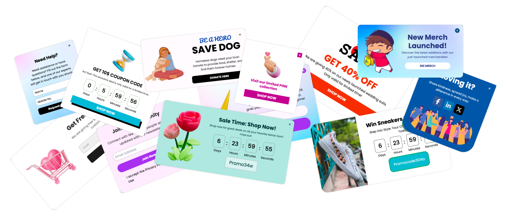
In the fast-paced world of digital marketing, capturing and holding user attention is crucial. One of the most effective tools for achieving this is the popup. However, not all popups are created equal. The visual appeal of your popups—specifically the colors and fonts you choose—can significantly impact their effectiveness. This article will explore the best colors and fonts for popups, helping you enhance engagement and boost conversions.
Colors and fonts are more than just aesthetic choices; they influence emotions, readability, and user behavior. Colors can evoke specific feelings and prompt actions, while fonts affect how easily your message is read and understood. By carefully selecting the right colors and fonts, you can create popups that not only look good but also drive engagement and conversions.
Understanding the Psychology of Colors
The Role of Colors in User Perception
Colors play a critical role in how users perceive your brand and message. Different colors can evoke different emotions and associations, influencing how users feel and act. For example, blue is often associated with trust and security, while red can evoke urgency and excitement. Understanding these associations can help you choose colors that align with your brand and objectives.
How Different Colors Influence Emotions and Actions
Here is a brief overview of how some common colors can influence emotions and actions:
Blue: Trust, security, calmness
Red: Urgency, excitement, passion
Green: Growth, harmony, freshness
Yellow: Optimism, attention, energy
Orange: Friendliness, enthusiasm, creativity
Purple: Luxury, creativity, wisdom
Black: Power, elegance, sophistication
White: Simplicity, cleanliness, purity
Pink: Playfulness, romance, nurturing
Grey: Neutrality, balance, calm
Multicolor: Versatility, diversity, attention-grabbing
Cultural Significance of Colors
It's also important to consider the cultural significance of colors, as different cultures can have varying associations with the same color. For example, while white symbolizes purity and peace in many Western cultures, it can represent mourning in some Eastern cultures. Being mindful of these differences is crucial, especially for global brands.
Top 11 Colors for Popups
1. Blue: Trust and Security

Examples of Blue Popups:
A financial service offering a free consultation.
A security software promoting a trial version.
Best Practices for Using Blue in Popups:
Use blue to convey trustworthiness and reliability.
Combine with white or light colors for a clean, professional look.
2. Red: Urgency and Excitement

Examples of Red Popups:
A limited-time discount offer.
A call-to-action for a flash sale.
Best Practices for Using Red in Popups:
Use red to create a sense of urgency and drive immediate action.
Balance with neutral colors to avoid overwhelming the user.
3. Green: Growth and Harmony

Examples of Green Popups:
A sustainability-focused campaign.
A health and wellness product promotion.
Best Practices for Using Green in Popups:
Use green to signify growth, harmony, and health.
Pair with white or natural tones for an earthy feel.
4. Yellow: Attention-Grabbing and Optimism

Examples of Yellow Popups:
An announcement of a new feature or product.
A subscription offer for an online magazine.
Best Practices for Using Yellow in Popups:
Use yellow to grab attention and convey optimism.
Combine with dark text for readability.
5. Orange: Friendly and Energetic

Examples of Orange Popups:
A promotional offer for a fun event.
An invitation to join a community or group.
Best Practices for Using Orange in Popups:
Use orange to create a friendly and energetic vibe.
Balance with cooler colors to avoid being too intense.
6. Purple: Luxury and Creativity

Examples of Purple Popups:
A premium product announcement.
A creative workshop invitation.
Best Practices for Using Purple in Popups:
Use purple to convey luxury and creativity.
Combine with gold or silver for an elegant look.
7. Black: Power and Elegance
Examples of Black Popups:
A high-end product launch.
A luxury service promotion.
Best Practices for Using Black in Popups:
Use black to create a powerful and elegant impression.
Pair with white or metallic accents for sophistication.
8. White: Simplicity and Cleanliness

Examples of White Popups:
A minimalist design product offer.
A clean and simple subscription form.
Best Practices for Using White in Popups:
Use white for a clean and simple look.
Combine with bold text and clear images.
9. Pink: Playfulness and Romance

Examples of Pink Popups:
A Valentine's Day promotion.
A playful, fun campaign targeting a younger audience.
Best Practices for Using Pink in Popups:
Use pink to convey playfulness and romance.
Pair with softer tones for a gentle appearance.
10. Grey: Neutrality and Balance

Examples of Grey Popups:
A professional service offer.
A neutral background for a more focused message.
Best Practices for Using Grey in Popups:
Use grey for a balanced, neutral look.
Combine with vibrant colors for contrast.
11. Multicolor: Versatility and Attention

Examples of Multicolor Popups:
A vibrant, fun campaign.
An attention-grabbing offer for a diverse audience.
Best Practices for Using Multicolor in Popups:
Use multicolor to create a lively and versatile appearance.
Ensure the colors complement each other and don't clash.
The Impact of Fonts on Popup Effectiveness
The Psychology of Fonts
Fonts influence how users perceive and engage with your message. Different fonts convey different emotions and tones, affecting readability and user interaction. For instance, a serif font like Times New Roman may convey tradition and reliability, while a sans-serif font like Arial suggests modernity and simplicity.
How Fonts Influence Readability and Engagement
Fonts that are easy to read ensure that your message is clearly understood, which is crucial for effective communication. Using too many decorative fonts can distract users, while simple, clean fonts can enhance readability and engagement. Choosing the right font can significantly improve the user experience and effectiveness of your popups.
Top 11 Fonts for Popups
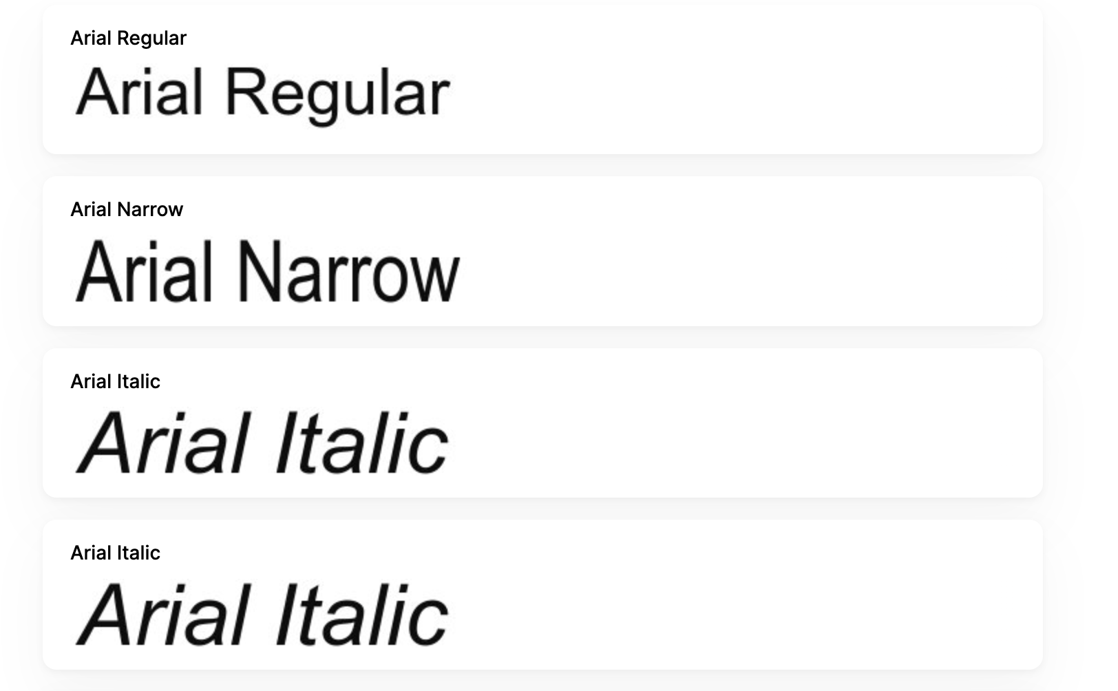
1. Arial: Simple and Readable
Examples of Arial in Popups:
A clear and straightforward call-to-action.
Informational popups requiring quick readability.
Best Practices for Using Arial in Popups:
Use Arial for a clean and modern look.
Ideal for any type of popup due to its readability.
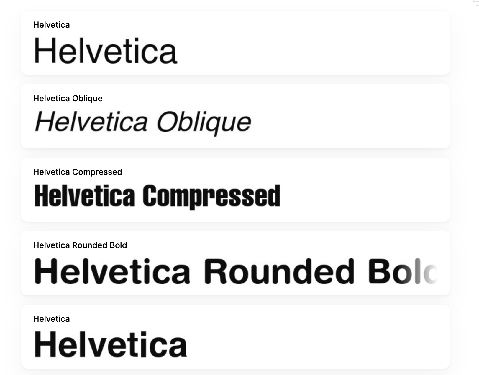
2. Helvetica: Modern and Neutral
Examples of Helvetica in Popups:
Professional service offers.
Modern product promotions.
Best Practices for Using Helvetica in Popups:
Use Helvetica to achieve a neutral, professional appearance.
Pair with high-quality images for a sleek design.
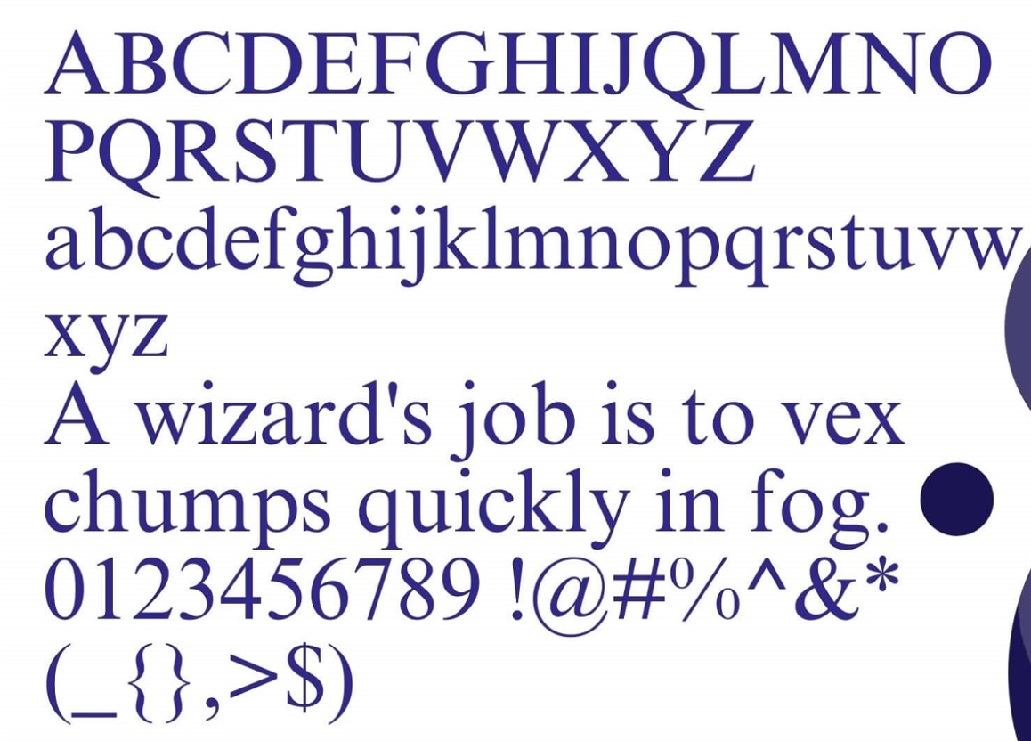
3. Times New Roman: Traditional and Formal
Examples of Times New Roman in Popups:
Formal event invitations.
Educational content promotions.
Best Practices for Using Times New Roman in Popups:
Use Times New Roman to convey tradition and reliability.
Best for formal and educational contexts.
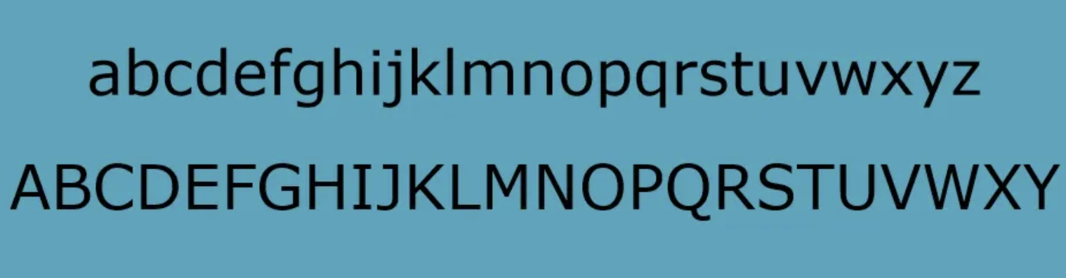
4. Verdana: Clear and Open
Examples of Verdana in Popups:
Clear calls-to-action.
Readable subscription forms.
Best Practices for Using Verdana in Popups:
Use Verdana for a crisp and clear look.
Ideal for readability-focused designs.
5. Georgia: Elegant and Classic
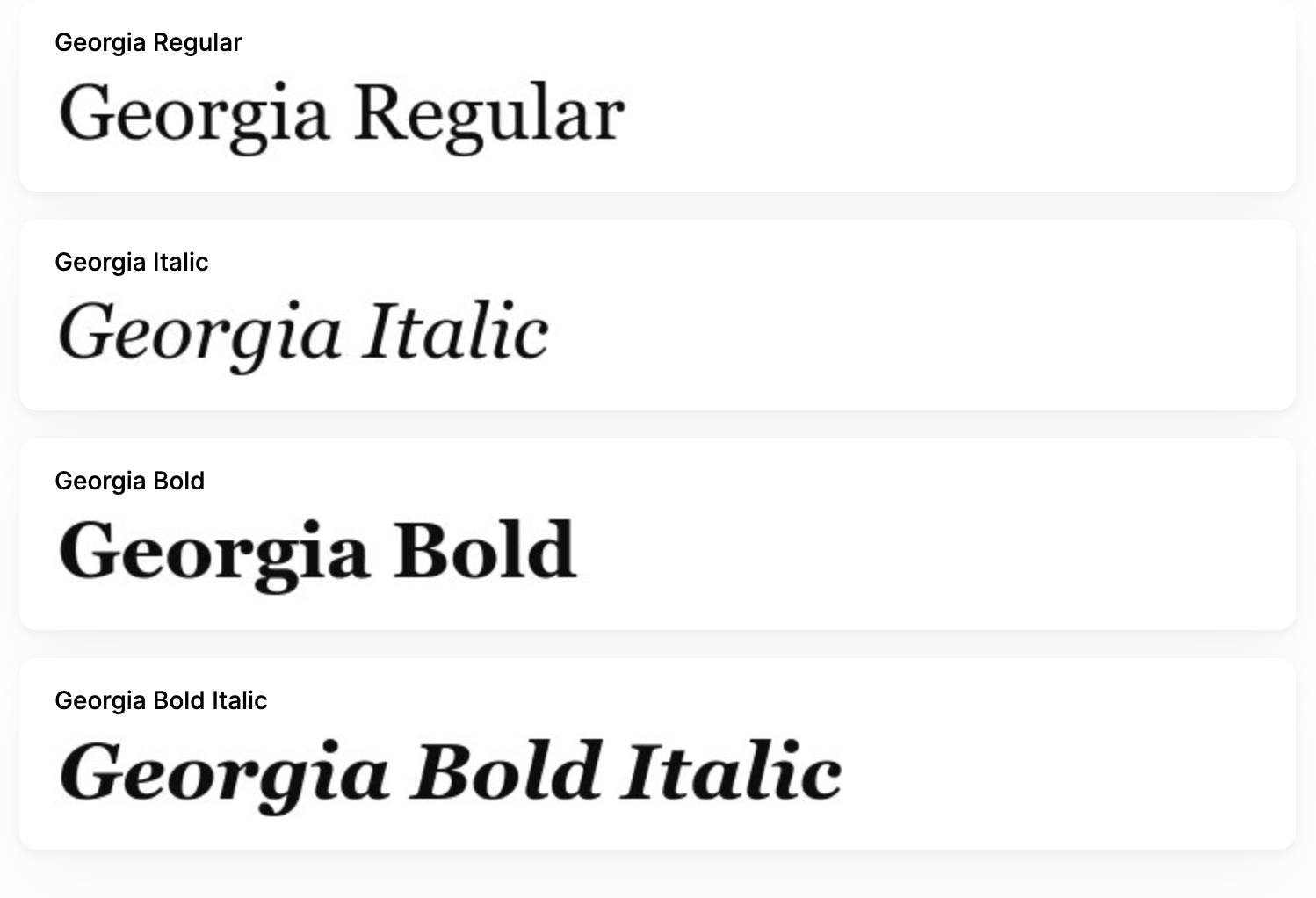
Examples of Georgia in Popups:
Elegant product announcements.
Classic promotional offers.
Best Practices for Using Georgia in Popups:
Use Georgia for a touch of elegance and class.
Perfect for upscale and sophisticated promotions.
6. Tahoma: Crisp and Modern
Examples of Tahoma in Popups:
Modern service offers.
Clean and simple subscription forms.
Best Practices for Using Tahoma in Popups:
Use Tahoma for a crisp and contemporary appearance.
Great for modern, sleek designs.
7. Open Sans: Friendly and Neutral
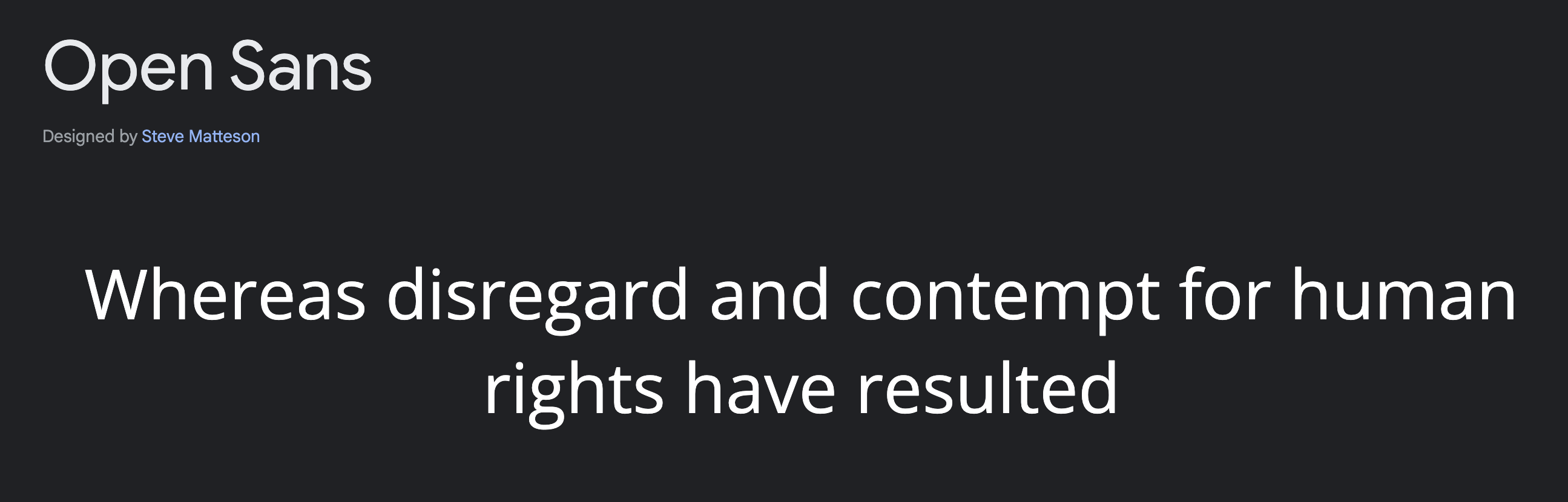
Examples of Open Sans in Popups:
Friendly and inviting popups.
Neutral design elements.
Best Practices for Using Open Sans in Popups:
Use Open Sans for a welcoming and neutral look.
Versatile for various popup types.
8. Roboto: Clean and Professional

Examples of Roboto in Popups:
Professional service announcements.
Clean and modern promotional offers.
Best Practices for Using Roboto in Popups:
Use Roboto for a clean and professional feel.
Ideal for modern and professional contexts.
9. Lato: Warm and Inviting

Examples of Lato in Popups:
Inviting calls-to-action.
Warm and friendly promotional messages.
Best Practices for Using Lato in Popups:
Use Lato to create a warm and inviting appearance.
Perfect for engaging and friendly popups.
10. Montserrat: Bold and Modern

Examples of Montserrat in Popups:
Bold product launches.
Modern, eye-catching promotions.
Best Practices for Using Montserrat in Popups:
Use Montserrat for a bold and contemporary look.
Great for attention-grabbing designs.
11. Comic Sans: Playful and Unconventional
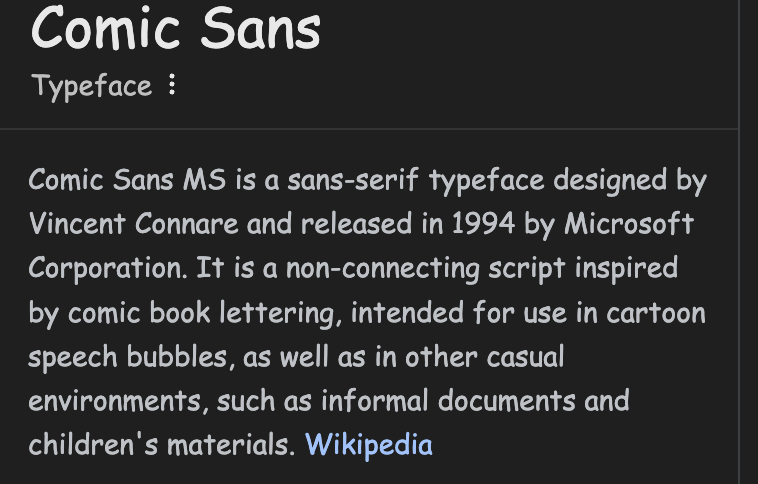
Examples of Comic Sans in Popups:
Fun and playful campaigns.
Casual, unconventional offers.
Best Practices for Using Comic Sans in Popups:
Use Comic Sans to add a playful and casual tone.
Best for informal and fun contexts.
Best Colors and Fonts for Popups in Poper
Choosing the right colors and fonts for your popups can make a big difference. Poper makes it easy to experiment and find what works best.
Easy Customization with Poper
Poper is user-friendly and intuitive:
Drag-and-Drop Editor: Quickly choose and customize colors and fonts without any design skills.
Variety of Templates: Select from a range of pre-designed templates with effective color and font combinations.
Real-Time Preview: See your changes instantly to ensure the perfect look.
Flexible Options: Adjust everything from background colors to font styles to match your brand.
Combining Colors and Fonts for Maximum Impact
Matching Colors with Fonts
Matching the right colors with fonts can enhance the overall impact of your popups. Choose combinations that complement each other and align with your brand’s identity. For instance, pairing a bold font with a vibrant color can create a striking and memorable design.
Creating Contrast for Readability
Contrast is key to ensuring your popup text is readable. Use dark text on light backgrounds or vice versa to make your message stand out. This not only improves readability but also enhances the visual appeal of your popups.
Ensuring Brand Consistency
Maintaining brand consistency in your popups is crucial for building trust and recognition. Use your brand’s colors and fonts consistently across all popups to create a cohesive and professional look. This helps reinforce your brand identity and makes your popups more effective.
Best Practices for Designing Popups
Keep It Simple
Simplicity is essential in popup design. Avoid cluttering your popups with too much information or complex visuals. Focus on delivering a clear and concise message that prompts user action.
Focus on User Experience
Prioritize user experience in your popup designs. Ensure your popups are easy to read and interact with, and that they provide value to your users. A positive user experience can significantly enhance the effectiveness of your popups.
Test Different Combinations
Testing is crucial for optimizing your popups. Experiment with different color and font combinations to see what works best for your audience. A/B testing can help you identify the most effective designs and improve your popup performance.
Frequently Asked Questions
What are the best colors for increasing popup conversion rates?
The best colors for increasing popup conversion rates are those that evoke positive emotions and prompt action, such as blue for trust, red for urgency, and green for growth.
How do I choose the right font for my popup?
Choose a font that aligns with your brand’s tone and is easy to read. Fonts like Arial, Helvetica, and Open Sans are versatile and highly readable, making them great choices for popups.
Can I use multiple colors in a single popup?
Yes, you can use multiple colors in a single popup, but ensure they complement each other and don’t clash. Use contrasting colors for text and background to enhance readability.
What are the most readable fonts for popups?
The most readable fonts for popups include Arial, Verdana, and Tahoma. These fonts are simple, clear, and easy to read, making them ideal for popup designs.
How can I ensure my popup design aligns with my brand?
To ensure your popup design aligns with your brand, use your brand’s colors, fonts, and visual style consistently across all popups. This helps create a cohesive and recognizable brand identity.
Are there any colors or fonts I should avoid in popups?
Avoid using colors that clash or are too bright, as they can be hard on the eyes. Similarly, avoid overly decorative fonts that can be difficult to read. Stick to simple, clear fonts and visually appealing color combinations.
Conclusion
Choosing the right colors and fonts for your popups can significantly enhance their effectiveness. Colors like blue, red, and green, combined with readable fonts like Arial, Helvetica, and Verdana, can help you create engaging and high-converting popups.
Visual appeal is crucial for popup success. By understanding the psychology of colors and fonts and following best practices, you can design popups that not only capture attention but also drive user action.