Pop-ups are like good customer service—they might interrupt your day, but if done right, they make things better, not worse.
Email subscription pop-ups have become one of the most widely-used tactics in digital marketing. But do they actually work? Let’s dive into the power of pop-ups, backed by data, and explore how these tools can significantly impact lead generation and audience engagement.
What Are Email Subscription Pop-Ups?
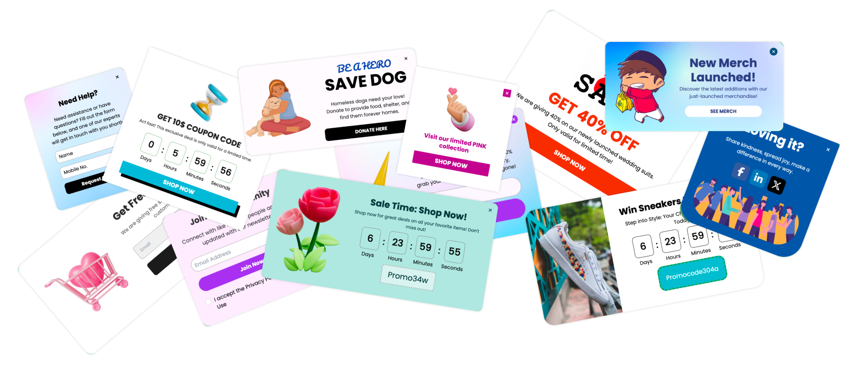
Email subscription pop-ups are small, often eye-catching windows that appear on websites, asking users to input their email addresses in exchange for something valuable—whether it’s a free ebook, discount code, or exclusive content. These pop-ups are an essential part of digital marketing as they help convert casual website visitors into subscribers.
Importance of Pop-Ups in Modern Digital Marketing
With the growing importance of email marketing in driving conversions and building long-term customer relationships, pop-ups have taken center stage. According to studies, well-placed pop-ups can lead to conversion rates of up to 9.28%. When designed effectively, they can drive high-quality leads and grow your email list exponentially.
The Popularity and Controversy of Pop-Ups
Pop-ups have stirred up quite the debate in the marketing world. On one hand, they’re known for being highly effective in boosting conversions; on the other, they’re infamous for disrupting user experience. So, where do they really stand?
A Brief History of Pop-Ups
Pop-ups first emerged in the late 1990s as a way to combat banner blindness. While initially annoying, modern pop-ups have evolved. Now, marketers focus on non-intrusive designs and use advanced strategies like exit-intent pop-ups to make sure they appear at just the right moment—when a user is about to leave the site.
The Balance Between Engagement and Disruption
The key to an effective pop-up is balance. Too many pop-ups can alienate users and increase bounce rates. However, with the right timing, design, and offer, pop-ups can turn potential customers into loyal subscribers.
Pop-Ups: Friend or Foe?
| Advantages | Disadvantages |
|---|---|
| High conversion rates | Can interrupt user experience |
| Great for list building | Can slow down site loading time |
| Customizable and versatile | Poorly timed pop-ups can drive users away |
The Effectiveness of Email Subscription Pop-Ups

Are pop-ups really worth the hype? To answer that, let’s look at the key metrics.
Do Pop-Ups Really Work? Key Metrics to Consider
When measuring the success of pop-ups, focus on the following:
Conversion Rate: How many visitors are converting into subscribers? A good pop-up can convert at rates as high as 11%.
Click-Through Rate (CTR): The percentage of people who interact with your pop-up. A well-designed pop-up can drive a CTR of up to 30%.
Bounce Rate Impact: Pop-ups that disrupt user experience can increase your bounce rate, so it's crucial to use them wisely.
Long-Term Engagement: Are the leads you're generating through pop-ups sticking around? Keep an eye on email engagement metrics to gauge the quality of your subscribers.
Understanding the Psychology Behind Pop-Ups
The secret behind successful pop-ups lies in psychology. Humans are wired to respond to certain triggers, which pop-ups are designed to activate:
Urgency and Scarcity: Time-sensitive offers (like "Limited time only!") increase the likelihood of conversions.
Curiosity: A pop-up that teases valuable content creates an irresistible urge to engage.
Social Proof: Highlighting that "100,000+ subscribers have joined" leverages the principle of social proof, making your pop-up more convincing.
FOMO (Fear of Missing Out): Phrases like "Don’t miss out!" appeal to our natural fear of missing opportunities, prompting immediate action.
Types of Email Subscription Pop-Ups
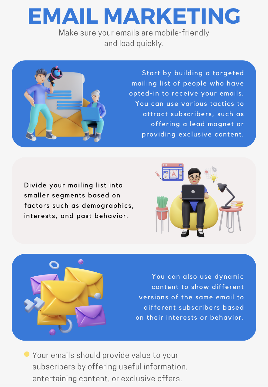
Not all pop-ups are created equal. To maximize success, it’s essential to use the right type of pop-up based on user behavior and content strategy.
Exit-Intent Pop-Ups
What are exit-intent pop-ups?
Exit-intent pop-ups appear when a user is about to leave your site. This gives you one last chance to convert them with a compelling offer, like a discount code or valuable content.
Scroll-Triggered Pop-Ups
How do they work?
These pop-ups show up when a user has scrolled a certain percentage of your page, typically indicating that they are engaged with your content. They work best on long blog posts and product pages.
Best Practices for Designing Effective Pop-Ups
Creating pop-ups that convert requires more than just throwing a form on your website. The design, timing, and offer all play crucial roles in determining whether your pop-up will engage users or drive them away.
Creating Compelling Offers
At the core of any effective pop-up is the offer. Users need a reason to part with their email addresses, so make sure what you’re offering has real value. Some of the most compelling offers include:
Exclusive Discounts: Perfect for e-commerce sites. Offering 10-20% off on the first purchase can quickly convert visitors into customers.
Free Ebooks or Guides: Content-driven sites can entice users with valuable, in-depth content in exchange for a subscription.
Access to Exclusive Content: Whether it’s early access to new products, blog posts, or member-only deals, exclusivity works wonders.
Your pop-up’s success relies heavily on how aligned your offer is with your audience's needs and pain points.
A/B Testing Your Pop-Ups
One of the most effective ways to optimize your pop-ups is through A/B testing. This allows you to test different versions of your pop-up to see what resonates most with your audience. Key elements to test include:
Headlines: Sometimes, a simple tweak in your headline can drastically improve conversions. For instance, instead of “Sign Up Now,” try “Unlock Exclusive Offers.”
CTA Buttons: Test different colors and texts for your call-to-action buttons. A bright, contrasting color that stands out can make a huge difference.
Images and Visuals: Visuals create immediate impact, so make sure they’re relevant and attention-grabbing.
Mobile Optimization for Pop-Ups
With more users browsing on mobile than ever before, mobile-friendly pop-ups are a must. If your pop-up isn't optimized for smaller screens, it will frustrate users and hurt your overall engagement.
Ensure that your pop-up is responsive and scales down correctly for mobile devices.
Google penalizes websites with intrusive pop-ups on mobile, so make sure your pop-ups don’t cover the entire screen or interfere with navigation.
A clean, mobile-optimized pop-up that’s easy to close is key to minimizing frustration while maximizing conversions.
Minimizing Annoyance While Maximizing Engagement
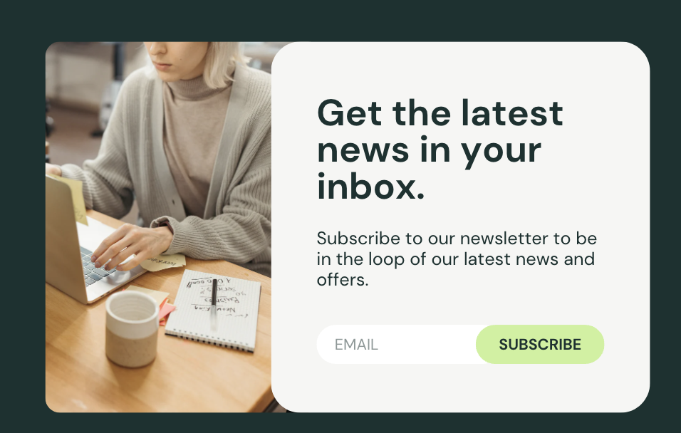
Pop-ups often have a bad reputation for being annoying, but it’s possible to engage users without driving them away. The key lies in timing and frequency.
Avoiding Pop-Up Fatigue
Pop-up fatigue occurs when visitors are bombarded with too many pop-ups or when pop-ups appear too frequently. To prevent this:
Limit the number of pop-ups on any given page.
Use time delays or scroll triggers to ensure your pop-up only appears when a user has engaged with your content.
Consider implementing a cookie system that remembers when users have already seen your pop-up so they don’t keep seeing it on every visit.
GDPR and Privacy Considerations
With data privacy laws like GDPR in effect, it’s crucial to ensure your pop-ups comply with regulations. Here’s what to keep in mind:
Get clear consent: Make sure users understand what they’re signing up for by using transparent language in your pop-up copy.
Offer an opt-out: Give users the ability to unsubscribe easily if they choose.
Include a link to your privacy policy to give users peace of mind about how their data will be used.
How Poper Can Help You Design High-Converting Pop-Ups
Poper is an AI-powered onsite engagement platform that allows businesses to create effective, high-converting pop-ups tailored to their audience. With features like exit-intent pop-ups, scroll triggers, and A/B testing, Poper enables you to:
Optimize timing and design for maximum engagement.
Run comprehensive A/B tests to see what works best for your audience.
Ensure mobile responsiveness and GDPR compliance.
With Poper, you can build pop-ups that not only engage but also convert visitors into loyal subscribers. Whether you're looking to grow your email list, increase sales, or engage your audience, Poper offers a range of tools to ensure your pop-ups hit the mark.
Pop-Up Alternatives to Consider
While email subscription pop-ups are highly effective, they are not the only tool available for capturing leads or engaging users. There are several other options that can be just as successful, especially when pop-ups are not the ideal fit for a specific page or audience.
Embedded Forms
One alternative is using embedded forms placed directly within your content or website. These forms are less intrusive and allow users to naturally opt into your offer as they browse. Embedded forms work well in blog posts, landing pages, or at the end of articles where readers are already engaged with the content.
Benefits of Embedded Forms:
Non-intrusive: Since they don’t pop up and disrupt the user experience, embedded forms can be integrated smoothly into the site layout.
Higher trust: Users who willingly fill out embedded forms might be more qualified leads, as they’ve actively chosen to engage with the form.
Example:
A tech blog places a simple embedded subscription form at the bottom of each article, offering readers weekly updates on the latest tech news. This allows the user to sign up without feeling pressured, and the form blends seamlessly with the website.
Slide-In Forms
Slide-in forms offer a middle ground between intrusive pop-ups and embedded forms. These forms appear from the side or bottom of the screen as the user scrolls or after a timed delay. The advantage is that they capture attention without fully interrupting the browsing experience.
Why Use Slide-In Forms:
Minimal disruption: Unlike pop-ups, slide-ins don’t completely block the view, making them feel less aggressive.
Good for longer pages: Slide-ins are especially effective on long content pages or blogs where the user has invested time in reading.
For example, a fitness blog might use a slide-in form halfway through an article, offering a free workout plan in exchange for an email signup.
Sticky Bars
Sticky bars are another useful alternative, sitting at the top or bottom of the webpage, remaining visible as the user scrolls. Sticky bars are often used for announcements, promotions, or gathering email signups without intruding into the user’s main browsing area.
Why Sticky Bars Work:
Always visible: Because they stay in one place, sticky bars are hard to miss and constantly remind users of the offer.
Non-disruptive: They don’t interrupt the user's flow but still offer consistent visibility.
A SaaS website could use a sticky bar to promote a free trial or special discount while visitors explore their homepage.
Choosing the Right Alternative
When deciding which alternative to use, consider the goals of your campaign and your audience’s preferences. If you’re looking for a subtle approach, embedded forms or sticky bars may be the best choice. For slightly more attention-grabbing options, slide-in forms strike a balance between effectiveness and user experience.
Poper: The Smart Way to Engage Users with Pop-Ups
To create highly effective, user-friendly pop-ups, you need a platform that offers flexibility, personalization, and ease of use. Poper is an AI-powered onsite engagement platform that helps businesses boost conversions through advanced pop-up technology.
Why Choose Poper for Your Pop-Up Needs?
Customizable Pop-Up Designs: Tailor your pop-ups to match your brand’s aesthetics and messaging.
Advanced Targeting Options: Show the right pop-up to the right audience, based on behavior, location, or time on page.
A/B Testing Capabilities: Continuously optimize your pop-ups with built-in A/B testing features, ensuring maximum engagement.
Mobile-Friendly Design: Create responsive pop-ups that look great on all devices without risking penalties from Google for intrusive mobile interstitials.
GDPR Compliance: Poper ensures that your pop-ups are fully compliant with data protection regulations, safeguarding your business and customers.
With Poper, you can easily implement exit-intent, scroll-triggered, time-delayed, or click-activated pop-ups and boost your email list, increase conversions, and deliver a better user experience—all from a single platform.
Start Your Pop-Up Journey with Poper
Ready to take your pop-ups to the next level? Sign up for a free trial of Poper and discover how smart pop-ups can transform your website’s engagement and conversion rates.
It seems that we've covered the main parts of the article based on the structure you requested. Let's continue and conclude with a final recap and FAQs to wrap up everything neatly.
FAQs
What is the best type of pop-up for lead generation?
Exit-intent pop-ups are widely considered the most effective for lead generation because they catch visitors as they are about to leave the site, providing one last opportunity to engage without interrupting their browsing experience.
How do I prevent pop-ups from annoying my site visitors?
Make sure your pop-ups are well-timed and targeted. Avoid overwhelming users by limiting the number of pop-ups on any given page, and ensure the pop-ups provide real value—whether it's a discount, exclusive content, or useful resources.
How can I track the performance of my pop-ups?
You can use built-in analytics in platforms like Poper to track metrics such as conversion rates, click-through rates, and bounce rates. Additionally, A/B testing different designs and offers will help you refine and improve performance over time.
What is the best time to display a pop-up?
This depends on your audience and goals. Time-delayed pop-ups often work well on blogs and long-form content, while exit-intent pop-ups are ideal for e-commerce sites. Testing different timings (e.g., after 10 seconds or after 70% scroll) can help you find the sweet spot.
How do I make my pop-ups GDPR compliant?
Ensure that your pop-ups include a clear opt-in for users, provide information about how their data will be used, and offer a link to your privacy policy. Additionally, platforms like Poper help ensure that your pop-ups comply with data protection regulations.
Conclusion: Do Email Subscription Pop-Ups Really Work?
In 2025, email subscription pop-ups remain one of the most effective tools for growing email lists and improving conversions when done correctly.
The key to effective pop-ups lies in the offer and timing. Whether using exit-intent, scroll-triggered, or time-delayed pop-ups, the message must feel personalized, and the offer must provide real value to your audience. Testing different designs, CTAs, and strategies will ensure that your pop-ups not only engage users but also convert them into subscribers or customers.
Pop-ups, particularly when implemented with platforms like Poper, help businesses of all sizes grow their audience, collect leads, and increase sales—while respecting the user experience.
