Email marketing remains one of the most effective digital marketing strategies, offering unparalleled reach and ROI. In a digital landscape cluttered with competitive marketing messages, email provides a direct line of communication with your audience, making it crucial to continuously grow and nurture your email list.
Email has a median ROI of 122%—over 4x higher than other marketing formats including social media, direct mail, and paid search.
DMA, 2016
Role of Email Opt-in Popups in Growing Your Subscriber Base
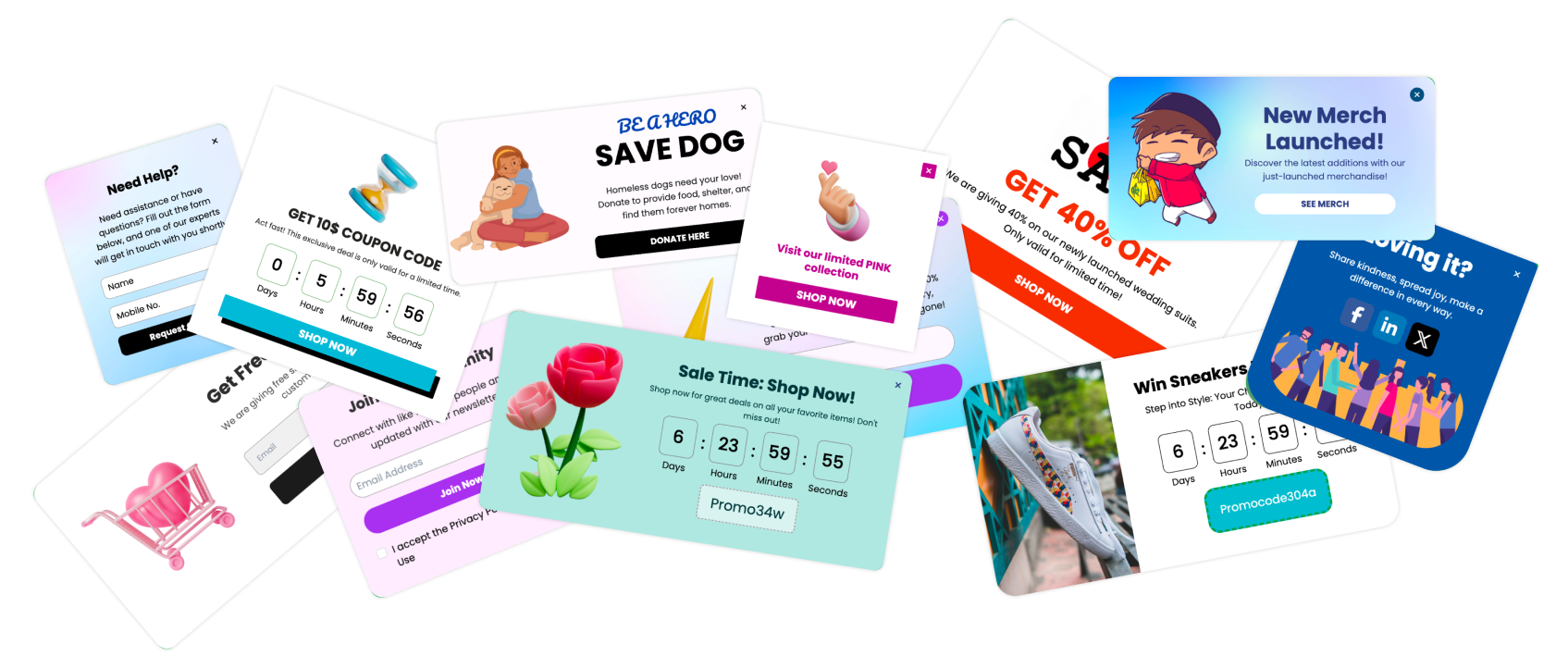
Email opt-in popups are essential tools for converting website visitors into subscribers. Unlike passive signup forms, popups actively engage visitors, presenting them with a compelling offer or message that encourages email signup. This proactive approach is vital in a marketing environment where attention is fleeting and first impressions count.
Understanding Email Opt-in Popups
Delving into the mechanics and psychology behind email opt-in popups helps clarify why they're so effective at growing email lists and enhancing user engagement. Let's break down what these popups are and how they tap into user psychology to motivate action.
What Exactly Are Email Opt-in Popups?
Email opt-in popups are dialog boxes that appear on websites, prompting visitors to subscribe to email lists. They can be triggered by various actions, such as a user arriving on a page, intending to exit, or after spending a certain amount of time on a site. The primary goal is to capture email addresses, which marketers can later use to disseminate newsletters, promotional content, and personalized offers.
The Psychological Impact of Popups on User Behavior
Creating a Sense of Urgency
Many popups utilize the psychological principle of urgency to compel users to act immediately. By presenting an offer as time-sensitive, popups can encourage users to subscribe right away to avoid missing out.
The Rule of Reciprocity
Popups often offer something valuable in exchange for the user's email address, such as a discount code or a free ebook. This taps into the psychological tendency to reciprocate when someone receives something of value, enhancing the likelihood of a sign-up.
Fear of Missing Out (FOMO)
By highlighting what others have gained from subscribing, or what might be lost by not signing up, popups can leverage FOMO to boost conversion rates.
Engagement Through Interaction
Popups require users to make an active choice—to either engage or dismiss. This interaction can significantly increase the user's engagement with the site, making them more likely to commit to a subscription.
Types of Email Opt-in Popups
Different types of email opt-in popups cater to various user behaviors and preferences, each with unique features and best practices. Understanding these can help you choose the right popup style for your website to maximize effectiveness.
1. Lightbox Popups: Features and Best Practices
What is a Lightbox Popup?
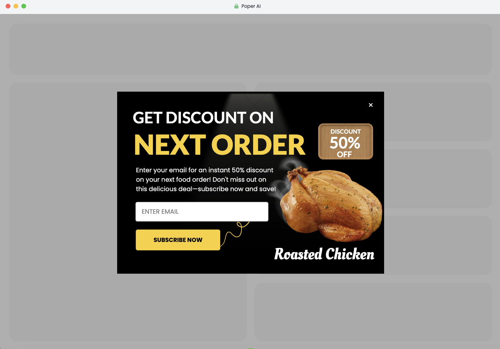
A lightbox popup dims the background content and highlights the popup itself, focusing the user's attention solely on the signup offer. This type is among the most common and effective at capturing user emails because it temporarily halts other interactions.
Best Practices:
Use them sparingly to avoid overwhelming users.
Include a clear and concise message along with an attractive offer.
Ensure easy dismissal of the popup to enhance user experience and comply with usability standards.
2. Floating Bar Popups: Advantages and Placement Tips
Efficient and Less Intrusive
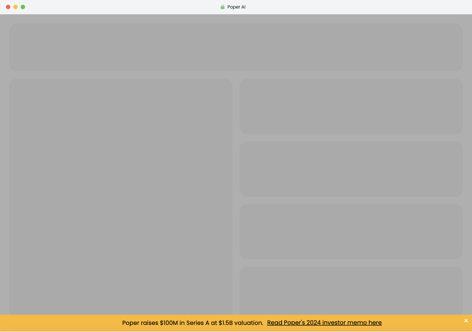
Floating bars sit at the top or bottom of the user's screen and scroll along with them. They are less intrusive than lightbox popups and are always visible, providing constant, gentle reminders without significantly disrupting the user experience.
Placement Tips:
Place at the top to immediately catch the user’s attention.
Use a contrasting color to make the popup stand out but not clash with the site design.
Keep the message short and the signup form simpler to maximize efficiency.
3. Slide-in Popups: When and Where to Use Them Effectively
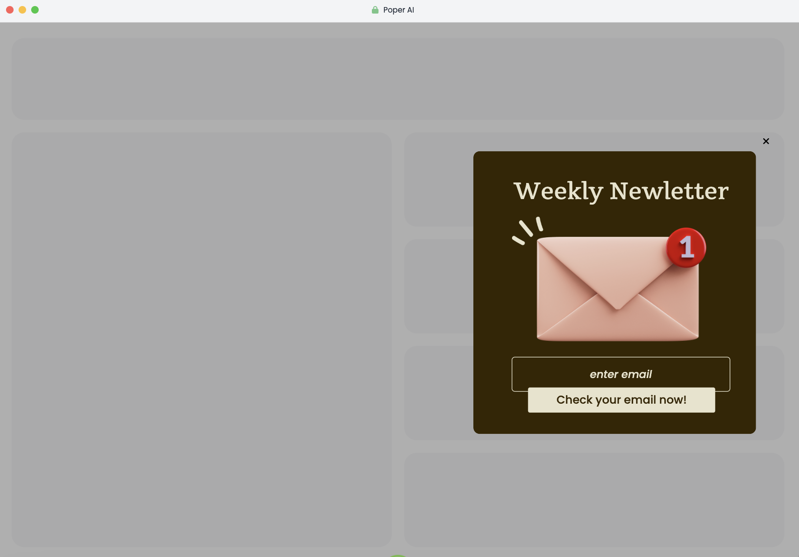
Subtle Yet Persuasive
Slide-in popups appear from the side of the page, typically as the user scrolls down to a certain point. They're less aggressive than lightbox popups but can be very effective when timed correctly.
Usage Tips:
Trigger them based on user scroll to capture engaged users.
Position them on the lower corner of the page to ensure visibility without blocking key content.
Optimize for mobile screens to avoid covering too much content.
4. Fullscreen Welcome Mats
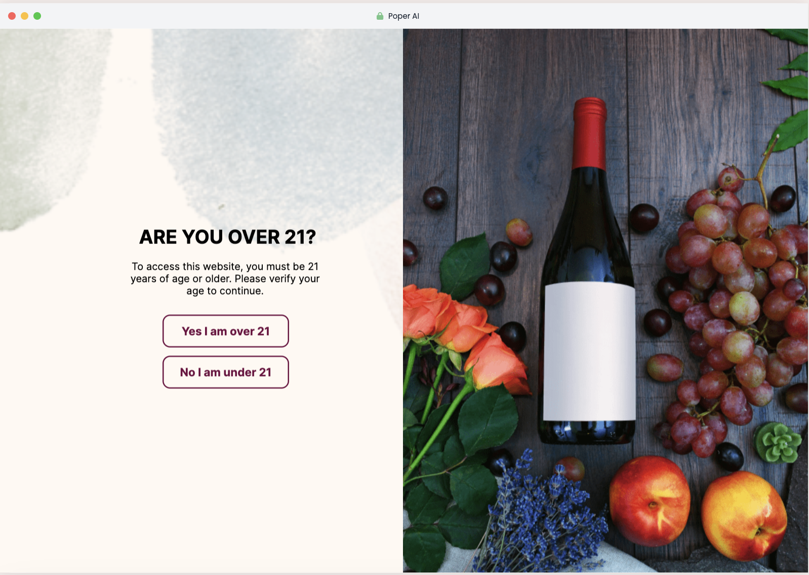
Commanding Attention
Fullscreen welcome mats take over the entire screen, presenting a cannot-miss offer. When used correctly, they can significantly boost conversion rates.
Balancing Impact with User Experience:
Use as a first interaction on high-traffic landing pages.
Offer substantial value like a major discount or exclusive content to justify the intrusion.
Include an obvious and easy way to exit the fullscreen popup to respect the user's choice.
Designing Effective Email Opt-in Popups
Creating email opt-in popups that not only capture attention but also motivate users to subscribe requires thoughtful design. Here’s how you can design popups that are both visually appealing and strategically effective.
Key Elements of a Compelling Popup Design
Simplicity and Clarity
Focus on Minimalism: Keep the design simple. A cluttered popup can overwhelm users and dilute the main message. Stick to one clear message and one call to action.
Readable Fonts: Use fonts that are easy to read and large enough to be seen across all devices. This ensures that your message is easily digestible at a glance.
Visual Appeal
Attractive Color Scheme: Utilize colors that stand out but are harmonious with your website's overall design. Colors not only attract attention but also influence mood and behavior, so choose them wisely.
High-Quality Images: Incorporate high-quality graphics or images that align with the message. Visuals can significantly increase engagement and the perceived value of what you’re offering.
Color Psychology in Popup Design
Influence Emotions and Actions
Blue for Trust: Use blue to evoke trust and security, ideal for financial or health-related offers.
Red for Urgency: Red can create a sense of urgency and is often used for clearance sales or limited-time offers.
Green for Calm and Growth: Green is often associated with health, tranquility, and growth, suitable for subscription services or wellness products.
Customize Colors Based on Brand and Offer
Tailor your color choices to reflect your brand identity and the specific action you want users to take. Consistency with your brand colors enhances recognition and trust.
The Importance of Mobile-Responsive Popups
Adapting to User Behavior
With the increasing use of mobile devices to browse the web, ensuring your popups look great and function seamlessly on all screen sizes is crucial.
Responsive Design: Make sure your popup design adjusts automatically to fit the screen size and orientation of the device being used. This prevents formatting issues that could deter users from subscribing.
Test and Optimize
Regularly test your popups on various devices to ensure they are not only displaying correctly but are also easy to interact with. This includes making sure forms are easy to fill out and buttons are easy to tap.
Crafting the Perfect Opt-in Message
The content of your email opt-in popup is crucial in persuading users to subscribe. Crafting a message that resonates with your audience and clearly communicates the value of subscribing is essential for converting visitors into subscribers.
How to Write Engaging and Persuasive Popup Content
Clarity and Brevity
Concise Messaging: Keep your message short and to the point. Users should be able to quickly grasp what you are offering and what they need to do.
Clear Call to Action (CTA): Your CTA should be unambiguous and compelling. Use action words that prompt immediate response, such as "Subscribe Now," "Get Access," or "Join Free for a Month."
Highlight Benefits, Not Features
Focus on Value: Instead of listing features of your service or product, highlight how subscribing will directly benefit the user. Will they get exclusive discounts, insider information, or valuable tips and tools?
Address User Needs: Tailor your message to meet the interests or needs of your audience. Demonstrate understanding and empathy to connect more deeply and effectively.
Common Copywriting Mistakes to Avoid in Popups
Avoiding Over-Promising
Keep Promises Realistic: Ensure that whatever is promised can be delivered. Over-promising can lead to disappointment and unsubscribes.
Transparency is Key: Be honest about what subscribing entails to build trust from the start.
Steer Clear of Jargon
Use Simple Language: Avoid using technical jargon or buzzwords that might confuse the reader. Keep your language simple and accessible to ensure your message is understood by a broad audience.
Timing and Placement Strategies
Optimizing the timing and placement of your email opt-in popups can significantly impact their effectiveness. The right strategy can mean the difference between a popup that annoys users and one that successfully converts visitors into subscribers.
Best Practices for Timing Your Popups
Understand User Behavior
Wait for Engagement: Delay your popup until the user has had a chance to engage with your content. For instance, triggering a popup after a user has scrolled through 50% of a page shows they are interested in your content, making them more likely to subscribe.
Exit-Intent Technology: Consider using exit-intent popups, which appear when the user is about to leave the site. This can be a last chance to offer something valuable and keep them connected.
Time-Based Triggers
Session Duration: Set popups to appear after the user has spent a certain amount of time on your site. This ensures that the popup targets users who are more engaged and thus more likely to subscribe.
Strategic Placement for Maximum Conversion
High Traffic Areas
Home Page and Main Articles: Place popups on high-traffic pages where they are more likely to be seen by a larger audience. Make sure they are contextually relevant to the content on these pages.
Sidebar and Footer: These are less intrusive places for popups that remain visible as users interact with the site, providing a constant but subtle reminder.
Ensure Visibility Without Disruption
Avoid Essential Content: Ensure that popups do not block important content on your site. Blocking content can frustrate users and lead to negative experiences.
How to Use Page-Level Targeting for Personalized Messages
Customize Offers Based on Content
Relevant Offers: Tailor popup messages based on the specific content the user is viewing. For example, offer a free guide related to the article's topic they are reading.
Segment Users: Use page-level insights to segment users based on their interests and tailor messages accordingly. This increases the relevance of your popups, enhancing the likelihood of conversion.
Leverage User Data
Behavioral Targeting: Use cookies to track user behavior across the site and deploy popups that resonate with their journey and preferences.
Compliance and Ethical Considerations
Navigating the legal and ethical landscape is critical when deploying email opt-in popups. Adhering to compliance standards not only protects your business but also builds trust with your audience.
Understanding GDPR and Its Impact on Email Popups
General Data Protection Regulation (GDPR)
Applicability: GDPR affects any business interacting with EU citizens, imposing strict guidelines on how personal data is collected, stored, and used.
Consent Requirements: Under GDPR, consent must be explicit, informed, and freely given. This means your popups must include clear information on what subscribers are signing up for and a straightforward mechanism to grant or withdraw consent.
How to Ensure Your Popups Are Not Intrusive
User-Friendly Design
Easy to Dismiss: Ensure that your popups can be easily closed without confusing or frustrating users. This respects the user’s choice and enhances their overall experience.
Balanced Frequency: Avoid bombarding users with popups. Excessive use can lead to annoyance and can diminish the effectiveness of your campaigns.
Best Practices for Transparent Data Collection
Clear Communication
Transparency: Clearly state what data is being collected and how it will be used directly within the popup. Providing a link to your privacy policy is also a good practice.
Value Exchange: Explain the benefits of signing up, such as exclusive content or special discounts, to justify the data exchange.
Creating Email Opt-in Popups Using Poper
Implementing email opt-in popups effectively involves not only good design and strategy but also choosing the right tools. Poper is one such tool that offers a straightforward and powerful platform for creating and managing popups. Here’s how you can utilize Poper to craft engaging email opt-in popups that convert.
Introduction to Poper for Email Opt-ins
Overview of Poper’s Features
Poper provides a user-friendly interface with drag-and-drop functionalities that make it easy to design popups without needing extensive coding knowledge.
It offers a range of customizable templates specifically designed for various marketing goals, including email opt-ins.
Step-by-Step Guide to Creating an Email Opt-in Popup with Poper
Step 1: Selecting the Right Template
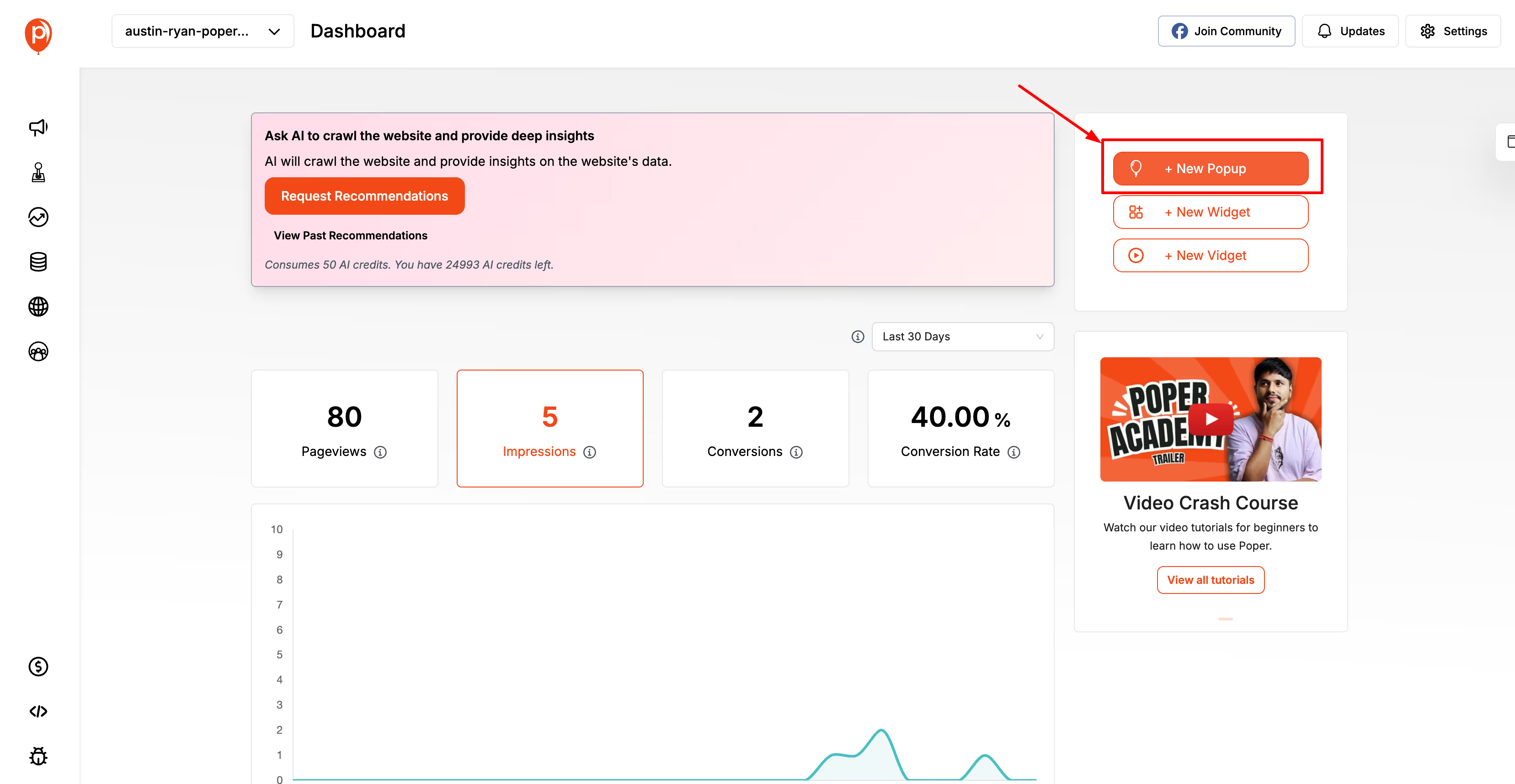
Open your web browser and go to the Poper website.
Login to your Poper account using your credentials.
On your dashboard, click on the “+ New Popup” button to create a new popup.
Step 2: Customizing Your Popup
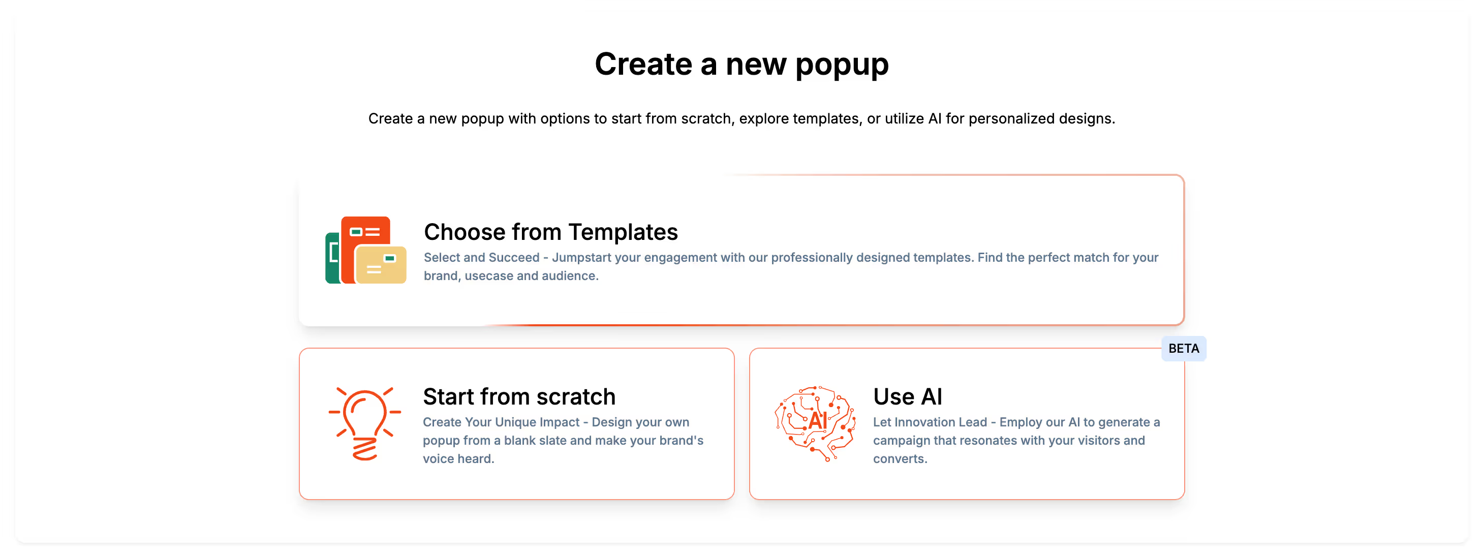
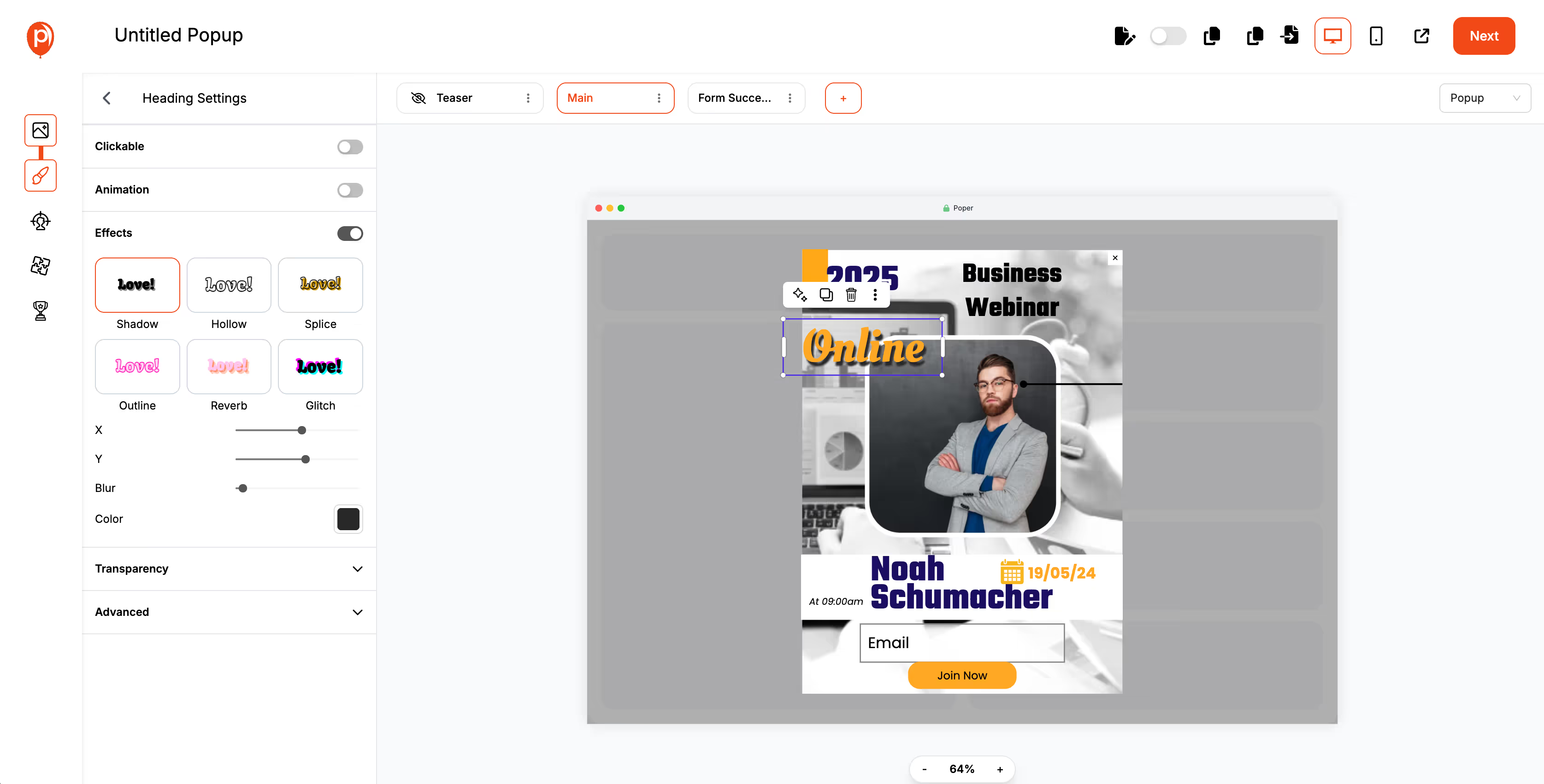
You have three options: Choose from Templates, Start from Scratch, or Use AI.
Customize the template by adding your own text, images, and branding elements. Poper allows you to modify the layout, colors, and fonts to match your website’s design.
Integrate fields for capturing user information, such as name and email address, ensuring these forms are easy to fill out and visually appealing.
Step 3: Setting Trigger Options
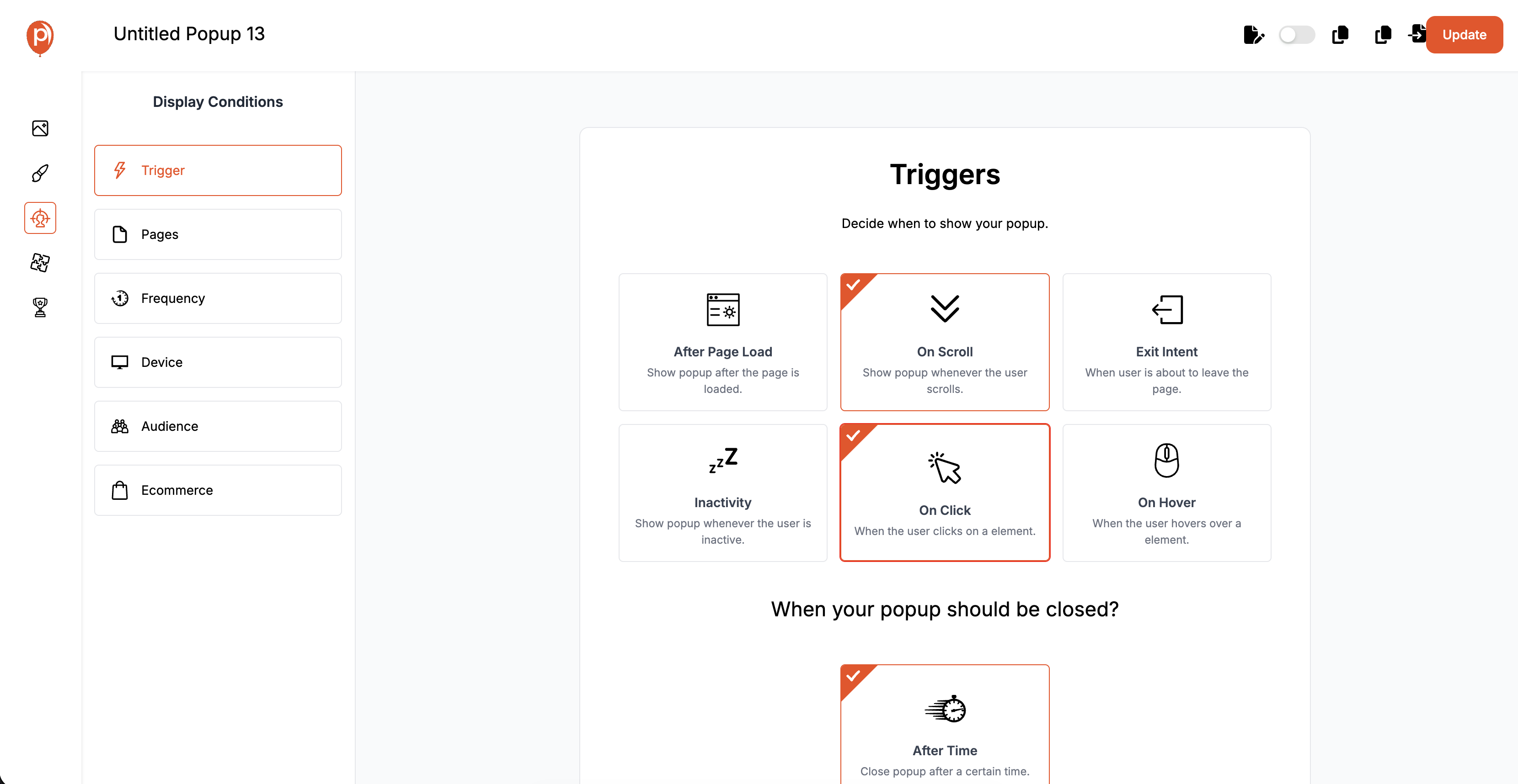
Decide when the popup should appear to visitors. Options include triggering the popup after a certain duration on the site, upon scrolling a certain percentage of a page, or when intending to exit the page.
Fine-tune the settings to target specific segments of your audience or specific pages, enhancing the relevance and effectiveness of your campaign.
Integrating Your Popup with Email Marketing Tools
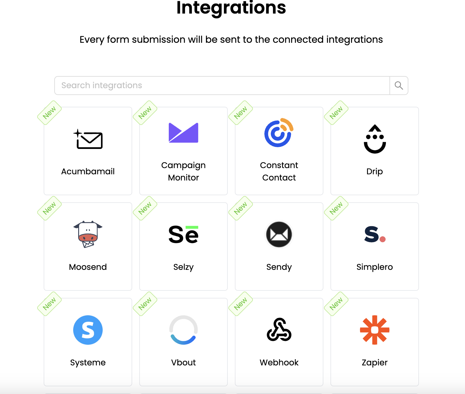
Poper easily integrates with most major email marketing platforms, allowing you to automatically sync new sign-ups to your existing email lists.
Set up confirmation emails and welcome messages through your email platform to immediately engage new subscribers.
Best Practices for Using Poper Popups
Continuously test and adjust the timing and content of your popups based on the performance analytics provided by Poper.
Consider A/B testing different versions of your popup directly within the Poper platform to refine what works best in terms of design and user engagement.
Troubleshooting Common Setup Issues
If you encounter issues with popup visibility or functionality, check Poper’s support for troubleshooting guides or reach out to their customer service.
Regularly review the integration points between Poper and your email system to ensure data is being transferred correctly and efficiently.
FAQs About Email Opt-in Popups
What is an email opt-in popup?
An email opt-in popup is a window that appears on a website to encourage visitors to subscribe to newsletters or marketing emails by entering their email address.
How can I make my email opt-in popup more effective?
Enhance your popup's effectiveness by ensuring it's timely, offers clear value, features simple design, and requests minimal information, typically just an email address.
Are email opt-in popups annoying to users?
Popups can be seen as intrusive, but if they are well-designed, offer real value, and include an easy way to close them, they can be a positive addition to the user experience.
What are the best practices for complying with privacy regulations when using email opt-in popups?
Ensure compliance by obtaining explicit consent, providing a privacy policy link on the popup, not pre-checking consent boxes, and keeping records of consents.
How frequently should I show an email opt-in popup to a visitor?
Show the popup sparingly, such as no more than once every 30 days per user, and consider using behavioral triggers like displaying the popup after multiple page visits to target more interested users.
Conclusion
Effectively leveraging email opt-in popups is a dynamic and powerful strategy to enhance your digital marketing efforts, grow your email list, and foster lasting relationships with your audience. By understanding the various aspects of popup implementation—from design and content to technical setup and compliance—you can create a strategy that not only captures attention but also converts visitors into loyal subscribers.


