
Designing popups for mobile users? Keep it simple and respectful to keep your audience happy.
Designing popups for mobile users has become an essential aspect of digital marketing, especially as mobile usage continues to surpass desktop browsing. Mobile popups are interactive elements that aim to capture the user's attention, promote products or services, collect leads, or encourage specific actions. However, due to the limited screen size and unique user behavior on mobile devices, creating effective and non-intrusive popups requires a thoughtful approach.
Understanding how to design mobile popups that are both effective and respectful of the user experience is crucial for marketers, developers, and designers alike.
Best Practices for Designing Mobile Popups
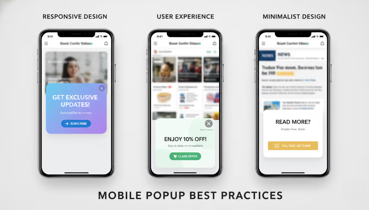
Ensuring Responsiveness
One of the foundational principles of mobile popup design is ensuring that popups are fully responsive. This means that they must automatically adjust to various screen sizes and orientations without compromising usability. A responsive popup will seamlessly fit into the mobile interface, offering a smooth experience across different devices, from smartphones to tablets.
Prioritizing User Experience
User experience (UX) should be at the forefront of any mobile popup design. Popups should be easy to close, non-intrusive, and should not obstruct the primary content of the page. Designing popups with the user in mind helps in reducing frustration and improving engagement rates. Implementing features like swipe-to-close, accessible close buttons, and limiting the frequency of popups are critical to maintaining a positive UX.
Using Minimalist Design
Minimalism plays a significant role in effective mobile popup design. Given the limited screen space, the design should focus on simplicity, using minimal text, clear calls to action (CTAs), and unobtrusive visuals. Minimalist design ensures that the message is communicated effectively without overwhelming the user, thereby increasing the likelihood of a positive response.
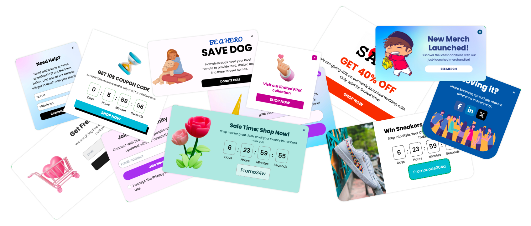
4 Types of Mobile Popups
1. Full-Screen Popups

Full-screen popups cover the entire mobile screen and demand the user’s full attention. These are typically used for critical messages, such as sign-up forms or important announcements. While effective, they must be used sparingly to avoid disrupting the user experience.
2. Slide-In Popups

Slide-in popups appear from the side or bottom of the screen, subtly catching the user’s attention without obstructing the content they are viewing. These popups are less intrusive and are ideal for promoting special offers or encouraging newsletter sign-ups.
3. Banner Popups

Banner popups are small, horizontal popups that appear at the top or bottom of the mobile screen. They are perfect for delivering brief messages like promotions or cookie consent notices. Due to their minimal impact on screen space, banner popups are widely used for non-intrusive communication.
4. Notification Bar Popups

Notification bar popups are similar to banner popups but are more versatile. They can be designed to stick to the top or bottom of the screen, providing persistent visibility for important information without interrupting the user's browsing.
Understanding Mobile User Behavior

Mobile Usage Patterns
Mobile users typically exhibit different browsing behaviors compared to desktop users. They are more likely to browse on the go, making quick decisions based on concise and clear information. Understanding these patterns helps in designing popups that are timely and relevant, ensuring they align with the user's immediate needs.
Scroll Behavior
Scrolling behavior on mobile devices is different from that on desktops. Users often scroll quickly through content, making it important to time popups appropriately. Popups that trigger as users reach certain scroll depths are effective because they appear when users are engaged with the content.
Interaction with Popups
Mobile users tend to interact differently with popups compared to desktop users. They may be less patient with popups that block content or are difficult to dismiss. Therefore, it’s essential to design popups that are easy to interact with, offering clear options to engage or dismiss.
Designing for Different Screen Sizes
Adapting Popups for Various Mobile Devices
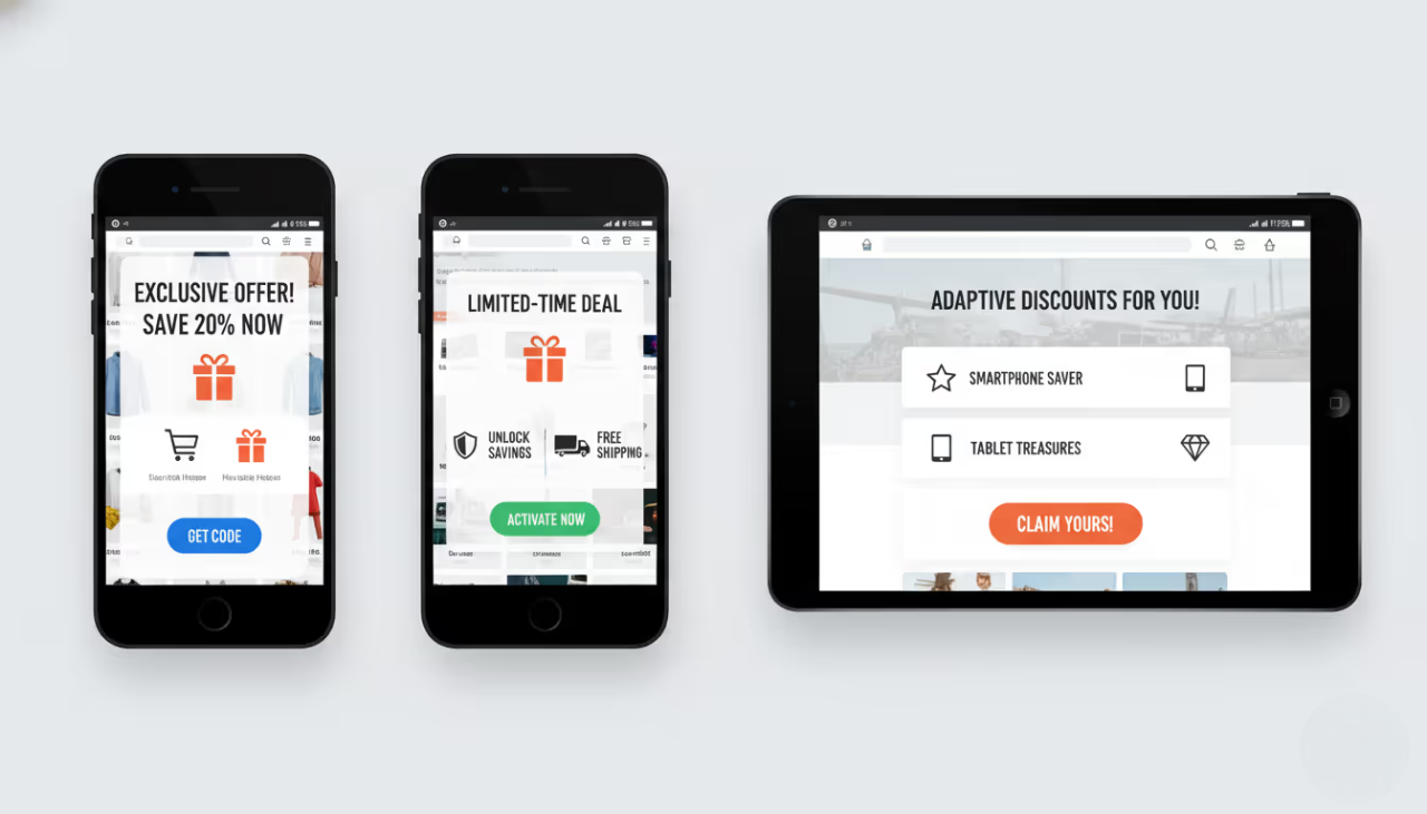
Given the diversity of mobile devices, popups must be adaptable to different screen sizes and resolutions. Designing flexible popups that adjust their layout and content based on the device ensures a consistent experience across smartphones, phablets, and tablets.
Importance of Adaptive Design
Adaptive design goes beyond simple responsiveness by tailoring the user experience to the specific device. This might involve adjusting the popup’s dimensions, simplifying content, or modifying interactive elements based on the device's capabilities and the context of use.
Mobile Popup Triggers
Time-Based Triggers
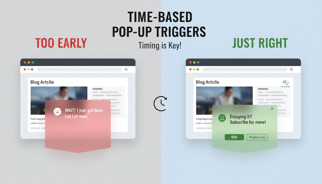
Time-based triggers activate popups after a user has spent a certain amount of time on a page. These are effective for capturing attention when users are engaged with the content. Timing is crucial; too soon, and the user might be annoyed; too late, and the opportunity could be missed.
Scroll-Based Triggers

Scroll-based triggers initiate popups when users scroll to a specific point on the page. This trigger is particularly effective for engaging users who are actively consuming content and are likely more receptive to relevant offers or calls to action.
Exit-Intent Triggers
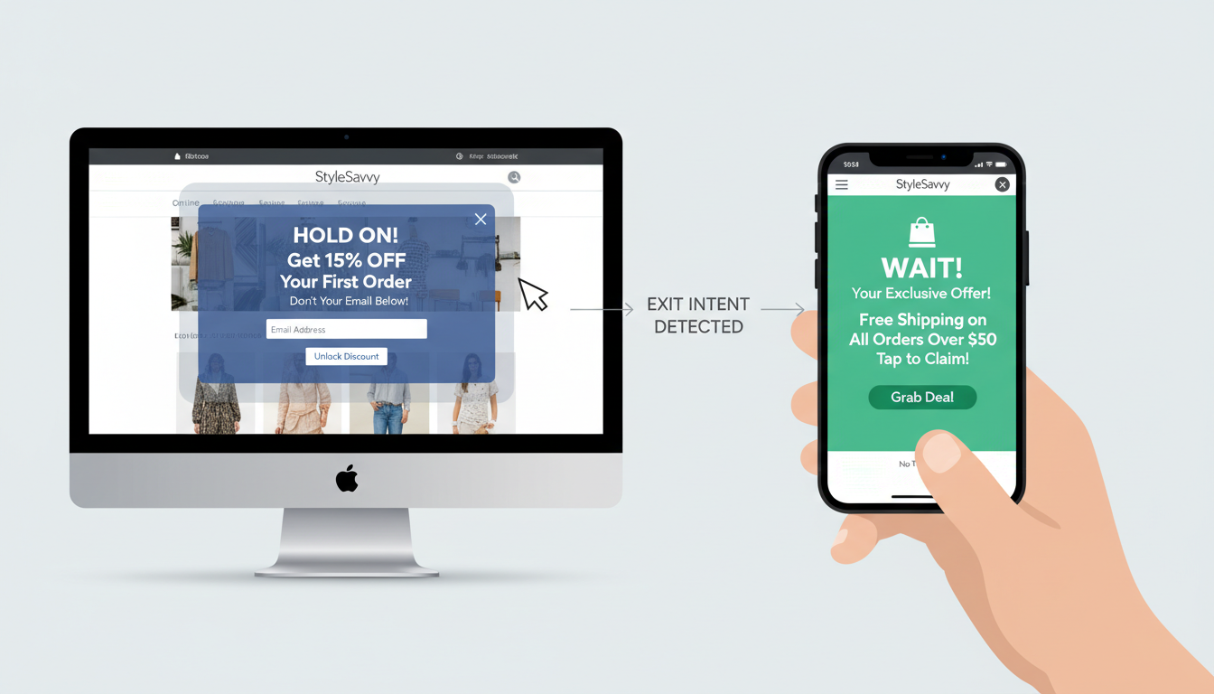
Exit-intent triggers detect when a user is about to leave a page and then display a popup as a last effort to retain their attention. While more commonly used on desktops, exit-intent popups can also be effective on mobile devices when designed appropriately.
Click-Based Triggers
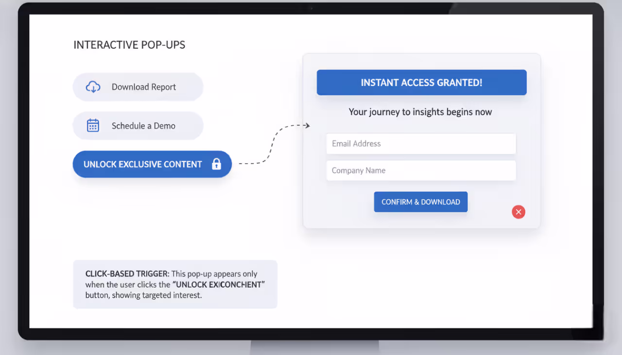
Click-based triggers display popups when a user clicks on a specific element, such as a button or link. These popups are highly targeted, appearing only when a user shows interest in a particular action, making them more likely to convert.
Optimizing Popup Load Time

Reducing Popup Size
To ensure that mobile popups load quickly, it’s important to keep them lightweight. This involves minimizing the use of heavy images, excessive scripts, and other elements that can slow down loading times. A fast-loading popup enhances user experience and reduces bounce rates.
Minimizing Script Load Time
Scripts used to trigger and display popups should be optimized for speed. This includes minimizing the amount of JavaScript used, leveraging asynchronous loading, and using optimized libraries. Quick-loading scripts ensure that popups appear promptly without causing delays in page load time.
Asynchronous Loading
Asynchronous loading allows the popup to load independently of the main content, ensuring that the popup doesn’t hinder the overall page load speed. This technique is particularly useful for enhancing the performance of mobile pages, where loading speed is critical to user retention.
How to Create Mobile-Optimized Popups Using Poper
Step-by-Step Guide to Creating Mobile-Optimized Popups with Poper
Creating mobile-optimized popups with Poper.ai helps you capture leads, sign-ups, or conversions without disrupting the mobile user experience. With responsive templates and a mobile-first editor, you can design high-converting popups in just a few steps.
Step 1: Log In to Poper.ai
Sign in to your Poper.ai account and open the dashboard.
Click “New Popup” to begin creating a mobile-friendly popup.
Step 2: Choose a Mobile-Friendly Template
Browse templates designed for mobile lead generation, promotions, or announcements.
You can:
Select a responsive template optimized for small screens
Start from scratch using the drag-and-drop editor
Use Poper AI to generate a popup based on your prompt, automatically optimized for mobile
Step 3: Customize the Design for Mobile
Design with simplicity and readability in mind to ensure a smooth mobile experience.
Best practices for mobile popups:
Background colors: Use high-contrast colors for better visibility on small screens
Text size: Keep headlines short and readable
Graphics: Use lightweight icons or minimal visuals to avoid clutter
Messaging:
- Headline examples:
- “Get Instant Access”
- “Don’t Miss This Offer”
- “Join in One Tap”
- Supporting text:
- “Sign up in seconds—no long forms”
- Headline examples:
CTA buttons:
- Use large, thumb-friendly buttons
- Examples: Sign Up, Get Started, Unlock Now.
Step 4: Add Form Fields
Keep forms short to reduce friction on mobile devices.
Recommended fields:
Email (essential)
Name (optional)
To boost engagement, you can add:
One-tap opt-in buttons
Tap-to-reveal offers
Simple gamified elements
Step 5: Configure Mobile Display Rules
Ensure your popup appears at the right time without interrupting the mobile journey.
Triggers:
After scrolling
After a short delay
Exit intent (mobile-optimized)
Tap-based triggers
Placement tips:
Bottom slide-ins work best on mobile
Avoid full-screen popups unless necessary
Show popups on high-intent pages like product pages, blogs, or landing pages
Step 6: Preview on Mobile and Publish
Use Poper’s mobile preview mode to test how your popup looks on different screen sizes.
Before publishing:
Check text readability
Ensure buttons are easy to tap
Confirm fast load times
Once ready, click Publish.
Step 7: Test and Optimize for Mobile Conversions
Use Poper’s analytics to track mobile performance and continuously improve results.
Test variations of:
Headlines
Button text
Popup size and placement
Timing and triggers
A/B testing helps identify what drives the highest engagement and conversions on mobile.
Tracking Popup Performance
Metrics to Monitor
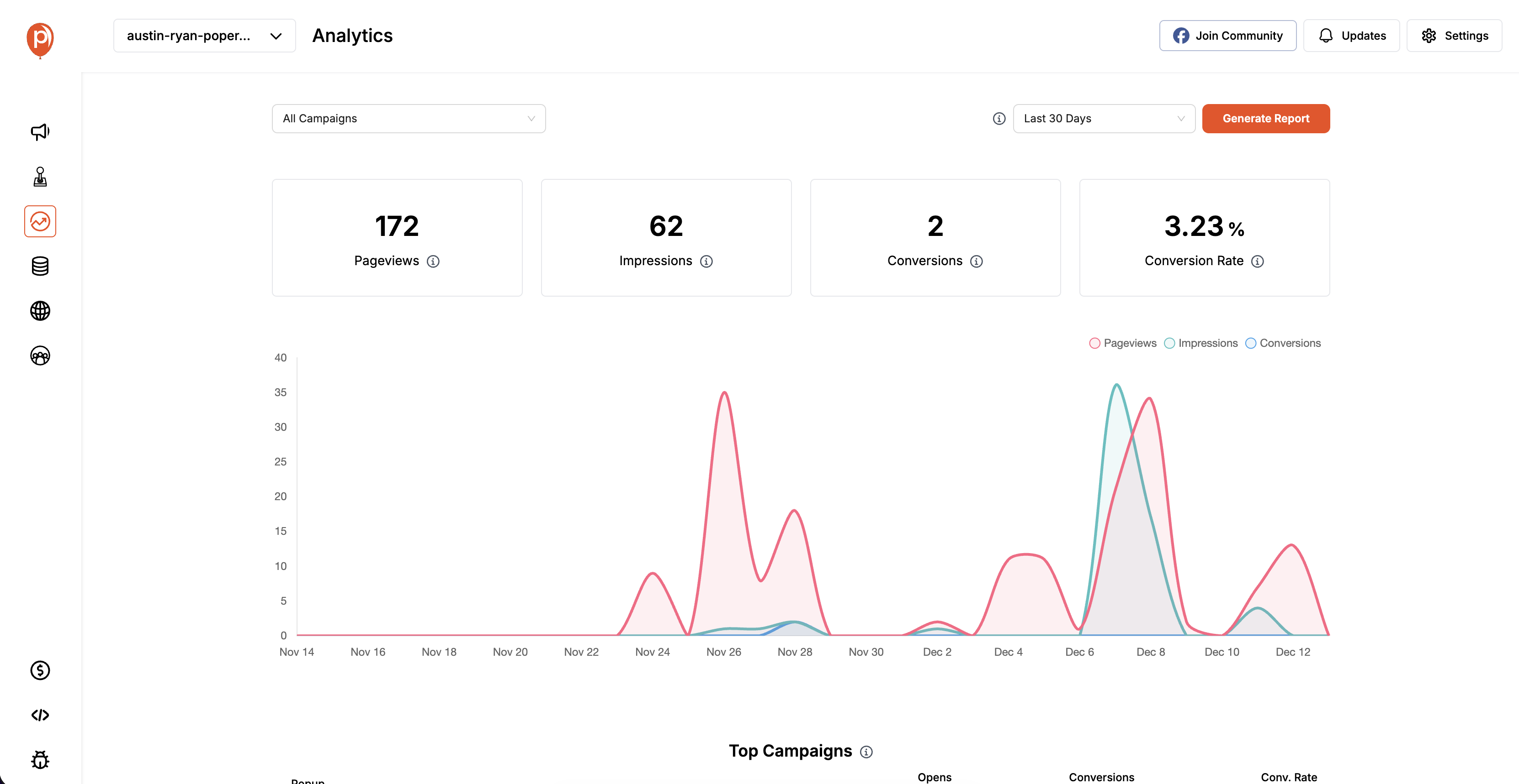
To gauge the effectiveness of mobile popups, it’s important to monitor key metrics such as click-through rates (CTR), conversion rates, bounce rates, and user engagement. These metrics provide valuable insights into how users are interacting with popups and can inform future design and strategy decisions.
Tools for Tracking Mobile Popup Performance
There are various tools available to track the performance of mobile popups, such as Google Analytics, Hotjar, and Optimizely. These tools offer detailed insights into user behavior, allowing you to analyze the effectiveness of your popups and make data-driven improvements.
Integrating Popups with Mobile Apps
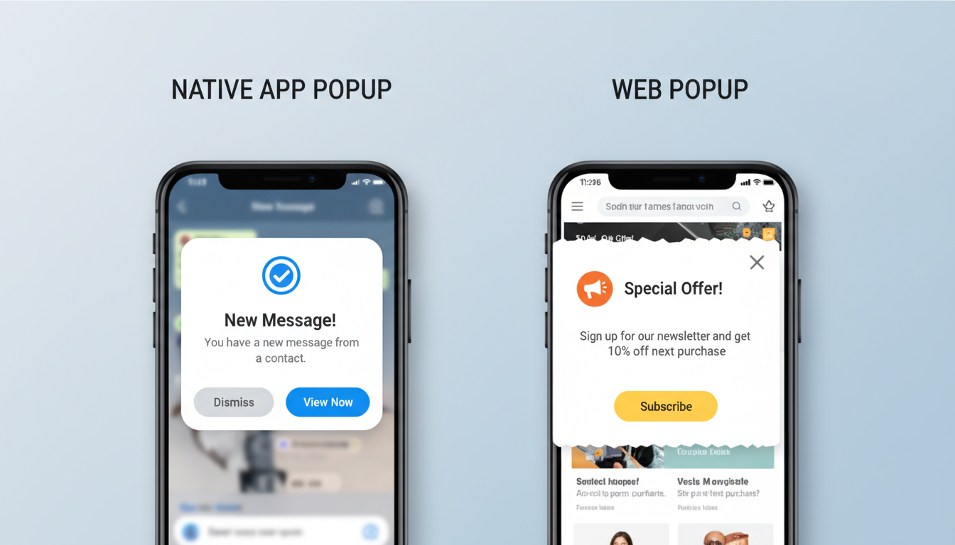
Native App Popups vs. Web Popups
When integrating popups with mobile apps, it’s important to consider the differences between native app popups and web popups. Native app popups are typically more responsive and offer a smoother user experience, while web popups can be more versatile and easier to implement across different platforms.
Best Practices for App Popups
For mobile apps, popups should be designed to align with the overall app experience, using consistent branding, design elements, and interactions. Consider using in-app behaviors to trigger popups, such as user inactivity or specific actions within the app, to enhance relevance and engagement.
FAQs
What is the best way to make popups mobile-friendly?
To make popups mobile-friendly, focus on responsive design, minimalism, and ensuring a seamless user experience by incorporating features like easily accessible close buttons and swipe-to-close options.
How can I improve the effectiveness of mobile popups?
Improving mobile popup effectiveness involves A/B testing different elements, optimizing load times, and tailoring the content to the user’s behavior and preferences.
Are full-screen popups effective on mobile?
Full-screen popups can be effective on mobile if used sparingly and designed thoughtfully. They should only be used for important messages that require the user’s full attention.
What are the key metrics for tracking mobile popup performance?
Key metrics include click-through rates, conversion rates, bounce rates, and user engagement. These metrics provide insights into how users are interacting with your popups.
How often should mobile popups appear?
Mobile popups should appear infrequently to avoid overwhelming users. Frequency caps and conditions based on user behavior can help manage the timing and frequency effectively.
Conclusion
Designing effective popups for mobile users is a delicate balance between capturing attention and maintaining a seamless user experience. By following best practices, understanding mobile user behavior, and leveraging the latest design trends, you can create popups that not only engage users but also enhance their overall experience on your site or app. As mobile usage continues to grow, refining your popup strategy will be key to staying ahead in the competitive digital landscape.

