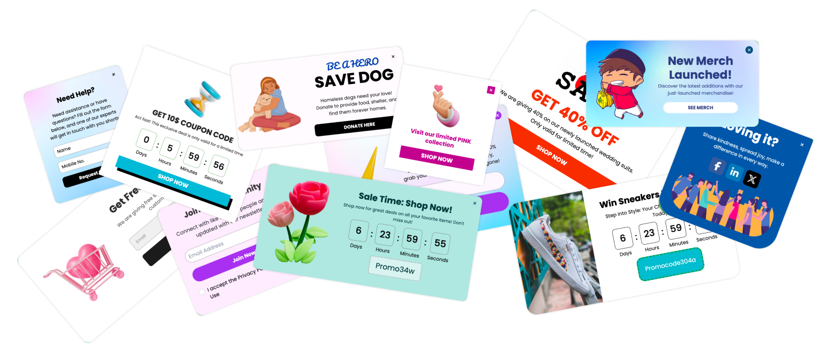
On-click popups, a pivotal tool in the arsenal of digital marketing, are designed to enhance user engagement and optimize conversion rates effectively. These popups are triggered by a user action, typically a mouse click, which makes them a proactive component of user interactions on a website.
Understanding On-Click Popups: Definition and Functionality
On-click popups are interactive modal windows that appear when a user clicks on a specified element of a webpage. These elements can be text, images, or buttons that, when interacted with, bring forth additional content in the form of a popup. The functionality of on-click popups revolves around capturing the user's active interest and providing them with relevant information or interactive content that can lead to increased site engagement and higher conversion rates.
Importance of On-Click Popups in User Experience and Conversion Optimization
The strategic use of on-click popups can significantly enhance the user experience by delivering timely and pertinent content without disrupting the user journey. For businesses, these popups are crucial in conversion optimization strategies as they can be used to present offers, gather feedback, or guide users through a user flow with precision and relevance.
The Basics of On-Click Popups
Understanding the fundamental aspects of on-click popups is essential for effectively incorporating them into your digital strategy. These tools are more than just simple interruptions; when used correctly, they can transform the user experience and facilitate deeper engagement with your content.
What is an On-Click Popup Button?
Core Definition
An on-click popup button is a user interface element that triggers a popup window when clicked. This interaction is intentional, distinguishing it from other types of popups that might appear based on timing or user behavior metrics such as scrolling.
Mechanism of Action
Typically, these buttons are linked to JavaScript that activates the popup. The content within can vary widely, from forms and special offers to additional information or interactive elements.
Designing On-Click Popup Buttons
Effective design of on-click popup buttons is critical for capturing user attention and encouraging interaction without disrupting the user experience. Here, we explore best practices for designing these elements to ensure they are both appealing and functional.
Best Practices for Designing Effective On-Click Popup Buttons
Clarity in Design
Visibility: Ensure that the popup button is clearly visible but not obtrusive. Use colors, fonts, and icons that stand out from the page's background yet remain harmonious with the overall design.
Intuitive Icons: Use icons or text that clearly communicate what will happen when the button is clicked. For instance, a '+' icon or 'Learn More' text can effectively indicate additional content availability.
Placement and Context
Strategic Placement: Position the popup button in locations where users are most likely to have engaged with the content sufficiently to want more information. Near the end of a section or beside particularly complex information are ideal placements.
Contextual Relevance: The button should relate directly to the adjacent content, ensuring that the popup feels like a natural continuation of the user's journey.
Creating On-Click Popup Buttons Using Poper
Using Poper to create on-click popup buttons is an effective way to enhance your website's interactivity and user engagement. Poper’s user-friendly platform allows for quick setup and customization of popups tailored to your specific needs. Here’s a step-by-step guide on how to create on-click popup buttons using Poper:
Step 1: Access the Poper Dashboard
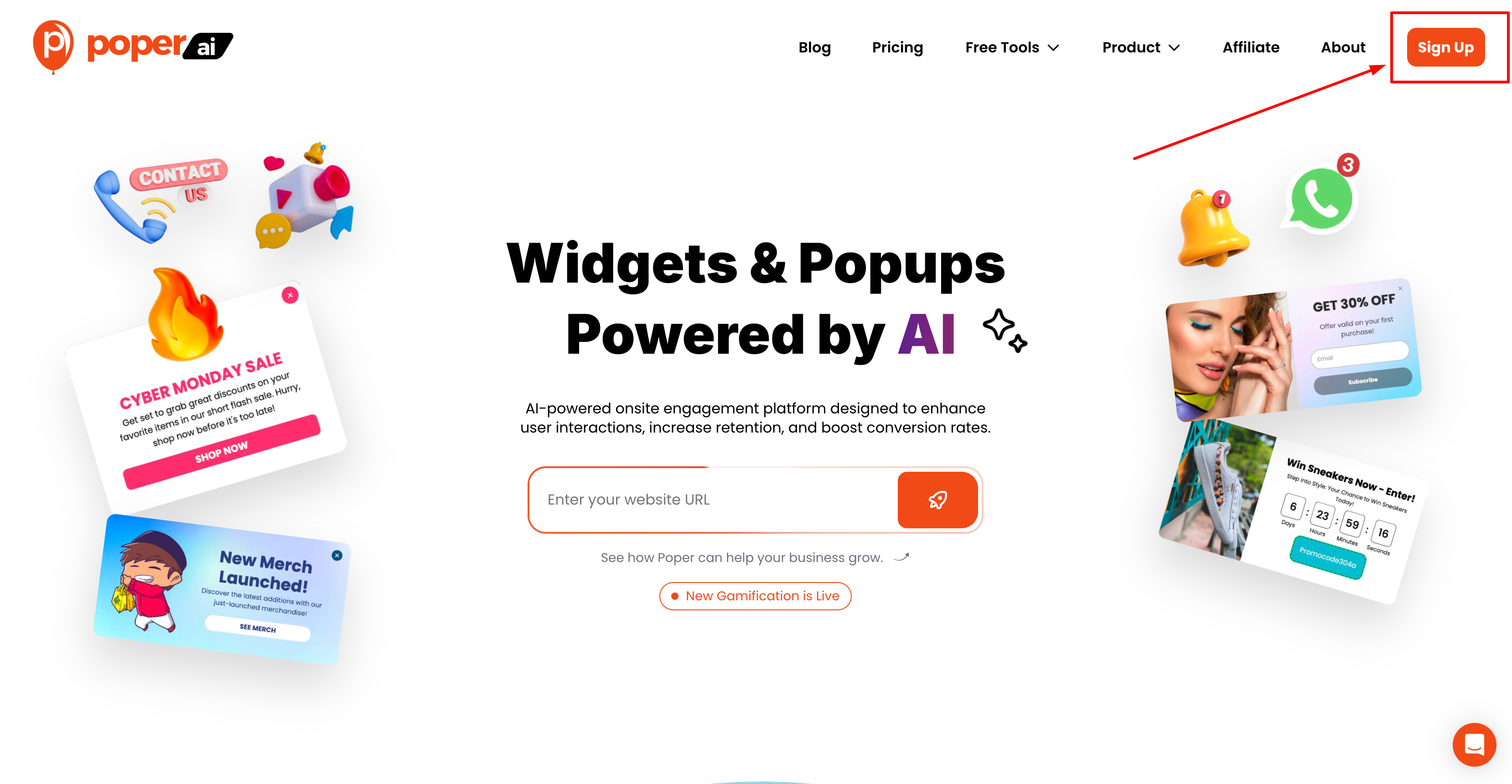
Log In: Start by logging into your Poper account. If you don’t have an account, you’ll need to sign up and configure your basic settings. Once on dashboard click"New Popup"
Step 2: Designing Your Popup
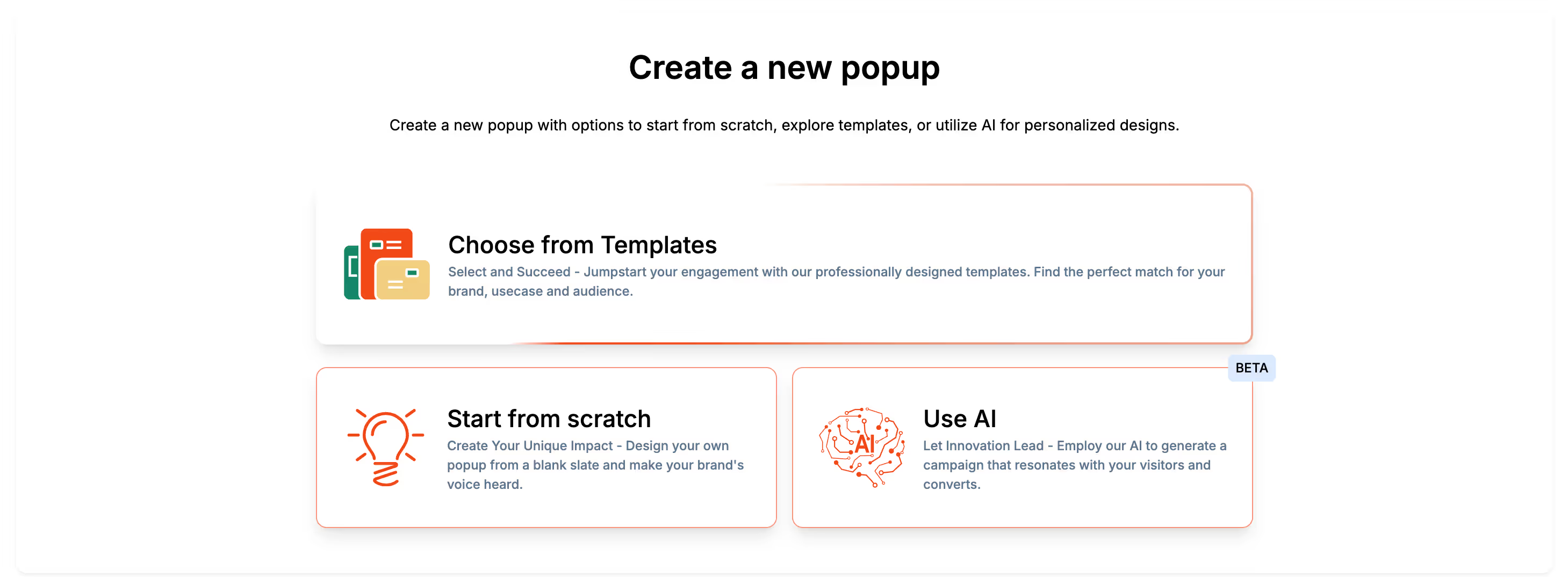
Choose a Template: Poper offers a range of templates that can be used as a starting point for your popup. Select one that best fits the type of interaction you want to encourage (e.g., sign-ups, downloads, sales promotions).
Customize the Design: Customize the template by adding images, text, and other elements that align with your branding. You can adjust colors, fonts, and layouts to match your website’s style.
Step 3: Setting Up the Trigger
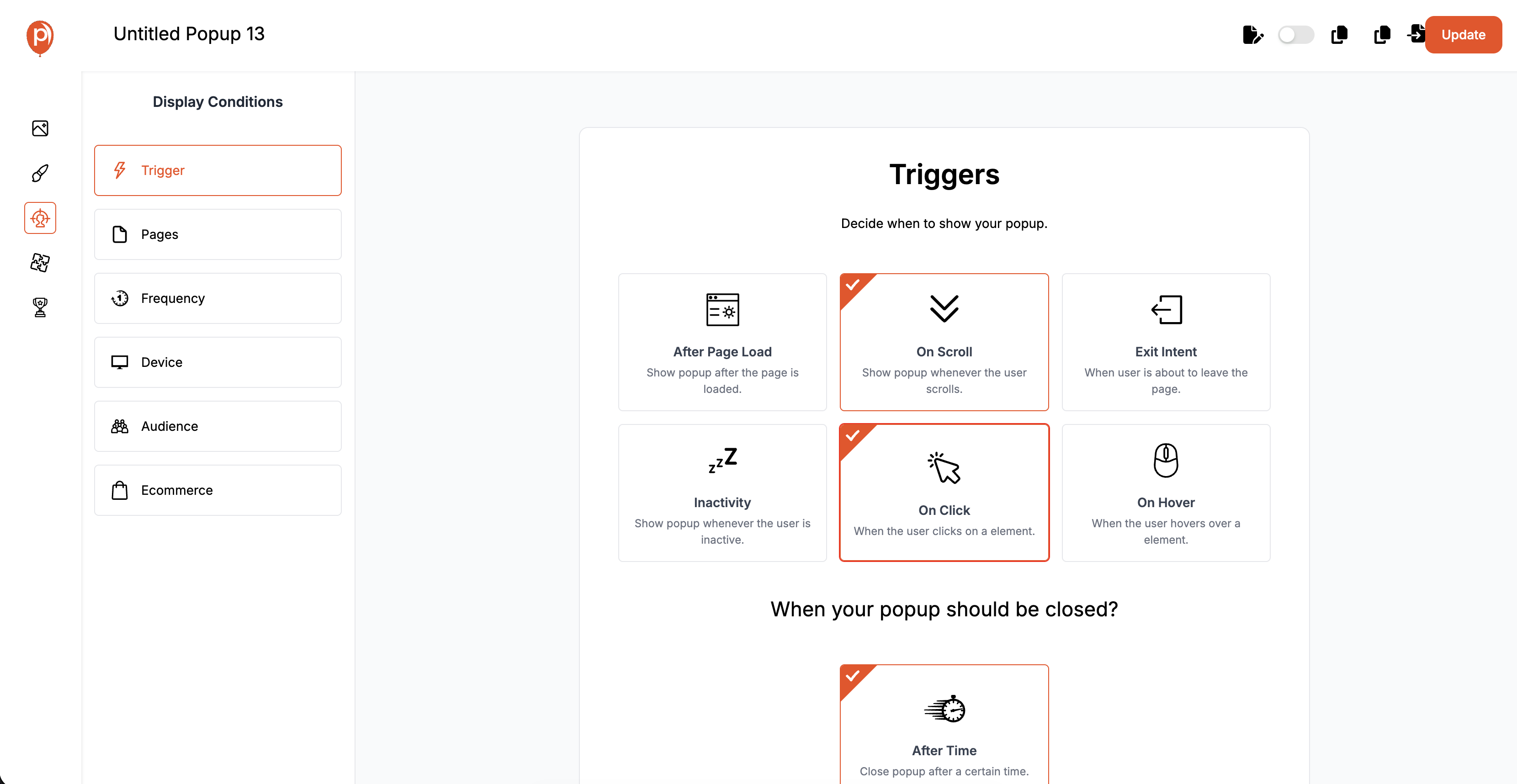
Select Trigger Type: Choose the ‘On-Click’ trigger option from the list of triggers. This setting configures the popup to appear only when a specific element (like a button or link) is clicked.
Configure Trigger Details: Specify which element on your webpage will serve as the trigger for the popup. This is typically done by assigning a unique ID or class to the button in your webpage’s HTML that Poper will recognize.
Step 4: Testing and Adjustments
Preview Your Popup: Use Poper’s preview feature to see how the popup will look and behave on your website. Make sure it activates when the designated button is clicked.
Test on Multiple Devices: Check the popup’s functionality across different devices and browsers to ensure it performs well universally. Make adjustments as needed to optimize the user experience.
Integration and Compatibility
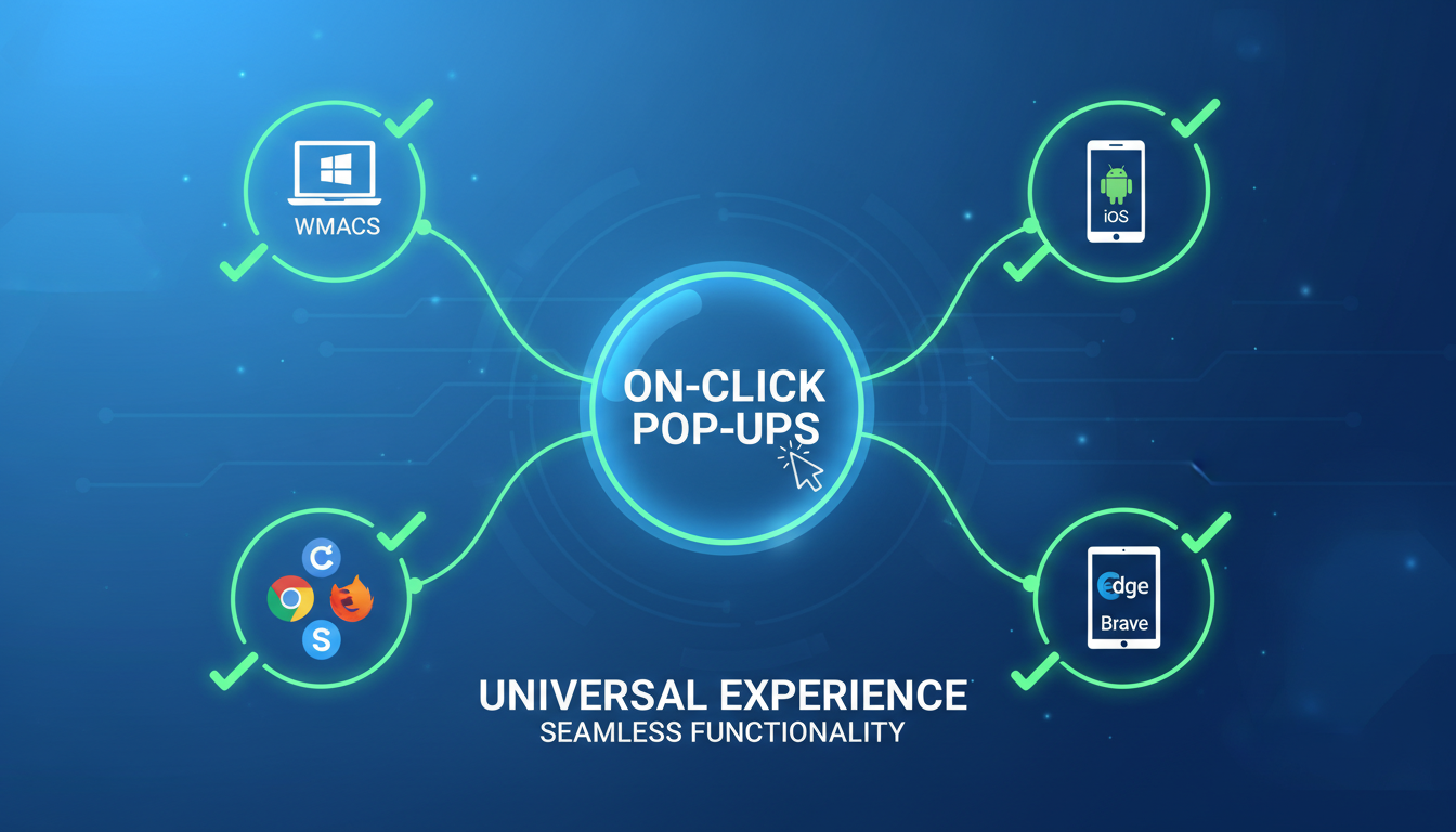
Ensuring that on-click popups integrate smoothly and function properly across all platforms and browsers is essential for maintaining a consistent user experience and maximizing their effectiveness.
Ensuring Compatibility Across Various Platforms and Browsers
Cross-Browser Testing
Comprehensive Testing: Test the on-click popups on major browsers such as Chrome, Firefox, Safari, and Edge to ensure they work seamlessly across all of them. Pay attention to any scripting or display issues that could affect the popup functionality.
Use Polyfills if Necessary: For features that are not supported by all browsers, consider using polyfills to enable compatibility without rewriting your existing code extensively.
Integrating On-Click Popups with Various Website Platforms
Using Plugins and Extensions
Plugin Options: Many website platforms offer plugins specifically designed to handle popups. These can simplify the process of creating and managing on-click popups by providing pre-built solutions that integrate easily with your site’s architecture.
Custom Integration: For more tailored needs, consider developing custom scripts or modifying existing plugins to better align with your specific requirements and functionality.
API Utilization
Leverage APIs: Some platforms offer APIs that allow for deeper integration of popups into the site’s functionality. Utilizing these APIs can help you create more dynamic and interactive popup experiences that are fully integrated with the site’s core features.
User Experience (UX) Considerations
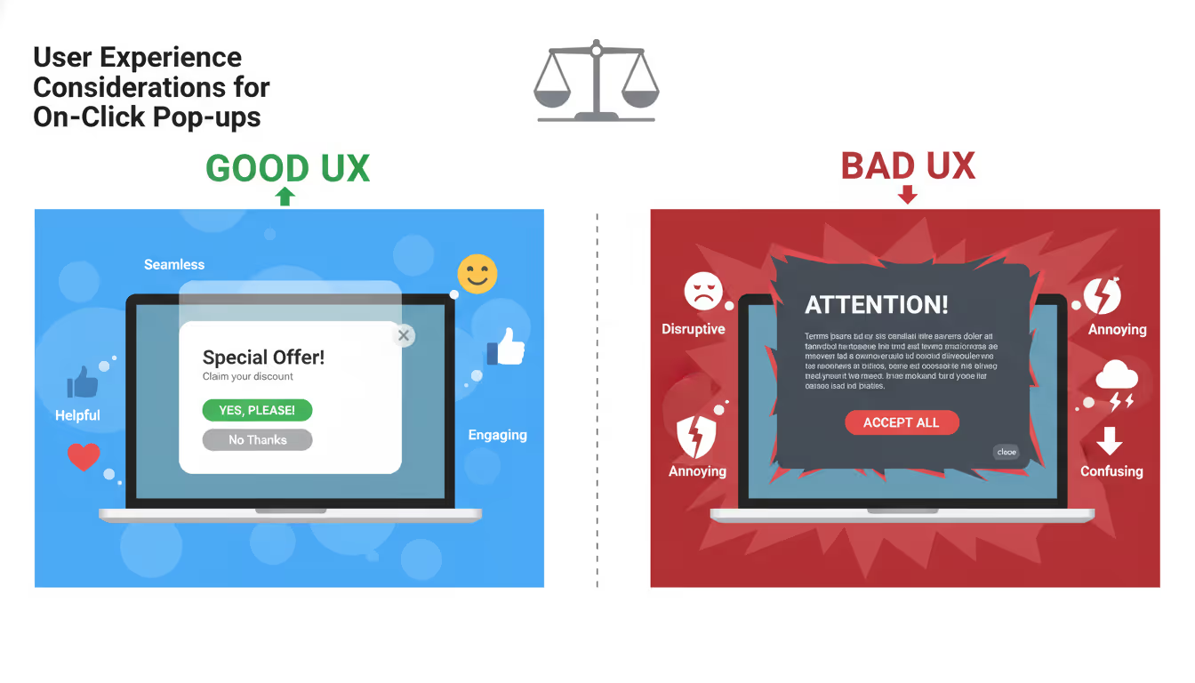
When deploying on-click popups, prioritizing user experience is essential to ensure that these elements enhance rather than hinder the user's interaction with your website. Thoughtful design and strategic placement of popups can make a significant difference in how they are perceived and interacted with by users.
Balancing Intrusiveness and User Control
Minimizing Disruption
User Initiation: Since on-click popups are triggered by user actions, they are inherently less intrusive than automatic popups. Ensure that this user-driven nature is maintained by making interactions obvious and intuitive.
Easy Dismissal: Provide clear and easy options for closing the popup. This empowers users and respects their preference, potentially reducing frustration and negative impressions.
Enhancing User Autonomy
Transparency: Be transparent about what will happen when a popup trigger is activated. For instance, use clear labels on buttons that will launch a popup, like "See Details" or "More Info."
Consent-Based Interaction: In cases where data collection is involved, such as email sign-ups or other forms, ensure that user consent is obtained clearly and straightforwardly.
Enhancing UX with Thoughtful Popup Design and Placement
Strategic Placement
Context-Relevant Placement: Position on-click popups in areas where they are most relevant. For example, place a signup button for a newsletter at the end of an article about related topics.
Avoid Critical Interference: Ensure that popups do not cover crucial content or navigation elements, especially on smaller screens where space is limited.
Design for Positive Engagement
Attractive Design: Create visually appealing popups that attract rather than annoy. Use design elements that align with your brand and enhance the content's presentation.
Interactive Elements: Consider incorporating interactive elements within the popup that engage the user, such as sliders, interactive forms, or embedded videos, to provide value and keep the user engaged.
Content Strategies for On-Click Popups
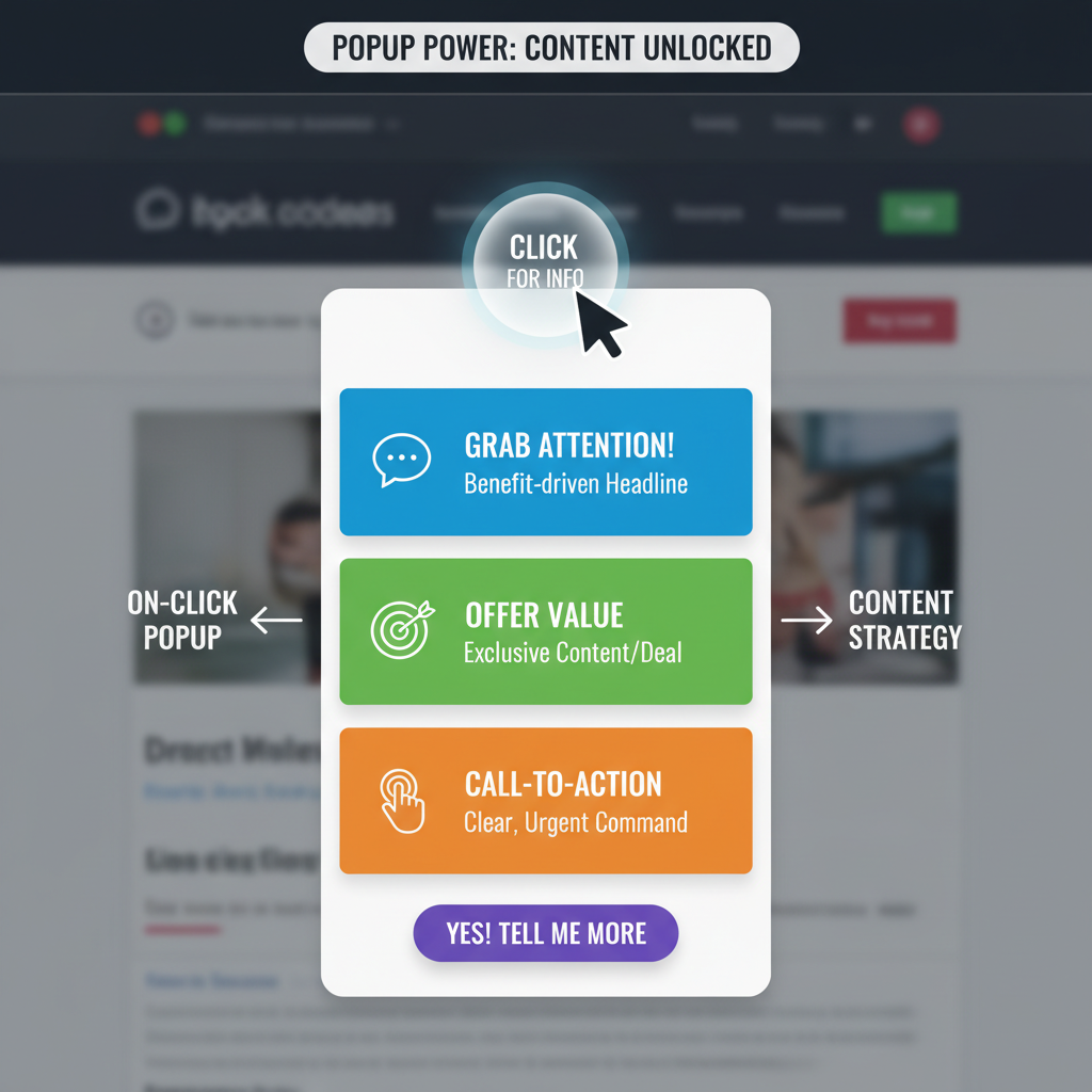
Effective content within on-click popups is crucial for capturing user interest and driving conversions. Crafting content that resonates with your audience and encourages them to take action can significantly enhance the effectiveness of your popups.
Crafting Compelling Content for On-Click Popups
Focus on Value Proposition
Highlight Benefits: Clearly articulate the benefits of engaging with the popup. Whether it’s a discount, a free download, or exclusive information, make sure the value is immediate and obvious.
Conciseness is Key: Keep the content brief and to the point. Avoid overwhelming users with too much information or too many choices within the popup.
Tailoring Content to Audience
Segmentation: Use audience segmentation to deliver more personalized content. Tailoring messages based on user behavior, demographics, or past interactions can increase the relevance and effectiveness of your popups.
Relevance: Ensure the content is highly relevant to the section of the site where the popup appears. This alignment helps maintain the flow of the user’s experience and increases the likelihood of a positive response.
Tips for Writing Effective Calls to Action
Action-Oriented Language
Use Strong Verbs: Employ verbs that inspire action, such as "Get," "Discover," "Start," or "Join." These prompt immediate responses.
Create Urgency: Phrases like "Limited time offer" or "While supplies last" can create a sense of urgency that encourages users to act promptly.
Visual Emphasis
Button Design: Make sure the call to action button is visually distinct and prominently placed within the popup. Use colors that stand out from the rest of the popup but still fit within the overall design scheme.
Size and Spacing: Ensure that the call to action button is large enough to be easily clickable, especially on mobile devices, and is spaced appropriately from other elements to avoid accidental clicks.
Conversion Optimization Techniques
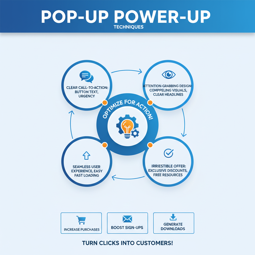
Optimizing on-click popups for conversions involves fine-tuning various elements to ensure that each popup not only captures attention but also effectively encourages users to take a specific action, such as making a purchase, signing up for a newsletter, or downloading a resource.
How On-Click Popups Can Drive Conversions
Directing User Focus
Strategic Placement: Position popups in areas where users are most likely to make a decision or need additional encouragement. For example, placing a popup with a discount offer on a product page can help clinch a sale.
Highlight Key Offers: Use popups to highlight exclusive deals, limited-time offers, or bonuses that can motivate a user to convert at that moment.
Enhancing User Decision Making
Simplify Choices: Provide clear, simple options within the popup to make the decision process straightforward for the user. Overcomplicating choices can lead to decision fatigue and reduce conversion rates.
Clarify Benefits: Clearly outline the benefits of the action you want the user to take. Users are more likely to convert if they understand exactly what they gain from doing so.
A/B Testing Strategies for On-Click Popup Buttons
Implementing Effective A/B Tests
Test Different Elements: Conduct A/B tests on various aspects of your popups, such as the call to action, layout, images, and content. This helps identify what resonates best with your audience.
Measure Impact on Conversions: Focus on how different popup versions affect conversion rates. This metric is crucial for determining which popup elements are most effective at driving user actions.
Iterative Refinement
Continuously Optimize: Use insights from A/B testing to make incremental improvements to your popups. Continual optimization helps keep your strategy aligned with user preferences and market trends.
Feedback Integration: Incorporate user feedback received through popups into your A/B testing strategy. This can provide direct insights into user preferences and pain points.
FAQs About On-Click Popups
What are on-click popup buttons?
On-click popup buttons are interactive elements on a website that trigger a popup window when clicked. These popups can display a wide range of content, such as forms, offers, or additional information, providing users with immediate access to relevant content without navigating away from the current page.
How do on-click popups differ from other types of popups?
Unlike automatic popups that appear based on timing or user scrolling, on-click popups require a direct action by the user. This makes them less intrusive and gives users more control over their interaction with your site, as they choose when to engage with the popup content.
What are the best practices for designing on-click popup buttons?
Key best practices include making the buttons visually distinct yet harmonious with the overall website design, placing them in contextually relevant locations, and ensuring they are labeled with clear, action-oriented text. It's also important to make sure the popup content is valuable and directly relevant to the surrounding content to maximize engagement and effectiveness.
Can on-click popup buttons improve conversion rates?
Yes, when implemented correctly, on-click popup buttons can significantly enhance conversion rates. By providing a timely and direct call to action, such as signing up for a newsletter or receiving a discount offer, these popups can effectively convert users' interest into actionable steps towards conversion.
How can I ensure my on-click popups are not annoying to users?
To ensure on-click popups are not annoying, provide clear and easy ways for users to close the popups, avoid using them excessively, and ensure the content offered is of genuine value. It’s also crucial to test different designs and timings to find a balance that works best for both user experience and business goals, minimizing any potential disruption or annoyance.
Summary
Incorporating on-click popups into your digital marketing strategy offers a powerful way to engage users directly and enhance their experience on your website. By understanding and applying the best practices outlined throughout this article, you can effectively leverage on-click popups to drive conversions, gather insights, and deliver targeted content.


