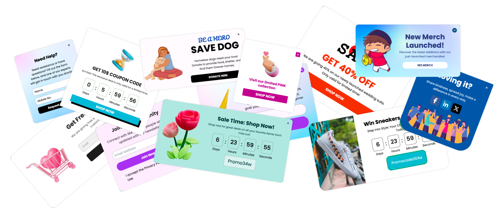
Popups are the bridge between a visitor’s curiosity and a business’s conversion. They create that crucial, timely opportunity to engage.
In today’s fast-paced digital world, popup marketing is more than just an attention-grabbing tool; it’s a strategic approach to engaging users, capturing leads, and driving conversions. With a carefully crafted popup strategy, online businesses can deliver value precisely when it’s most needed.
Popup marketing is the use of strategically placed, on-screen notifications that appear when a user interacts with a website. These popups serve to capture attention, delivering targeted messages or offers based on user behavior, intent, or specific triggers, such as exit attempts, scroll depth, or time spent on a page.
Initially regarded as intrusive, popups have evolved to become powerful tools that encourage user interaction without compromising the browsing experience. Modern popups are subtle, well-timed, and designed to be relevant and non-disruptive, making them effective in various stages of the digital customer journey.
Key Benefits of Popup Marketing
To understand why popups have become an essential part of digital marketing, we need to look at the benefits they offer for businesses striving to make meaningful connections with their online audience. When done right, popups serve as targeted, effective tools for increasing conversions, enhancing user engagement, and boosting data collection.
Increased Conversion Rates
A well-designed popup can make a huge impact on conversions. By delivering a compelling offer, reminder, or call-to-action (CTA) at the right moment, popups can transform a casual browser into a committed customer.
Enhanced User Engagement
Popups can serve as a gentle nudge for users to explore your site further. Instead of allowing users to drift away after a quick glance, popups can direct them toward helpful resources, popular products, or special offers.
Improved Customer Segmentation
Popups provide valuable data that can be used for targeting specific user segments with personalized messaging. By using different popup triggers, businesses can collect and organize data, such as user preferences, behavior patterns, and contact information.
Types of Popup Marketing Strategies
Popups come in various types, each designed to engage users differently based on their behavior, timing, and interaction with the website. Choosing the right strategy for each stage of the customer journey can help boost engagement, reduce bounce rates, and increase conversions.
| Popup Type | Best Use Cases | Purpose |
|---|---|---|
| Exit-Intent Popups | Cart abandonment, lead generation, content recommendations | Reduce bounce rate, encourage conversions |
| Timed Popups | Newsletter signups, special offers, surveys | Engage users without overwhelming them |
| Scroll-Triggered Popups | Content upgrades, related products, feedback requests | Target engaged users who show interest |
| Click-Activated Popups | Product info, lead magnets, event signups | Personalize the experience, trigger by user action |
| Full-Screen Popups | New visitor offers, announcements, content gateways | Create immediate impact with high visibility |
Designing Effective Popup Campaigns
Creating popups that grab attention without causing frustration is both an art and a science. A well-designed popup should balance compelling visuals, clear messaging, and a strong call-to-action (CTA) to maximize user engagement and conversions. Below, we’ll explore essential elements that make popups stand out while maintaining a positive user experience.
Crafting Compelling Headlines
Keep it Short: Limit headlines to 5-10 words to ensure they’re impactful and readable at a glance.
Focus on Value: Highlight the benefit or incentive, such as “Save 20% on Your First Order!” or “Get Exclusive Access to New Content.”
Use Action-Oriented Language: Drive engagement with active verbs like “Discover,” “Save,” or “Join.”
Using Visuals to Boost Appeal
High-Quality Images: Use professional, high-resolution images that are relevant to the offer or product.
Consistent Branding: Stick to brand colors and fonts to maintain a cohesive look across your site and popups.
Minimalism: Avoid clutter; a simple design with ample white space can make your popup more readable and visually pleasing.
Writing Clear and Persuasive Copy
Be Direct: Users should understand the offer and benefit within seconds.
Emphasize Urgency or Scarcity: If applicable, use phrases like “Limited Time Only” or “While Supplies Last” to create a sense of urgency.
Align with User Intent: Tailor the messaging to the page’s content or the user’s browsing behavior. For instance, a popup on a product page could focus on “Try Before You Buy” offers or similar incentives.
Incorporating Strong Calls-to-Action (CTAs)
Use High-Contrast Colors: Choose a button color that contrasts with the popup background, making it highly visible.
Be Specific: Instead of generic CTAs like “Submit” or “Click Here,” use phrases like “Get My Discount” or “Sign Up Now” to increase clarity.
Limit to One CTA: Stick to a single action to avoid confusing users and diluting the popup’s purpose.
Personalization in Popup Marketing
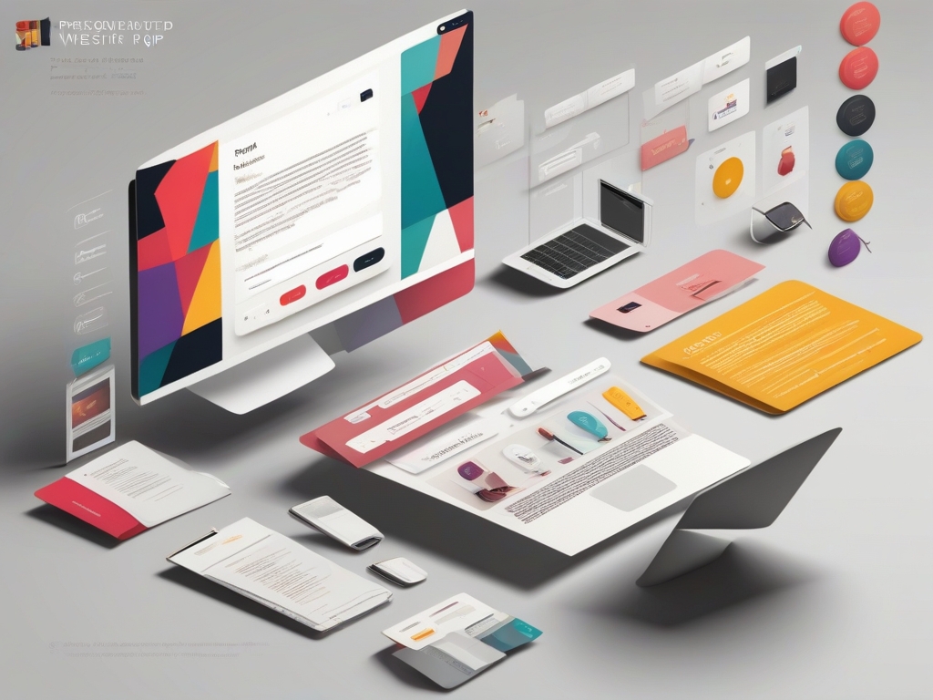
Personalization has become essential in popup marketing, enabling businesses to connect more meaningfully with their audience. Personalized popups resonate better with users because they reflect individual preferences, browsing behavior, or demographic information, making the experience feel relevant and engaging.
Why Personalization Matters
In a digital landscape filled with generic marketing messages, personalization stands out as a way to foster genuine connections. When a popup speaks directly to a user’s interests or past actions, they’re more likely to engage with it.
Key Benefits:
Higher Engagement Rates: Personalized popups are more likely to capture attention and keep users on-site longer.
Improved Conversion Rates: Targeted messaging increases the likelihood that users will act, whether it’s subscribing to a newsletter, claiming a discount, or purchasing.
Enhanced User Experience: Personalization helps reduce interruptions, as users only see relevant popups, creating a smoother and more enjoyable browsing experience.
Using Data to Create Targeted Popups
Leveraging data to craft tailored popups is central to effective personalization. By analyzing user behavior and preferences, you can create more precise segments and customize the popup content to match each group’s interests.
Data Sources:
Behavioral Data: Use information like time spent on pages, items added to the cart, or previous purchases to target users with popups that align with their actions.
Demographic Information: Customize popups based on age, location, or language preferences to make the experience feel more relevant.
On-Site Searches: For example, if a user searches for “summer dresses,” trigger a popup offering a discount on dresses to increase conversion chances.
Best Practices for Popup Timing and Frequency

The timing and frequency of popups play a critical role in their effectiveness. When popups appear at the right moment, they feel helpful rather than intrusive. However, showing too many popups or displaying them too soon can lead to frustration, increased bounce rates, and a poor user experience. Here’s how to strike the perfect balance.
Determining the Optimal Popup Timing
The key to successful popup timing lies in understanding your user’s journey. By aligning popup displays with specific user actions, you can maximize engagement without disrupting the experience.
Effective Timing Strategies:
Exit-Intent Timing: Exit-intent popups appear when users show signs of leaving the site, such as moving the cursor toward the top of the screen. This is a prime moment to capture leads by offering a discount or incentive before they go.
Scroll-Triggered Timing: For content-heavy sites like blogs, triggering popups after a user has scrolled a certain percentage down the page can indicate they’re engaged. This is an ideal moment to invite them to sign up for newsletters or download a free guide.
Time on Page: Displaying a popup after a user has been on a page for a specific duration (e.g., 30 seconds) allows them to engage with the content before being presented with a call-to-action.
Click-Activated Popups: These popups only appear when a user clicks on a particular button or link. Click-activated popups are highly targeted and work well for guiding users toward specific actions, like signing up for a demo or downloading a resource.
Setting Frequency Caps to Avoid Overload
While popups can be effective, excessive frequency can irritate users and drive them away. Frequency caps help control how often popups appear to each user, ensuring a balanced experience that encourages engagement without overwhelming.
Guidelines for Setting Frequency Caps:
Limit Per Session: Limit popups to a maximum of one or two per user session. Too many popups in one visit can make users feel pressured and reduce their likelihood of converting.
Control Return Frequency: For returning visitors, set popups to appear only once every few days, rather than every time they visit the site. This prevents repetitive interruptions and keeps your message fresh.
Sequence Popups Strategically: Instead of displaying all popups at once, sequence them based on priority. For example, an exit-intent popup could be shown last to prevent users from leaving, while a scroll-triggered popup could appear earlier to promote content engagement.
Popup Marketing for Different Goals
Popups can serve a variety of objectives, each with distinct strategies tailored to maximize effectiveness. Whether you’re aiming to generate leads, drive sales, or promote content, aligning your popup marketing with specific goals can create a more impactful user experience.
Lead Generation Popups
Lead generation popups are designed to capture visitor information, such as email addresses, in exchange for something of value. These popups help you build your subscriber list and nurture leads over time.
Key Tactics for Lead Generation Popups:
Offer Value-Driven Incentives: Encourage users to sign up by offering something valuable, like an eBook, exclusive content, or a discount code.
Use Gamified Popups: Tools like “spin-to-win” wheels or other interactive elements make the signup process engaging and increase conversion rates.
Integrate with Email Marketing: Ensure lead generation popups are connected to your email platform to automatically enroll users in a welcome or onboarding email sequence.
Sales and Conversion Popups
Sales-focused popups aim to convert site visitors into customers by offering time-sensitive deals, discount codes, or limited-time offers. These popups are especially effective for e-commerce and subscription-based businesses.
Strategies for Conversion-Focused Popups:
Highlight Urgency: Using countdown timers or phrases like “limited time offer” creates urgency and encourages immediate action.
Target Abandoning Users: Show discount codes or free shipping offers to users showing exit intent on product or cart pages.
Upsell and Cross-Sell: Suggest complementary products or upgrades in popups after users add items to their cart or complete a purchase.
Content Engagement Popups
Content engagement popups are ideal for blogs, news sites, and content-driven businesses. These popups aim to increase readership, promote specific articles, or encourage content sharing.
Best Practices for Content Engagement Popups:
Promote High-Value Content: Use popups to draw attention to trending articles, videos, or guides.
Encourage Social Sharing: Include share buttons or invite users to spread the word about popular content, helping you reach new audiences organically.
Invite to Join the Conversation: For community-focused sites, popups can invite users to leave comments, join forums, or subscribe to discussions.
Event and Webinar Sign-Up Popups
Event sign-up popups are effective for brands hosting webinars, workshops, or live events. These popups attract interested users by providing event details, registration links, or countdowns.
Optimizing Event Registration Popups:
Include Key Event Details: Make sure the popup highlights what users will gain from the event, along with date, time, and a clear CTA to sign up.
Add a Countdown Timer: A countdown to the event start time can create a sense of urgency, especially as the date approaches.
Follow Up with Email Reminders: For registered users, send reminder emails to increase attendance and ensure a successful turnout.
Survey and Feedback Popups
Survey popups are great for gathering insights directly from your audience. Whether it’s a simple rating or a detailed survey, these popups can help you understand user satisfaction, preferences, and pain points.
Effective Survey and Feedback Popup Tips:
Keep It Short and Simple: If asking for feedback, keep surveys to a few questions or provide options for single-click ratings.
Choose the Right Timing: Trigger feedback popups after key interactions, like completing a purchase or finishing an article.
Offer Incentives for Participation: Encourage users to provide feedback by offering a small reward, such as a discount or entry into a prize draw.
Measuring the Success of Popup Campaigns
| Metric | Purpose | Indication of Success |
|---|---|---|
| Conversion Rate | Measures actions taken (e.g., sign-ups, purchases) | High rate = successful messaging & offer |
| Click-Through Rate | Tracks user interest in the CTA | High rate = effective CTA & value proposition |
| Bounce Rate | Monitors if popups lead to immediate site exits | Low rate = engaging, non-disruptive popups |
| Exit Rate | Checks for drop-offs post-popup engagement | Low rate = popup aligns well with user flow |
| Dwell Time | Observes site stay duration post-popup | Longer dwell time = added value to user experience |
7 Common Popup Marketing Mistakes to Avoid
While popup marketing can be highly effective, there are several common pitfalls that can hinder your efforts and frustrate users. Avoiding these mistakes will help you create a better user experience and ensure your popups achieve their intended goals.
1. Using Too Many Popups
Less is More: One of the most significant mistakes marketers make is overwhelming users with too many popups. Frequent interruptions can lead to frustration and an increased bounce rate.
Best Practice: Limit the number of popups a user sees during a single session. Implement frequency caps to ensure that once a user has interacted with a popup (or closed it), they aren’t bombarded with more requests. This approach respects user experience while still allowing you to collect valuable feedback or conversions.
2. Irrelevant or Intrusive Content
Alignment is Key: Popups that don’t align with the user’s interests or the content they are currently engaging with can feel intrusive. For example, if a user is reading a blog post about SEO tips, an unrelated popup promoting a product in a different category may disrupt their experience.
Best Practice: Tailor your popup content to match the context of the user’s actions. Utilize behavioral triggers based on pages viewed, time spent, or products interacted with to present relevant offers or requests.
3. Ignoring Mobile Responsiveness
The Mobile Challenge: With a significant portion of web traffic coming from mobile devices, it’s crucial to ensure that your popups are mobile-friendly. Popups that aren’t optimized for smaller screens can be hard to navigate and may lead to user frustration.
Best Practice: Design popups that are responsive and user-friendly across devices. Test your popups on various screen sizes to ensure they look great and are easy to interact with on mobile.
4. Poorly Designed Popups
Visual Appeal Matters: A cluttered or unattractive popup can deter users from engaging. If your popups are hard to read or visually unappealing, they can create a negative impression of your brand.
Best Practice: Invest time in creating visually appealing popups with a clean layout, clear fonts, and engaging imagery. Ensure that the design aligns with your brand identity and enhances the message you want to convey.
5. Lack of Clear Call-to-Action (CTA)
The Power of a Strong CTA: If your popup lacks a clear, compelling CTA, users may not understand what action to take. A vague or weak call to action can lead to missed opportunities.
Best Practice: Use direct and persuasive language for your CTAs. Make it clear what the user will gain by clicking, whether it’s a discount, valuable content, or a subscription. Examples include “Get Your 20% Off Now!” or “Download Your Free Guide Today!”
6. Not Following Up After Popups
The Importance of Follow-Up: Many marketers fail to capitalize on popup interactions by neglecting follow-up communication. For instance, if a user subscribes via a popup, not sending a welcome email can lead to missed engagement opportunities.
Best Practice: Implement follow-up strategies to nurture leads who engage with your popups. For example, if someone signs up for a newsletter through a popup, send them a welcome email with valuable content or offers. This helps build a relationship and encourages further engagement.
7. Neglecting A/B Testing
Continuous Improvement: Skipping A/B testing can lead to missed opportunities for optimization. Relying solely on assumptions about what works can result in ineffective popups.
Best Practice: Regularly conduct A/B tests on different aspects of your popups—such as design, messaging, timing, and triggers—to identify what resonates best with your audience. Use the data collected to refine your strategies continually.
6 Real-World Examples of Successful Popup Campaigns
Learning from successful case studies can offer valuable insights into effective popup marketing strategies. Below are examples from leading brands that have harnessed the power of popups to drive engagement and boost conversions.
1. Airbnb: The Exit-Intent Popup
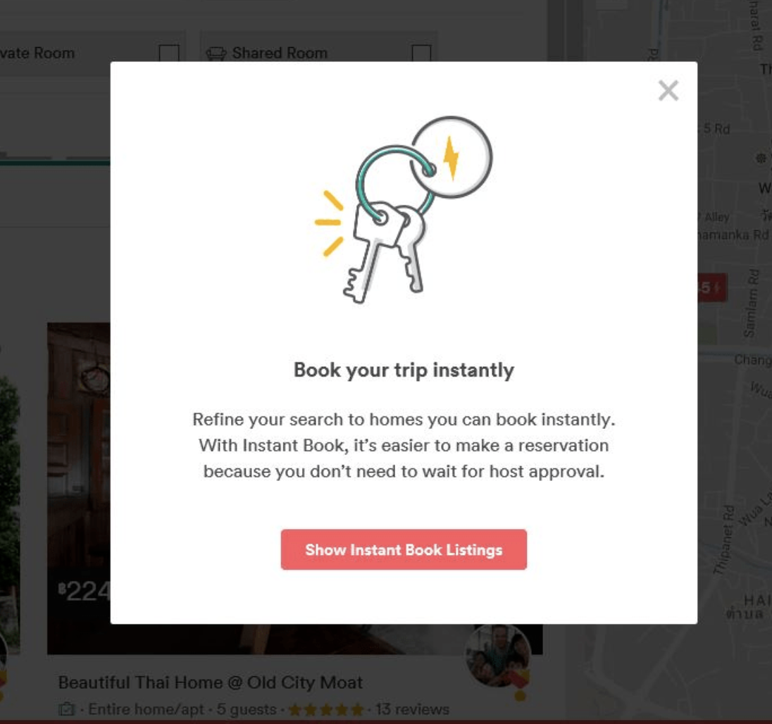
Airbnb effectively uses exit-intent popups to capture potential customers who are about to leave their website without making a booking. When users exhibit exit behavior, a popup appears offering a special discount on their first booking or encouraging them to sign up for exclusive offers.
Key Takeaway: Exit-intent popups can significantly reduce bounce rates by providing last-minute incentives that encourage users to stay or reconsider their decision to leave.
2. The New York Times: Subscription Offers
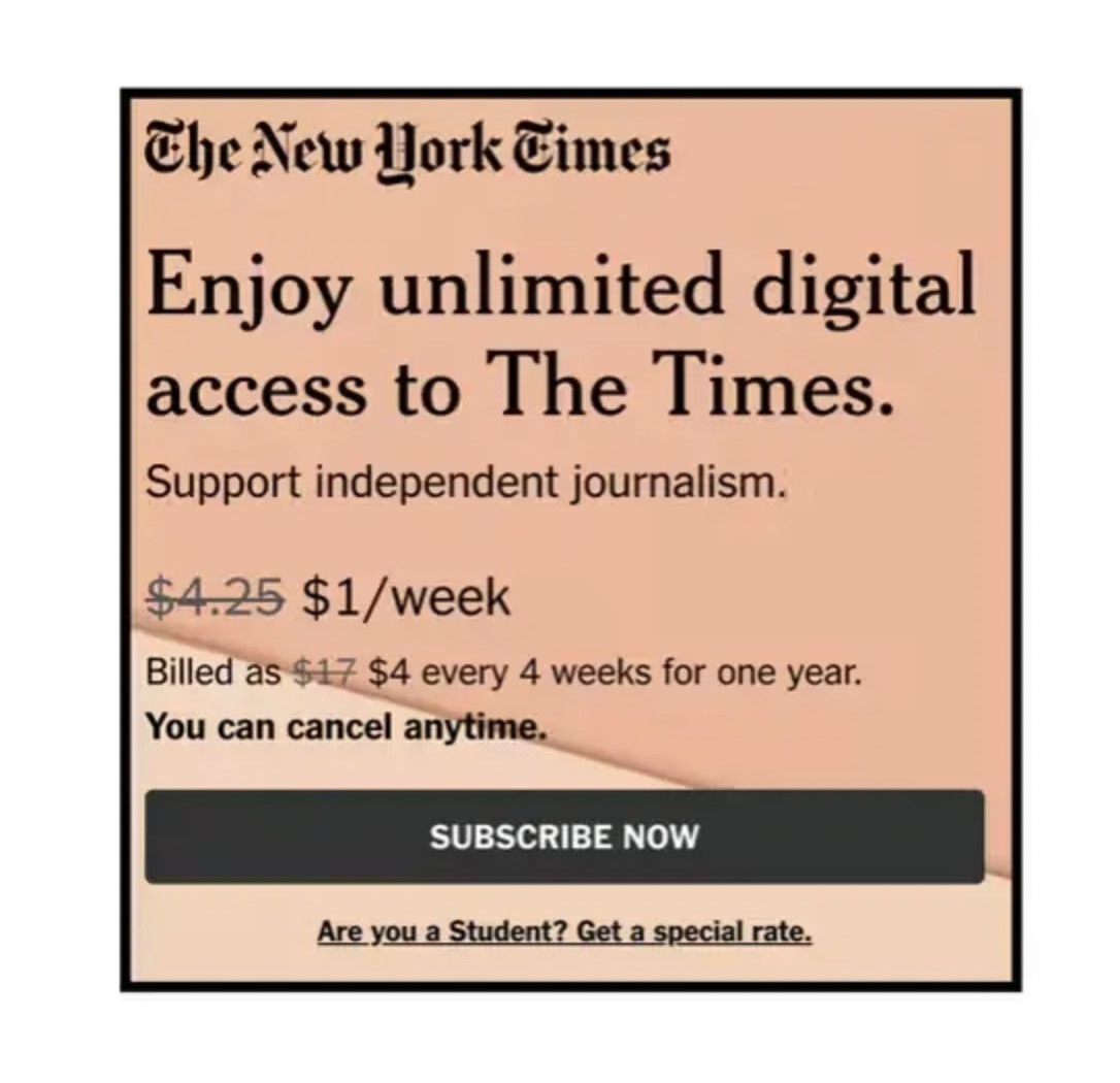
The New York Times employs timed popups to encourage users to subscribe after they have spent a certain amount of time reading articles. These popups offer a limited-time discount on subscription fees, prompting users to act quickly.
Key Takeaway: Timing your popups based on user engagement can help convert casual visitors into loyal subscribers by presenting offers at the right moment.
3. Aveda: Personalized Product Recommendations
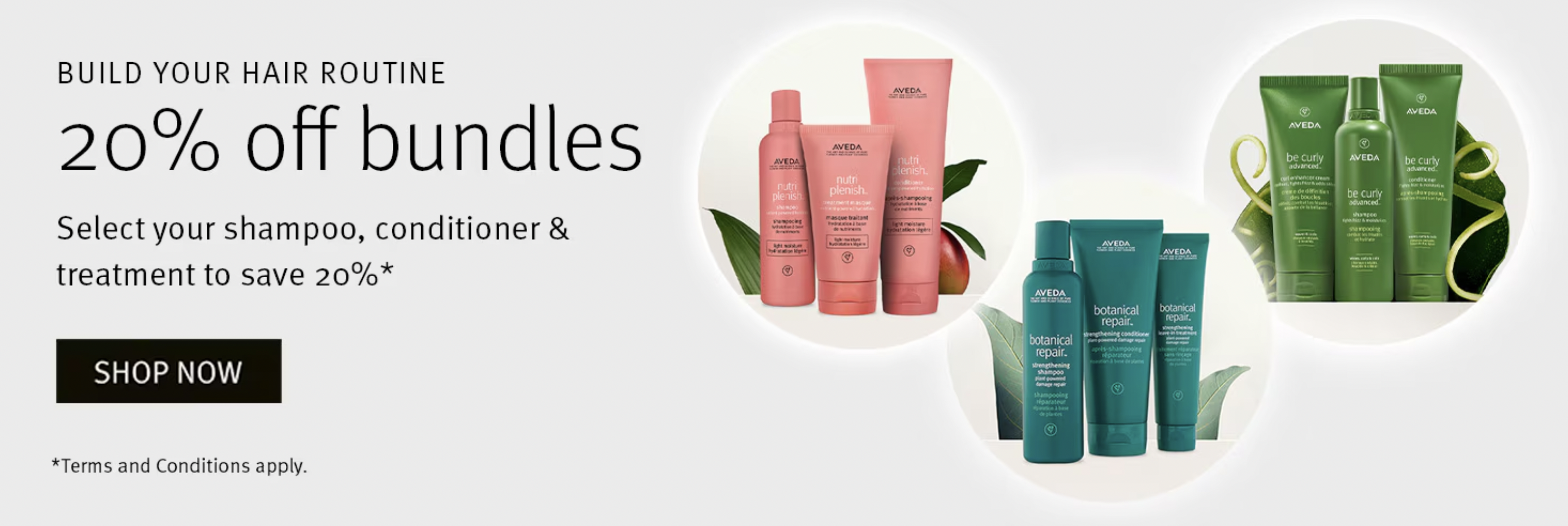
Aveda utilizes personalized popups that are triggered by user behavior, such as browsing specific product categories. When a user shows interest in hair care products, a popup appears suggesting related items along with a discount for first-time buyers.
Key Takeaway: Personalizing popups based on user behavior not only increases relevance but also enhances the likelihood of conversion by offering tailored recommendations.
4. HubSpot: Free Resource Promotion

HubSpot implements scroll-triggered popups that appear when a user scrolls a certain percentage down a blog post. These popups promote free resources, such as eBooks or templates, relevant to the content the user is currently reading.
Key Takeaway: Engaging users based on their content consumption through scroll-triggered popups can enhance user experience and provide valuable resources that nurture leads.
5. Chubbies Shorts: Gamified Sign-Up Popup
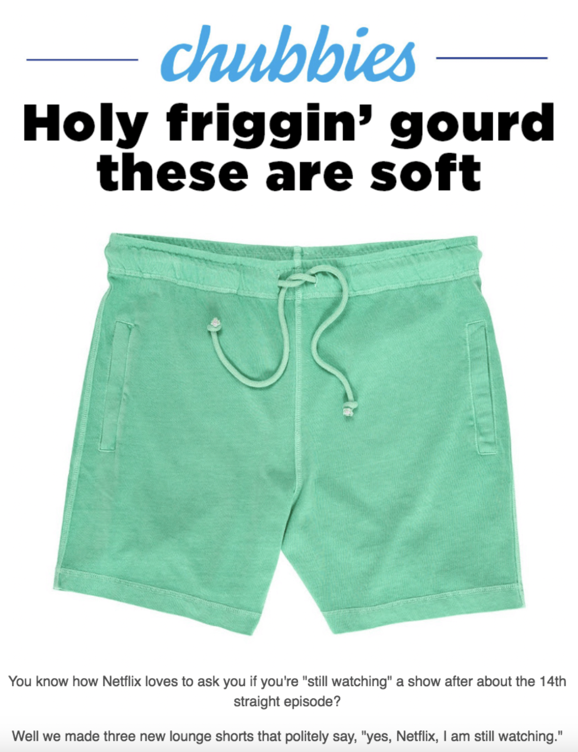
Chubbies Shorts leverages click-activated popups on their website that gamify the email sign-up process. When users click on a certain product, a playful popup appears, offering a chance to spin a wheel for a discount or special offer if they sign up for the newsletter.
Key Takeaway: Gamifying the sign-up process can create a fun interaction that encourages users to provide their information in exchange for potential rewards.
6. KFC: Limited-Time Offers
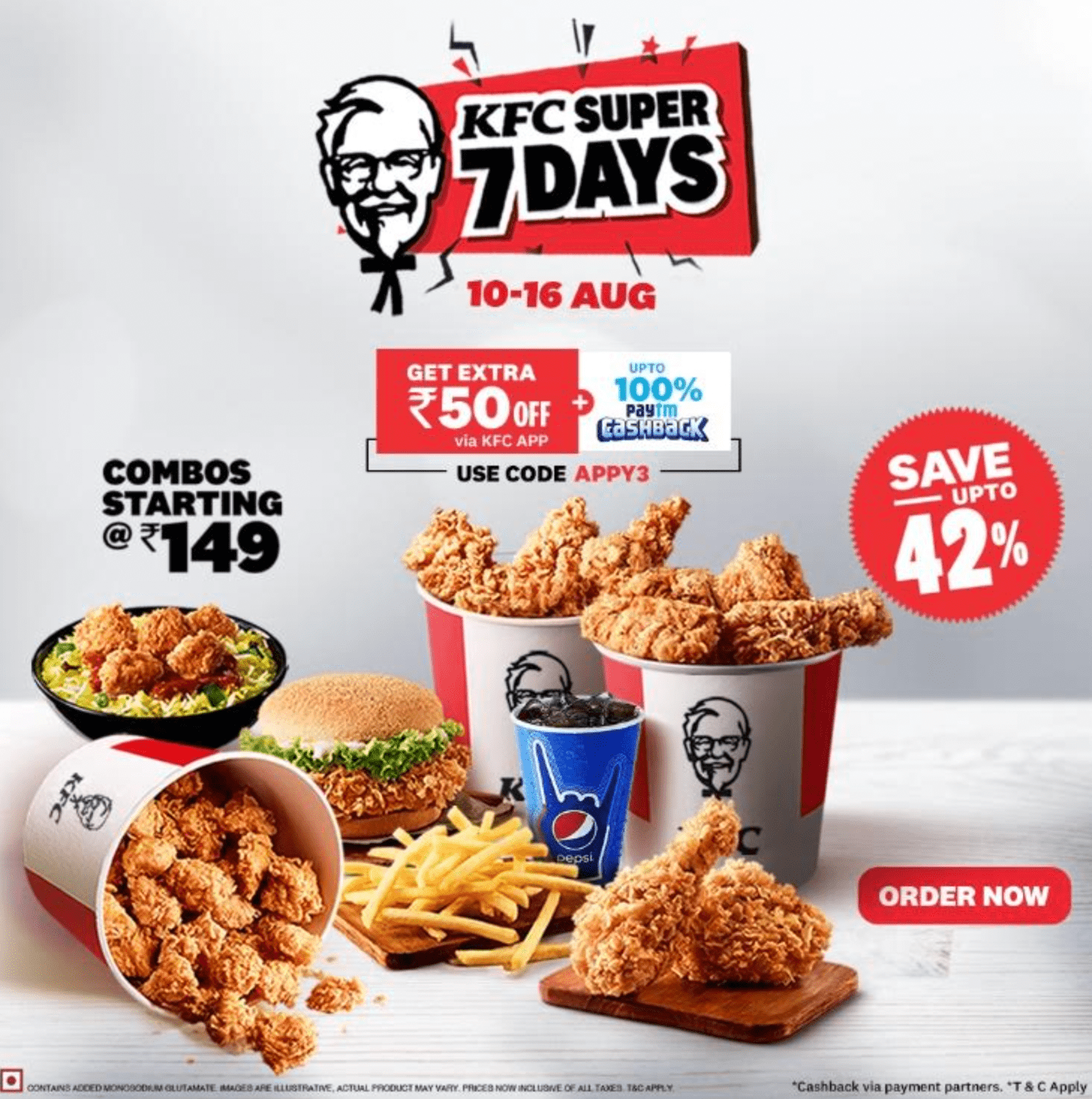
KFC employs full-screen popups that appear when users land on their site, showcasing limited-time offers and new menu items. These eye-catching popups create immediate interest and direct users toward promotional items.
Key Takeaway: Using full-screen popups effectively captures attention and can drive immediate action, especially when tied to limited-time promotions.
FAQs
What is the best type of popup for lead generation?
The most effective type of popup for lead generation is often the exit-intent popup, as it targets users who are about to leave the site, giving you a chance to capture their interest with an offer or subscription prompt.
How often should I display popups to avoid annoying users?
It's best to set frequency caps to limit the number of times a user sees the same popup. Generally, limiting it to once per session or once every few days can help maintain a positive user experience.
Can popups hurt my site’s SEO?
If popups are intrusive or disrupt the user experience significantly, they can negatively impact SEO. However, well-designed popups that add value and are used sparingly can enhance user engagement without harming SEO.
What are the most common design mistakes in popup marketing?
Common design mistakes include cluttered layouts, unclear messaging, poor use of colors, and not optimizing for mobile devices. It's crucial to ensure that popups are visually appealing, easy to read, and responsive across all devices.
