In the competitive digital landscape, it's crucial to keep visitors engaged and convert their interest into action. Time on page popups play a significant role in this process. By timing the popup to appear when a visitor is most engaged, you can provide relevant offers, gather valuable leads, and enhance the overall user experience.
Understanding Time on Page Popups
Definition and Characteristics of Time on Page Popups
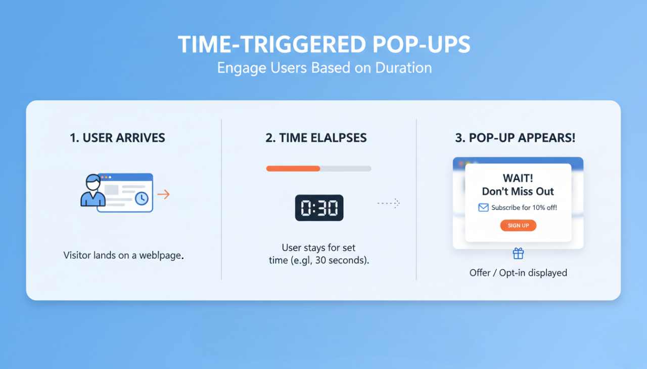
Time on page popups are triggered after a visitor has been on a webpage for a specified duration. These popups aim to engage users who have shown interest by staying on the page for a while. They can offer discounts, prompt newsletter sign-ups, or highlight special content.
How Time on Page Popups Differ from Other Popups
Unlike entry or exit-intent popups, time on page popups are specifically designed to appear based on the amount of time a visitor spends on a page. This timing strategy ensures that the popup appears when the visitor is most engaged, rather than immediately upon entry or just before leaving.
3 Benefits of Using Time on Page Popups
1. Increased User Engagement
By appearing when a visitor is already engaged with your content, time on page popups can effectively capture their attention and prompt further interaction.
2. Enhanced User Experience
Well-timed popups provide relevant information or offers at the right moment, enhancing the user experience rather than interrupting it.
3. Improved Conversion Rates
Because these popups target engaged visitors, they are more likely to convert. Whether it’s capturing email addresses, promoting a sale, or encouraging content downloads, time on page popups have been shown to significantly improve conversion rates.
Types of Time on Page Popups
1. Immediate Time-Based Popups
These popups appear immediately after a visitor has spent a minimal amount of time on the page, typically a few seconds. They are useful for capturing attention quickly, especially for short, impactful messages.
2. Delayed Time-Based Popups
Delayed popups are triggered after a visitor has spent a longer period on the page, such as 30 seconds to a minute. These popups are ideal for deeper engagement, as they target users who are more invested in the content.
3. Persistent Time-Based Popups
These popups remain visible for an extended period once triggered, ensuring that the visitor has ample time to read and engage with the content. They are particularly effective for promoting detailed offers or collecting comprehensive feedback.
Designing Effective Time on Page Popups
Key Design Principles for Time on Page Popups
To design effective time on page popups, focus on:
Simplicity: Keep the design clean and uncluttered.
Clarity: Ensure the message is clear and concise.
Visual Appeal: Use high-quality images and brand-consistent colors.
Best Practices for Visual Appeal
Contrast: Use contrasting colors to make the popup stand out.
Legibility: Choose easy-to-read fonts and make sure the text is large enough to be read at a glance.
Branding: Incorporate your brand’s logo and colors to create a cohesive look.
Examples of Successful Time on Page Popup Designs
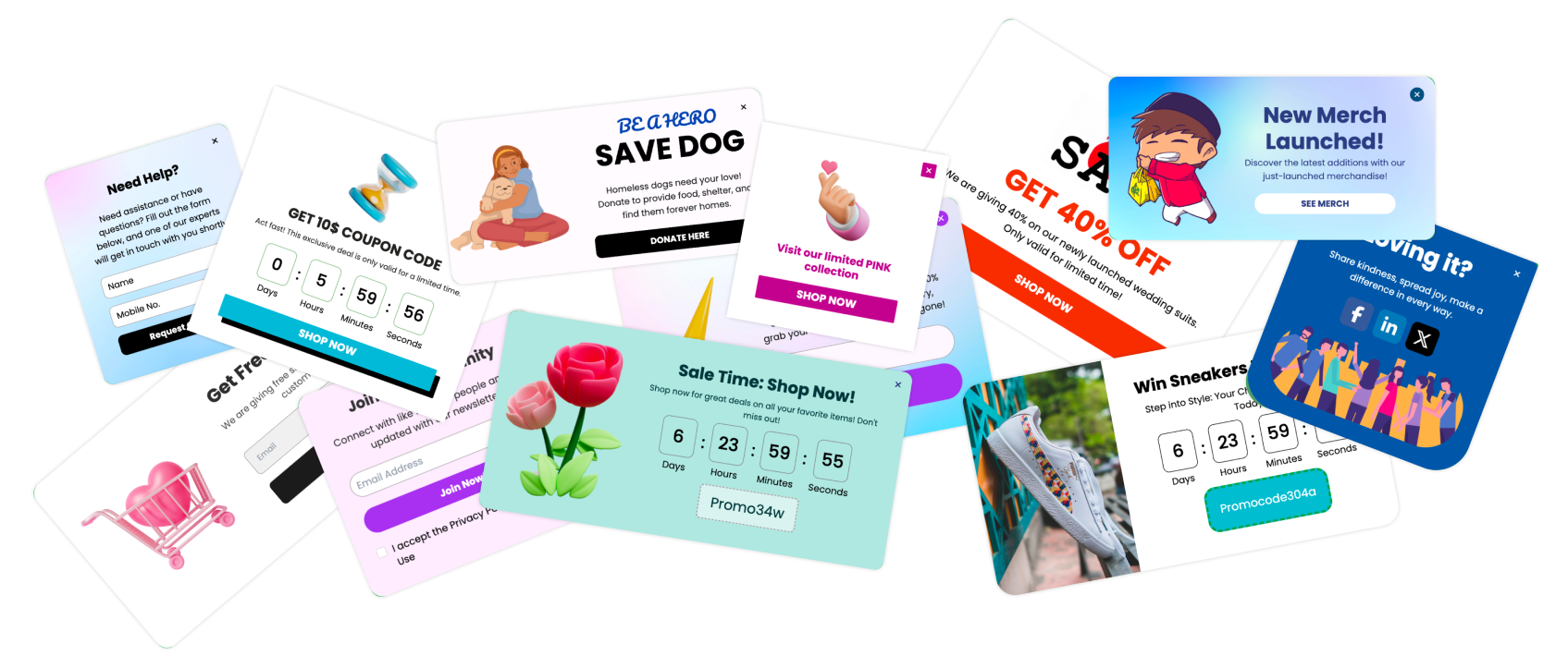
Discount Offers: A clean, simple design offering a discount code in exchange for an email sign-up.
Newsletter Sign-Ups: A visually appealing popup with an engaging headline and a clear call to action.
Content Promotion: A popup featuring a high-quality image and a compelling offer to download a free ebook or guide.
Crafting Compelling Content for Time on Page Popups
Writing Persuasive Headlines
A strong headline is crucial for capturing attention. Use action-oriented language and create a sense of urgency or curiosity. Examples include "Unlock Your Discount Now" or "Get Exclusive Access Today."
Creating Engaging Calls to Action (CTAs)
Your CTA should be clear and compelling. Use verbs that prompt action, such as "Subscribe," "Download," or "Claim Now." Make sure the CTA button stands out from the rest of the popup.
Using Visuals and Media to Enhance Messages
Incorporate high-quality images, videos, or graphics to make your popup more engaging. Visuals can quickly convey your message and make the popup more attractive and effective.
Timing Strategies for Time on Page Popups
Determining the Optimal Time to Trigger Popups
The optimal time to trigger a popup depends on your audience and goals. A common strategy is to display the popup after the user has spent 30 seconds to a minute on the page. This timing ensures that the user is engaged but not yet ready to leave.
Adjusting Timing Based on User Behavior
Analyze user behavior to adjust the timing of your popups. For example, if users typically leave a page after two minutes, consider displaying the popup at the 90-second mark. Use analytics tools to gain insights into user behavior and refine your timing strategy accordingly.
Testing Different Timing Strategies for Best Results
Continuously test different timing strategies to see what works best for your audience. A/B testing can help you compare the effectiveness of various timing intervals and optimize your approach.
Creating Time on Page Popups Using Poper
Step-by-Step Guide
Creating a time on page popup with Poper is straightforward. Follow these steps to engage your visitors effectively.
Step 1: Log in to Your Poper Account
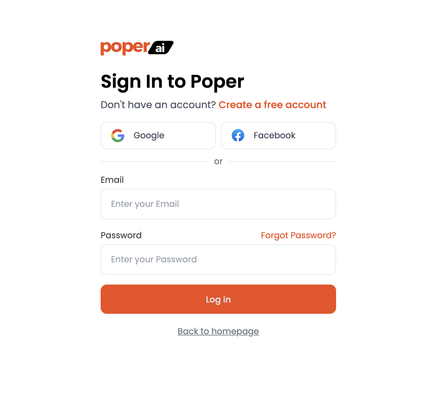
Log in to your Poper account. This will take you to the dashboard where you can manage all your popups.
Step 2: Click on "New Popup"
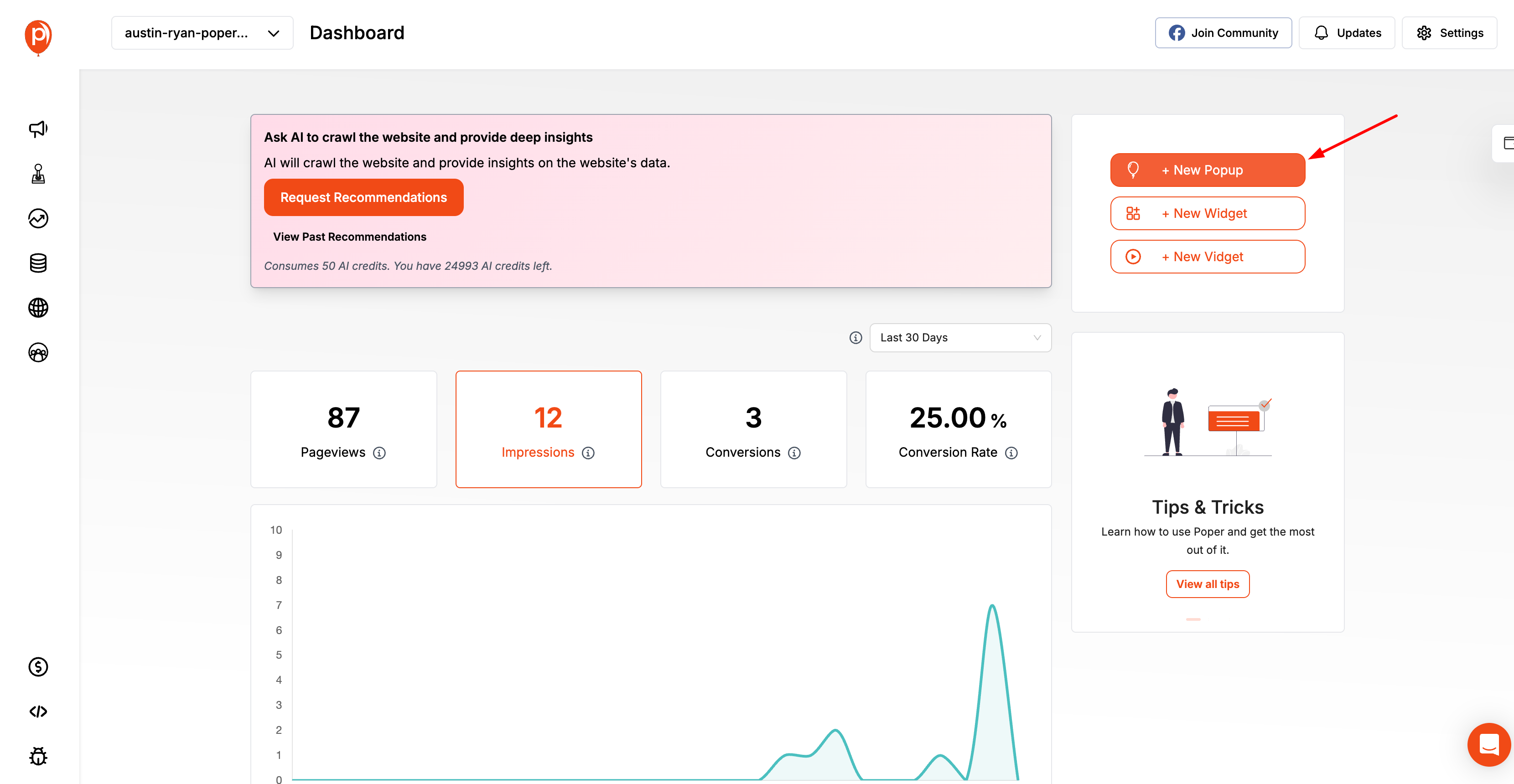
In the dashboard, click on the "+ New Popup" button to start creating a new popup.
Step 3: Choose How You Want to Create Your Popup
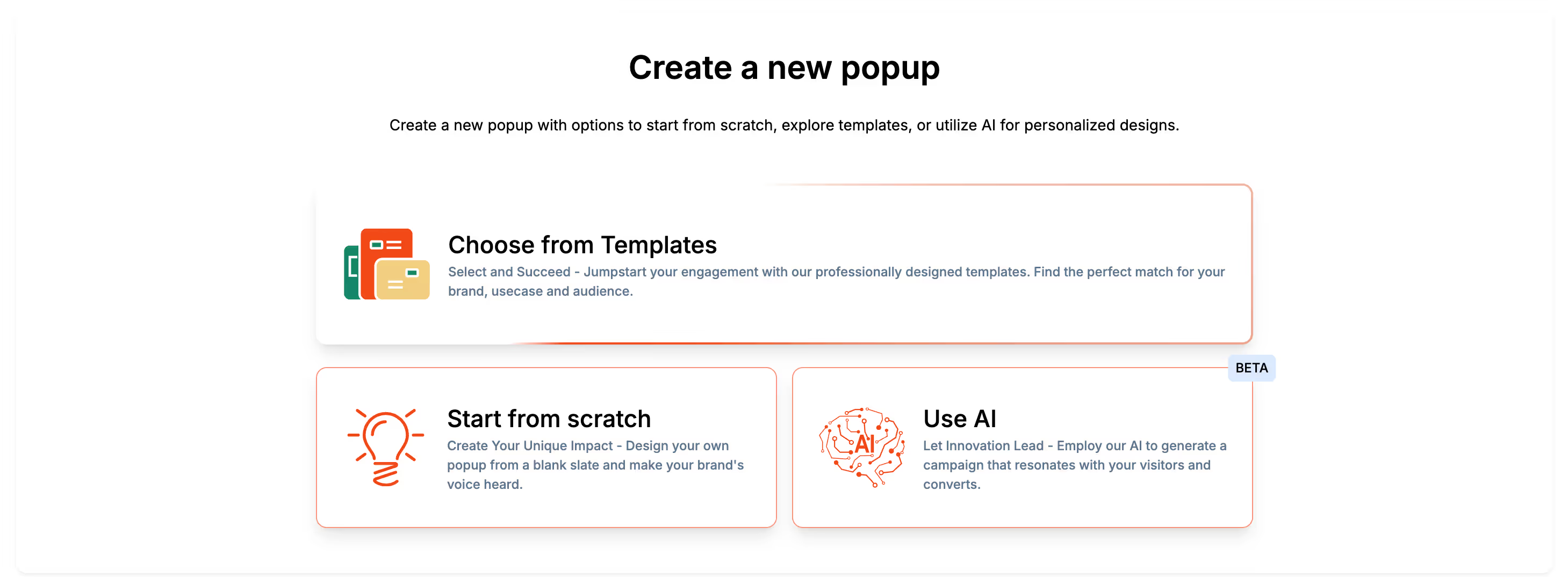
You will be presented with three options: choose from templates, start from scratch, or use AI. For a quick start, select "Choose from Templates".
Step 4: Select a Template
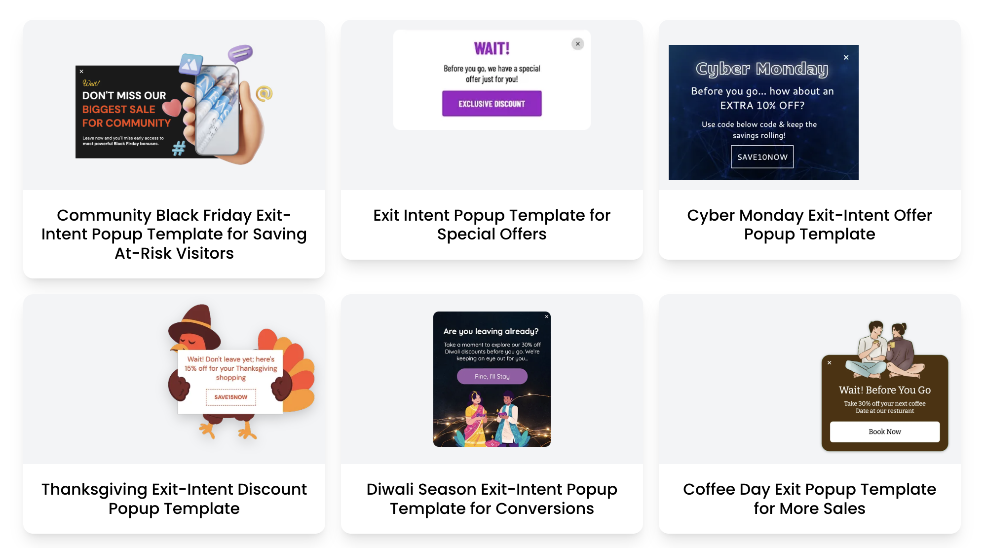
Browse through the available templates and select one that matches your campaign goals. Click on the template to proceed.
Step 5: Customize Your Popup
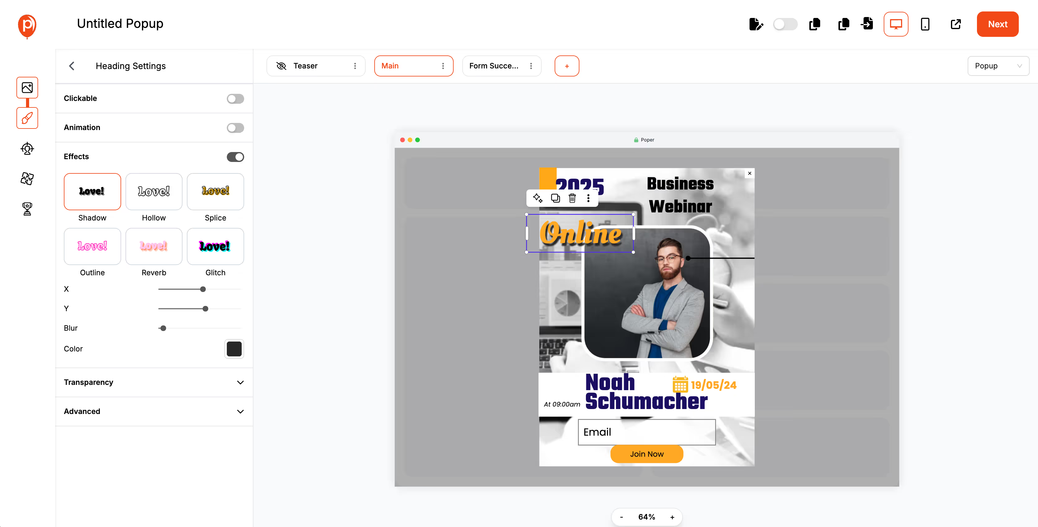
Edit the selected template to align with your branding and messaging. Customize colors, text, and images to create a compelling and visually appealing popup.
Step 6: Set Triggers
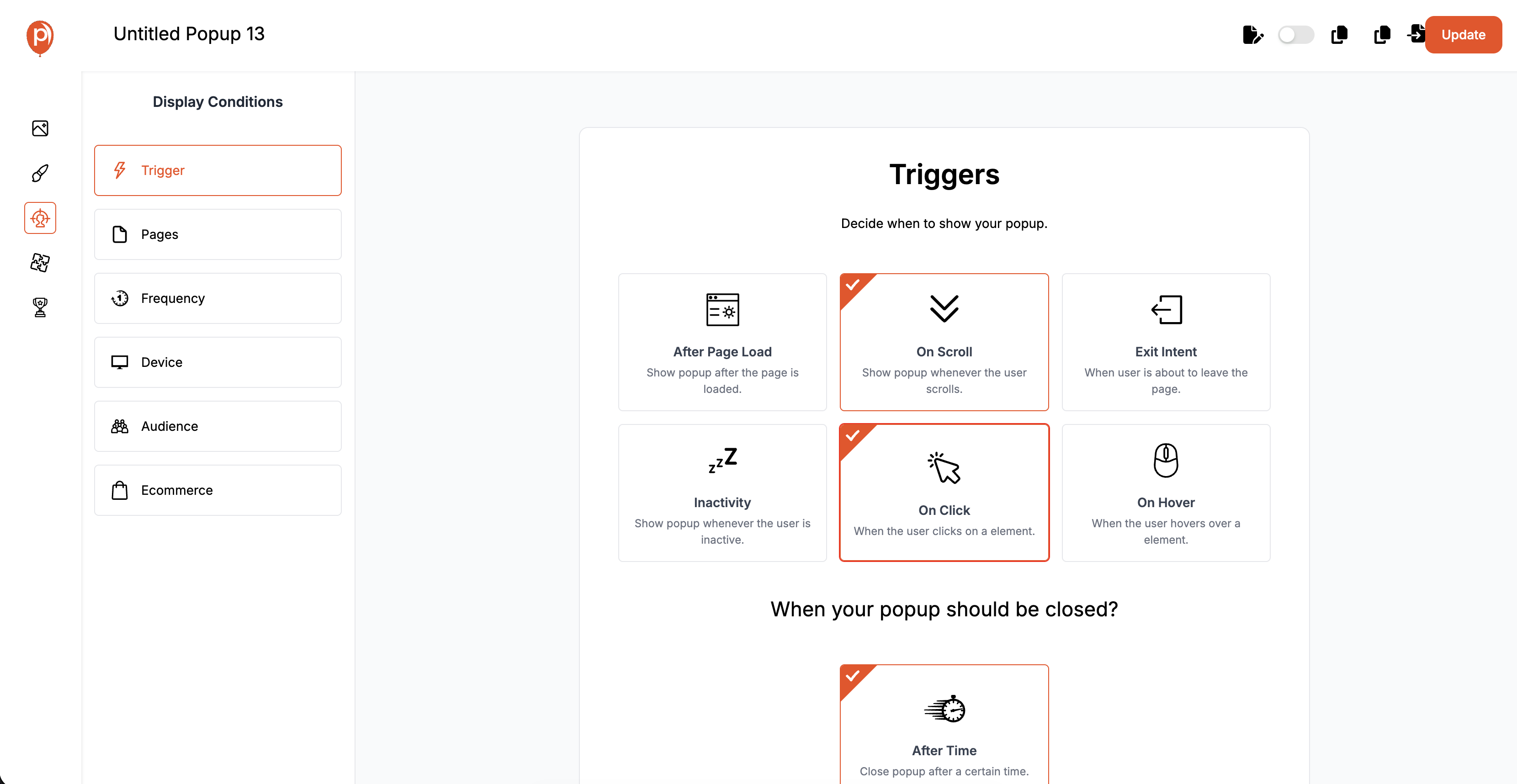
Configure the popup to appear after a specified amount of time on the page. You can also add multiple triggers, such as on scroll, inactivity, exit intent, on click, or on hover.
Step 7: Filter Your Audience
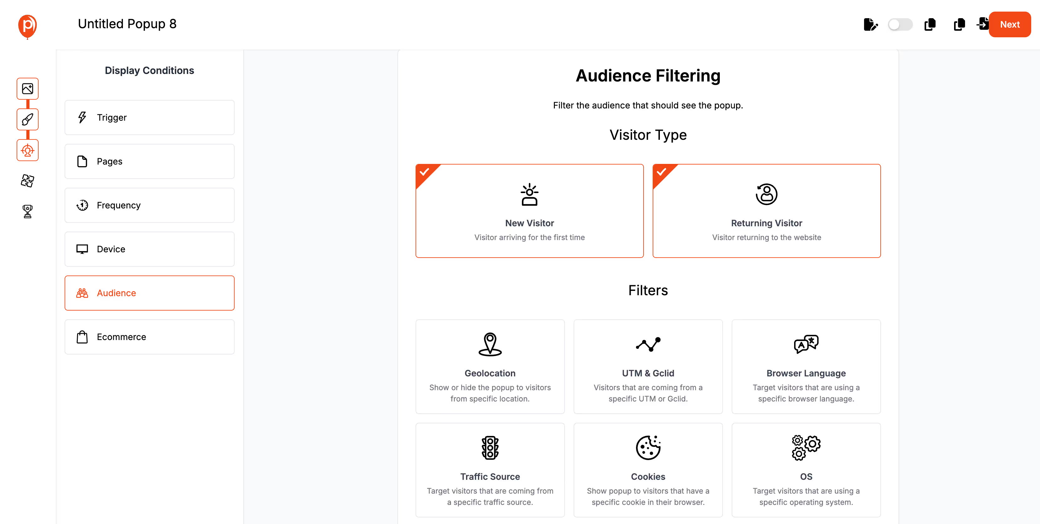
Use the audience filtering options to target specific visitor types. For a time on page popup, you might want to filter by returning visitors or specific user behaviors.
Step 8: Publish Your Popup
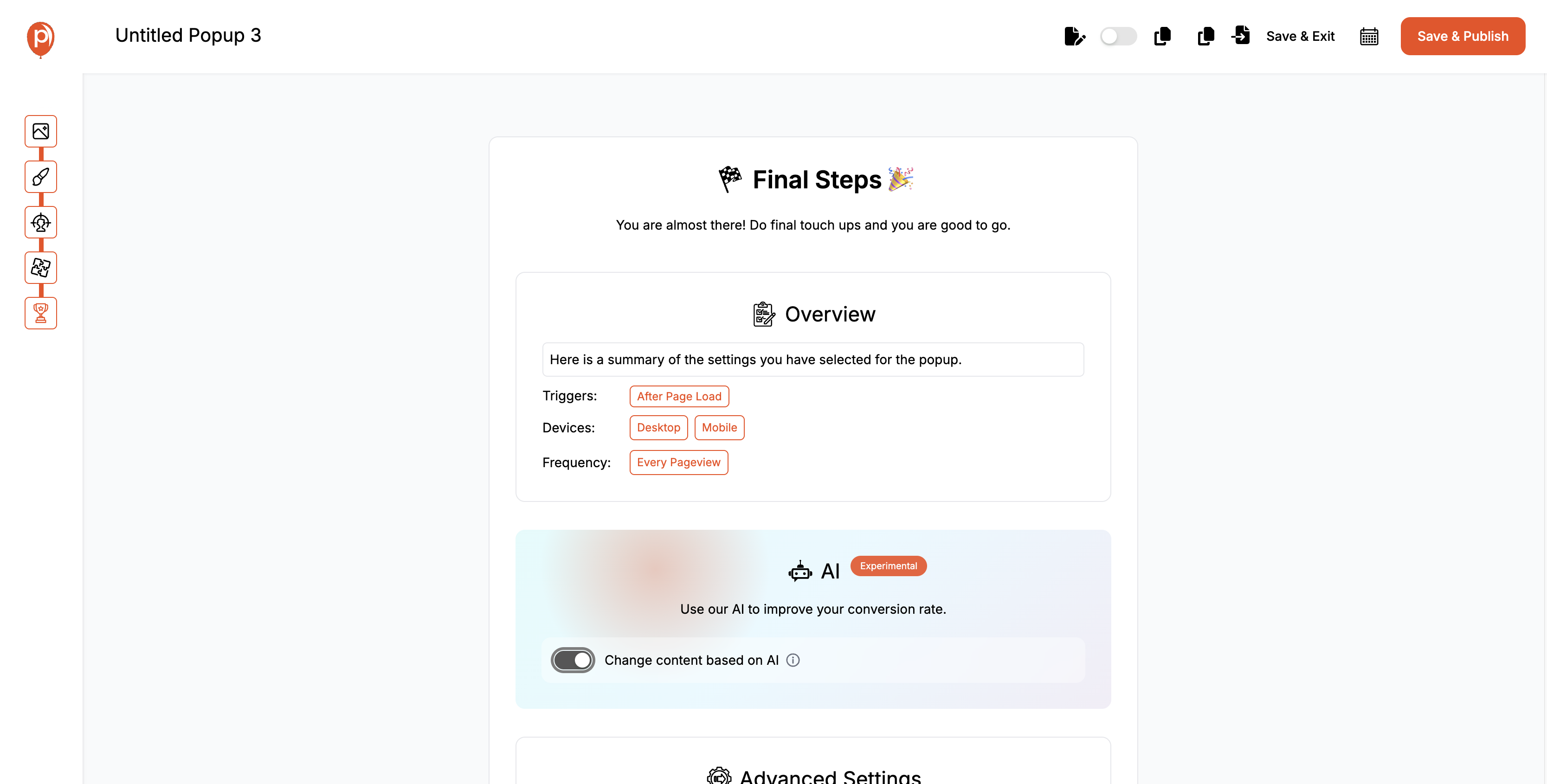
Once you're satisfied with the setup, click "Save & Publish" to make your popup live on your website.
Best Practices and Troubleshooting Tips
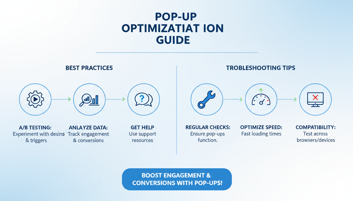
Regular Testing: Continuously test different designs and triggers to find the most effective combinations.
Monitor Performance: Use analytics to track engagement and conversion rates.
Seek Support: Utilize Poper’s support resources for troubleshooting and optimization.
By following these steps, you can effectively create and manage time on page popups using Poper, enhancing user engagement and driving higher conversion rates.
Enhancing Time on Page Popups with Advanced Features
Dynamic Content Based on User Behavior
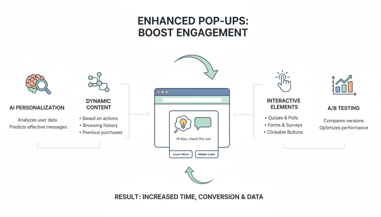
Incorporate dynamic content that changes based on user behavior. Personalize popups to show different messages depending on actions like previous purchases, browsing history, or time spent on site. This makes the popup more relevant and engaging.
Using AI for Personalization
Leverage AI to personalize your popups further. AI can analyze user data and predict the most effective content to display, ensuring each user sees a message that resonates with their interests and behavior.
Incorporating Interactive Elements
Make your popups more engaging by adding interactive elements such as forms, quizzes, or clickable buttons. Interactive popups can increase user engagement and provide additional data points for further personalization and marketing efforts.
A/B Testing Time on Page Popups
Importance of A/B Testing for Optimization
A/B testing is crucial for optimizing your time on page popups. By comparing different versions of your popups, you can determine which elements are most effective in driving engagement and conversions. This process helps you refine your popups to better meet the needs and preferences of your audience.
Key Metrics to Measure and Analyze
When conducting A/B tests, focus on key metrics such as:
Conversion Rates: Track how many users take the desired action after seeing the popup.
Engagement Rates: Measure how many users interact with the popup (e.g., clicking a CTA or filling out a form).
Bounce Rates: Monitor whether the popup causes users to leave your site.
Implementing and Analyzing A/B Tests
Set Clear Goals: Define what you want to achieve with your popup (e.g., higher sign-up rates, increased sales).
Create Variations: Develop different versions of your popup, changing one element at a time (e.g., headline, image, CTA).
Run Tests: Use A/B testing tools to show different versions of the popup to different segments of your audience.
Analyze Results: Compare the performance of each version based on the defined metrics and identify which version performs best.
Refine and Repeat: Implement the best-performing version and continue testing new variations for continuous improvement.
Case Studies of Time on page Popup
Successful Time on Page Popup Campaigns
Example 1: E-commerce Store
Strategy: Used time on page popups to offer a discount code after users spent 30 seconds on a product page.
Outcome: Increased conversion rates by 25%, with a significant boost in product purchases.
Example 2: Online Publisher
Strategy: Deployed time on page popups to promote newsletter subscriptions after readers spent one minute on an article.
Outcome: Achieved a 20% increase in email sign-ups, enhancing reader engagement and retention.
Lessons Learned from Various Industries
Retail: Time on page popups offering limited-time discounts can create urgency and drive sales.
Education: Using popups to offer free resources or trial classes can boost sign-ups and lead to long-term engagement.
Media: Promoting exclusive content through popups can significantly increase newsletter subscriptions and reader loyalty.
FAQs About Time on Page Popups
What is a Time on Page Popup and how does it work?
A time on page popup is an overlay element that appears after a visitor has spent a certain amount of time on a webpage. It engages users by offering relevant information or incentives based on their time spent on the site.
How can I design an effective Time on Page Popup?
To design an effective time on page popup, focus on simplicity, clarity, and visual appeal. Use contrasting colors, easy-to-read fonts, and incorporate your brand's logo and colors. Ensure the message is clear and concise.
What are the best times to display Time on Page Popups?
The best times to display time on page popups include after the user has spent 30 seconds to a minute on the page, adjusting timing based on user behavior, and continuously testing different intervals to optimize results.
Can Time on Page Popups be mobile-friendly?
Yes, time on page popups can and should be mobile-friendly. Ensure your popups are responsive and test them on various devices to ensure they function well on all screen sizes.
How do I measure the effectiveness of my Time on Page Popups?
Measure the effectiveness of time on page popups by tracking KPIs such as conversion rates, engagement rates, and bounce rates. Use tools like Google Analytics and Poper’s built-in analytics for detailed insights.
Conclusion
Time on page popups are a powerful tool for capturing user attention and driving conversions. By implementing them thoughtfully, you can enhance user engagement, increase conversion rates, and improve the overall effectiveness of your digital marketing efforts.
