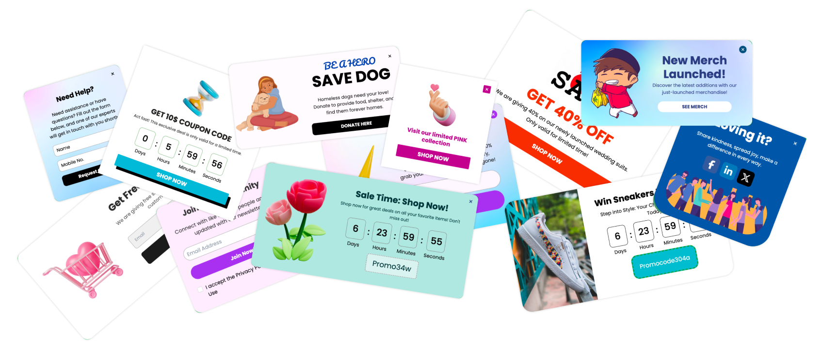
Creating a popup that appears when someone hovers over an element can be tricky. There are many ways to do this, but you can choose between using a tool like Poper, which simplifies the process, or doing it from scratch with HTML, CSS, and JavaScript. Let's explore both methods.
A. Creating a Hover Popup Using Poper
If you have an HTML website, you can easily use Poper to create and manage your popups. Here’s how:
1. Create a Poper Account
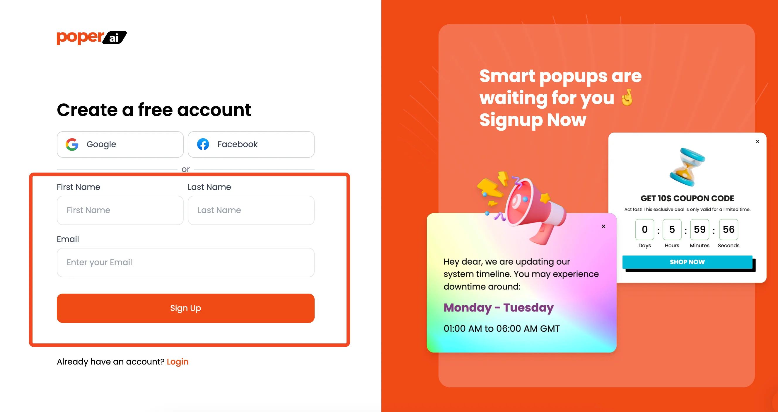
To get started, you'll need to sign up for a Poper account. This will give you access to the tools you need to create and manage popups on your website.
2. Add Your Domain
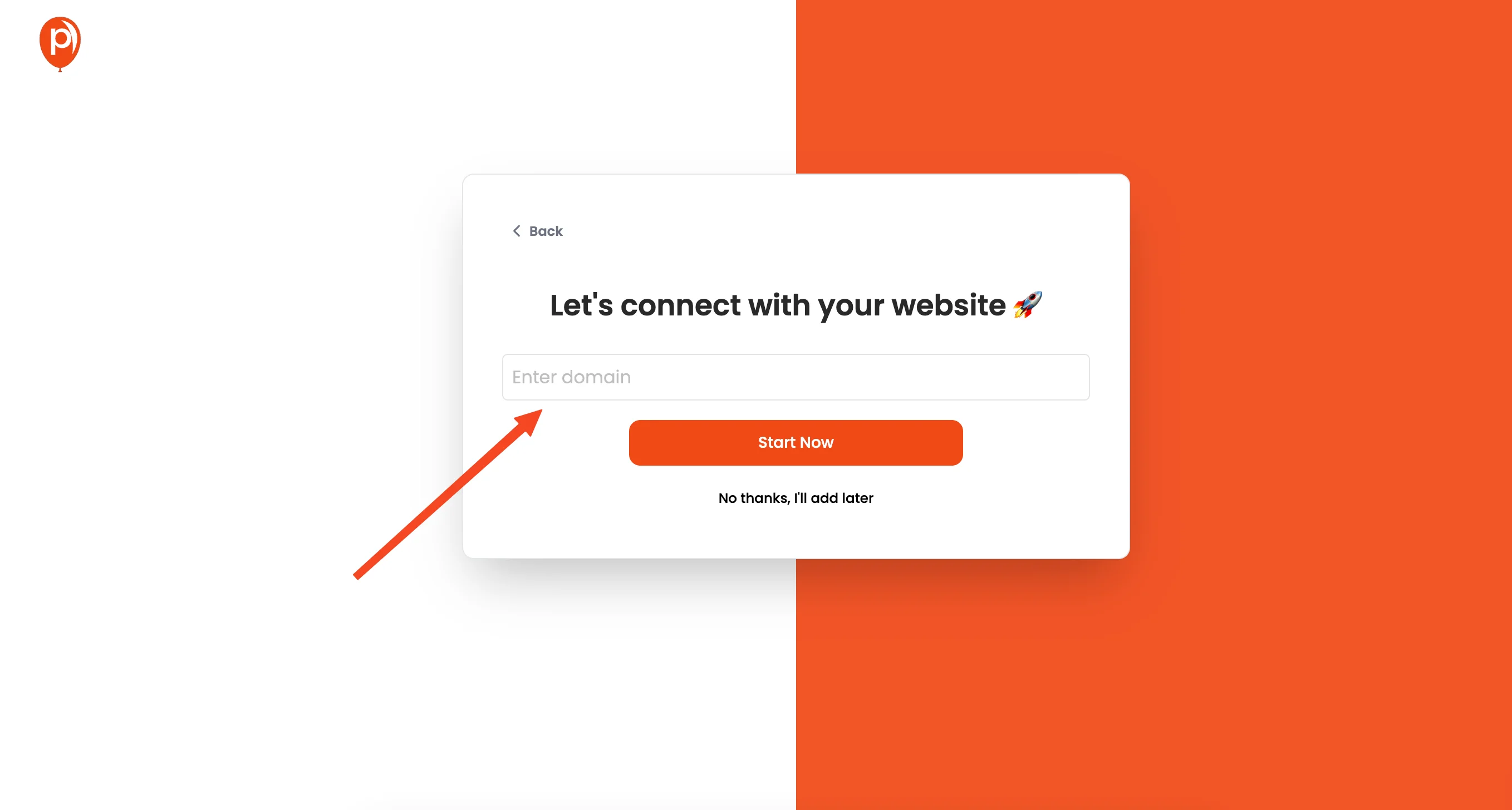
After signing up, the next step is to add your website's domain to your Poper account. This tells Poper where your popups will be displayed. You can then start creating a new popup.
3. Create a New Popup
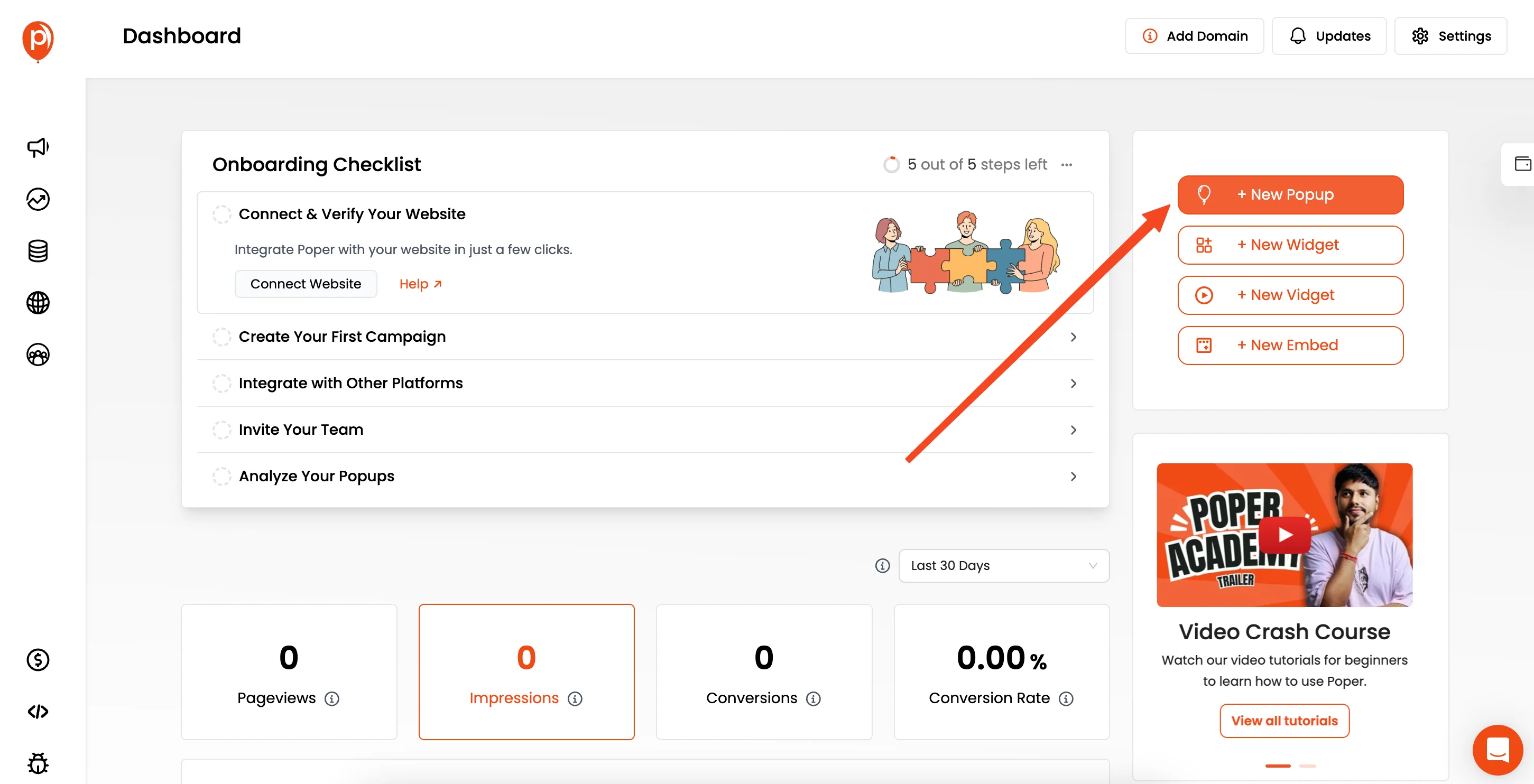
Click on the "New Popup" button in the Poper dashboard. You'll be given an option to either choose from pre-designed templates or create your own from scratch.
4. Select a Template or Create Your Own
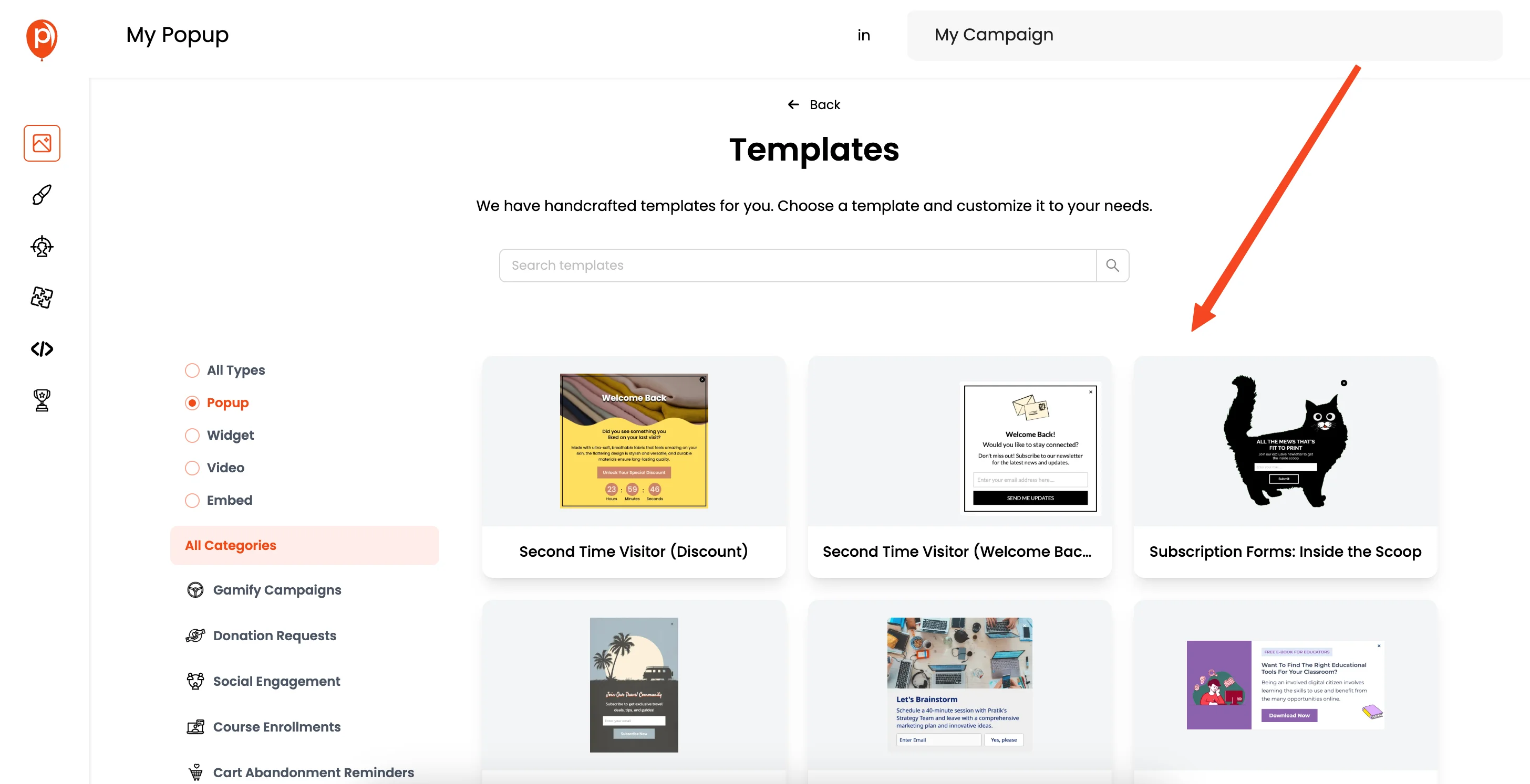
Choose a popup template that fits your goals, whether it’s collecting leads from ad campaigns or displaying special offers. You can also start with a blank canvas if you want to design something completely unique.
5. Customize the Popup
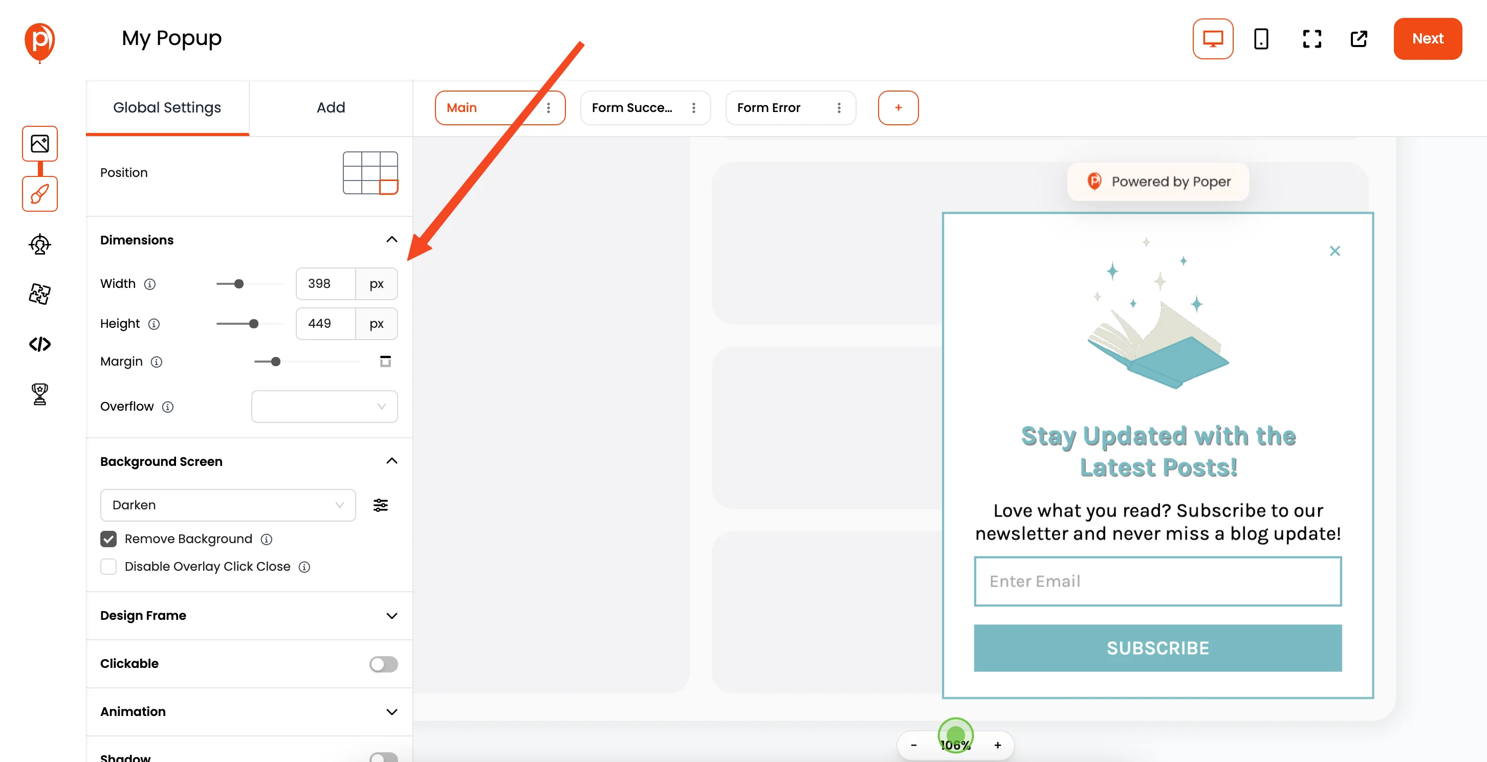
After selecting the template you'll be in the popup editor, where you can customize the look and feel of your popup. Change fonts, colors, and other design elements to match your website's style.
6. Set the Display Conditions
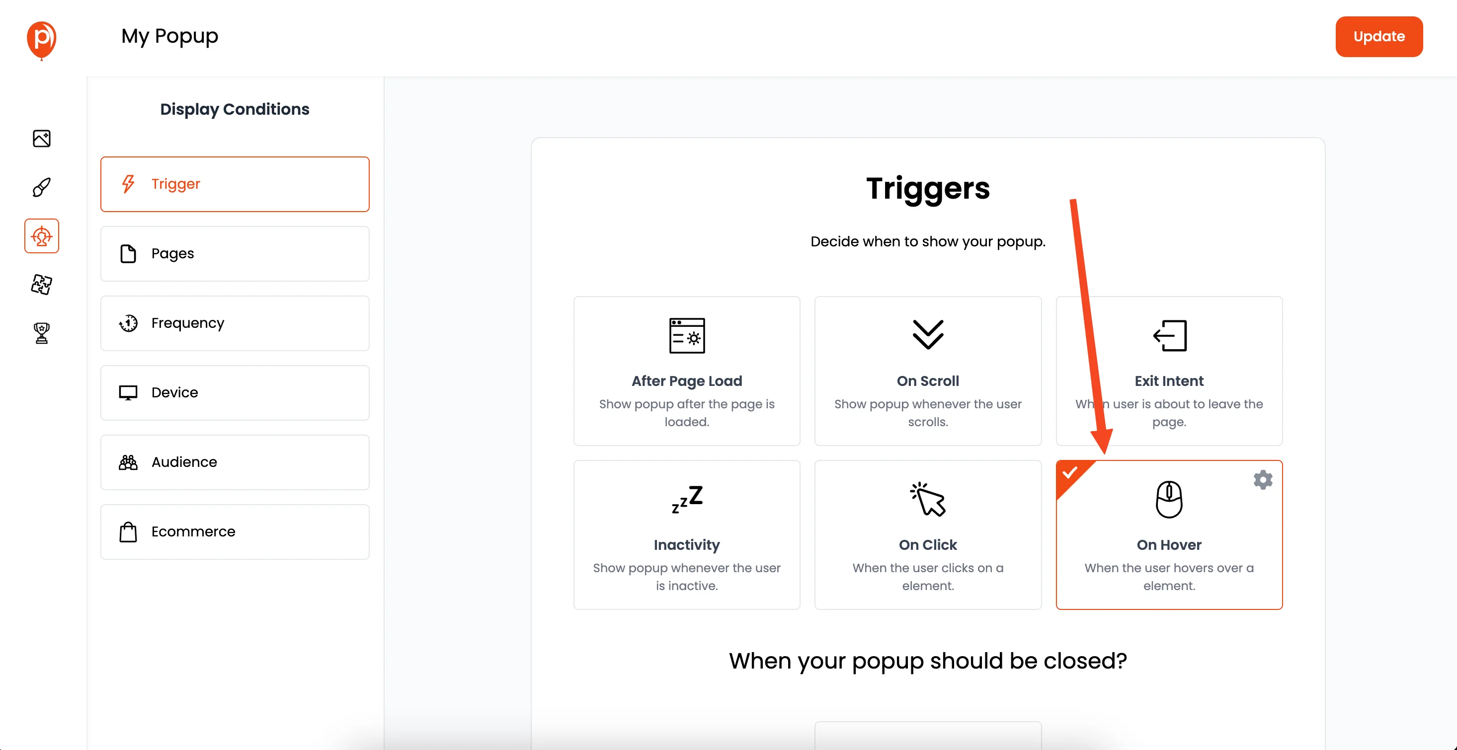
This step is crucial for hover popups. In the "Display Conditions" settings, select the "On Hover" option. You’ll need to enter a CSS selector, such as ".my-action-button". You will then add the class name to the button in your HTML.
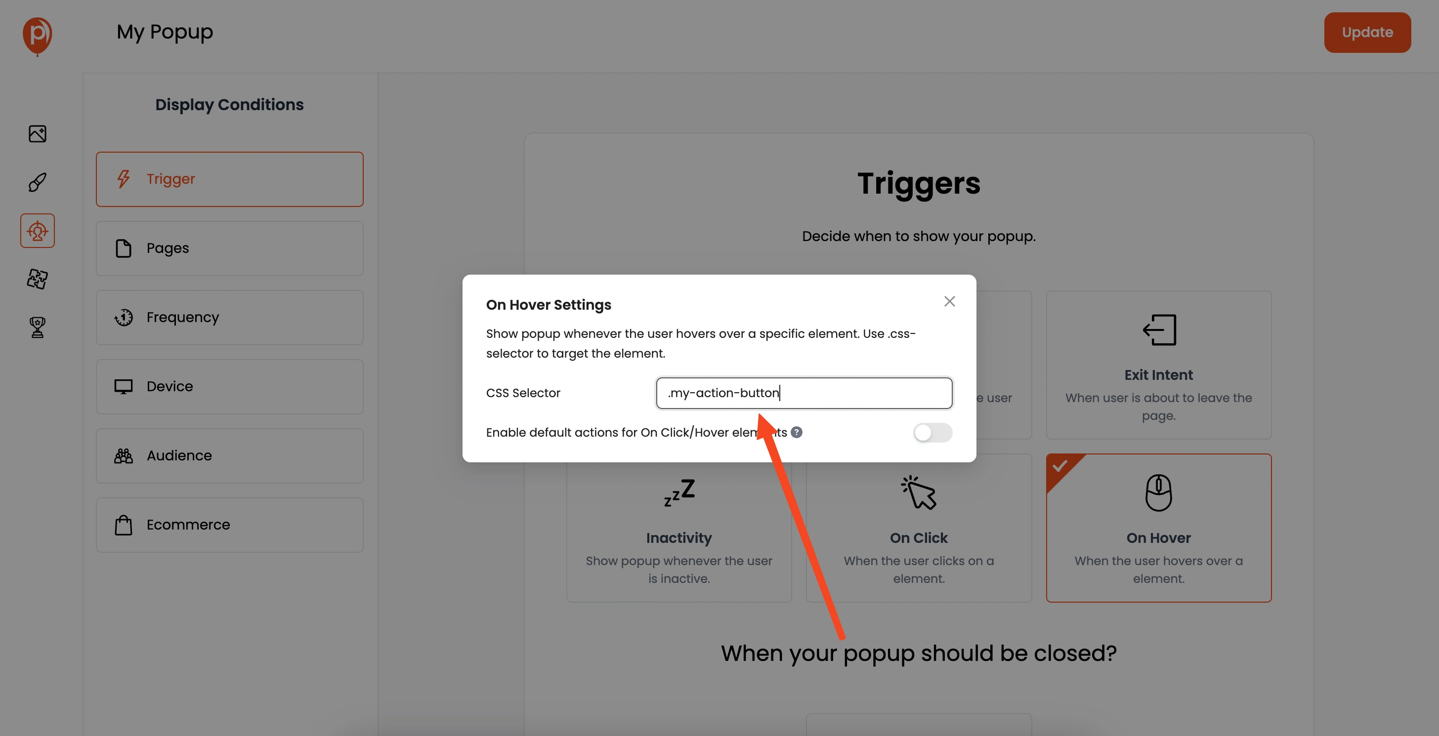
When someone hovers over the element, the Poper popup will appear. Here you can also target specific pages, user demographics, and more for better user targeting.
7. Connect Integrations
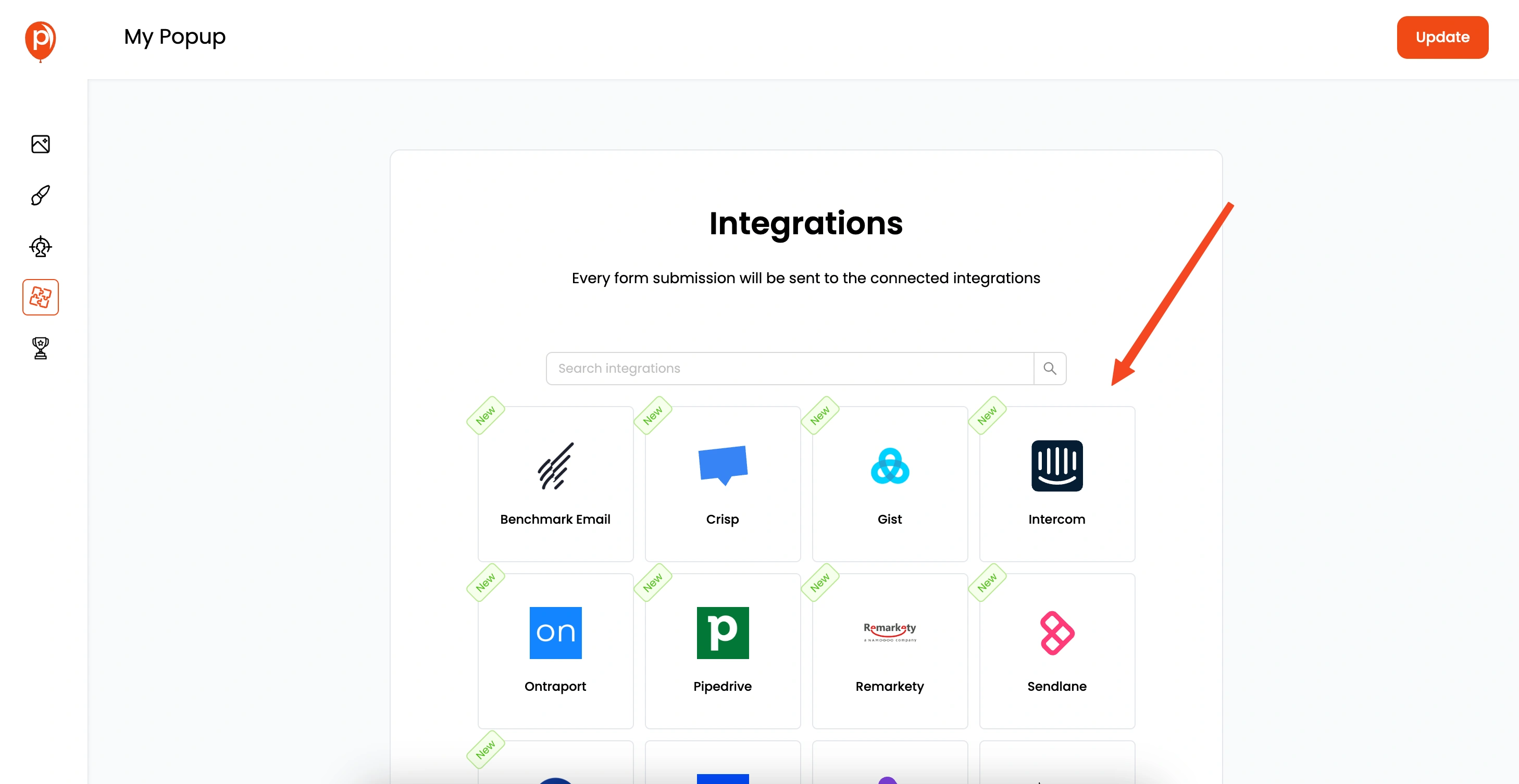
Poper lets you connect your popup with your favorite email marketing platforms. This way, you can easily collect leads and improve your marketing efforts.
8. Save and Publish
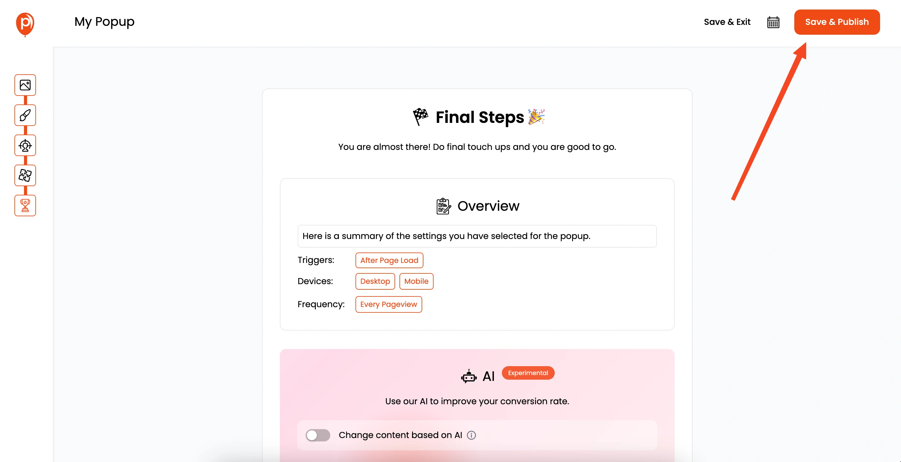
Once you've set up everything, click "Save & Publish". Your popup is now ready to go live on your site.
9. Get the Custom Code
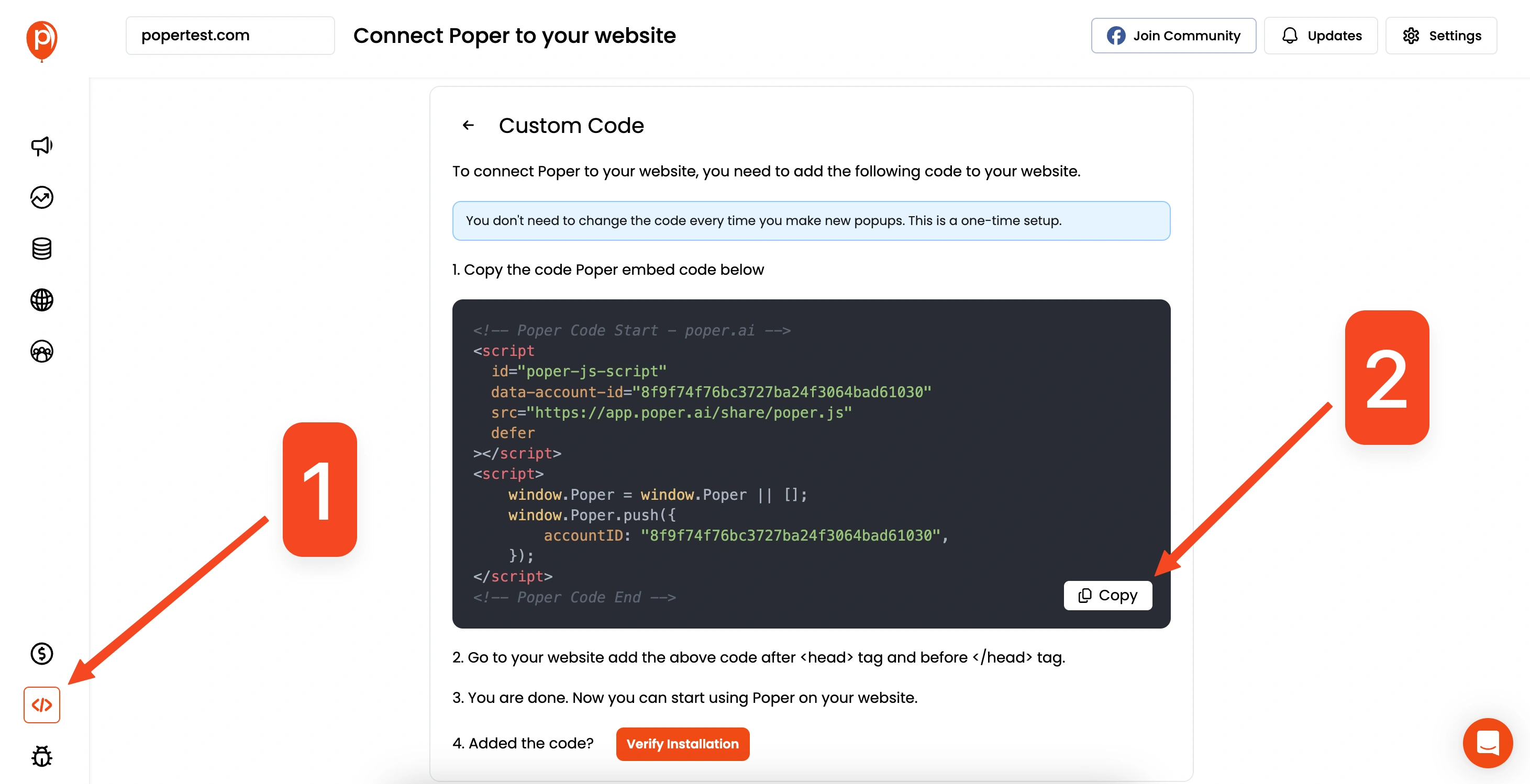
Go to the "Code" section in the Poper dashboard's left navigation bar. Select the "Custom Code" option and copy the code provided.
10. Add the Code to Your HTML
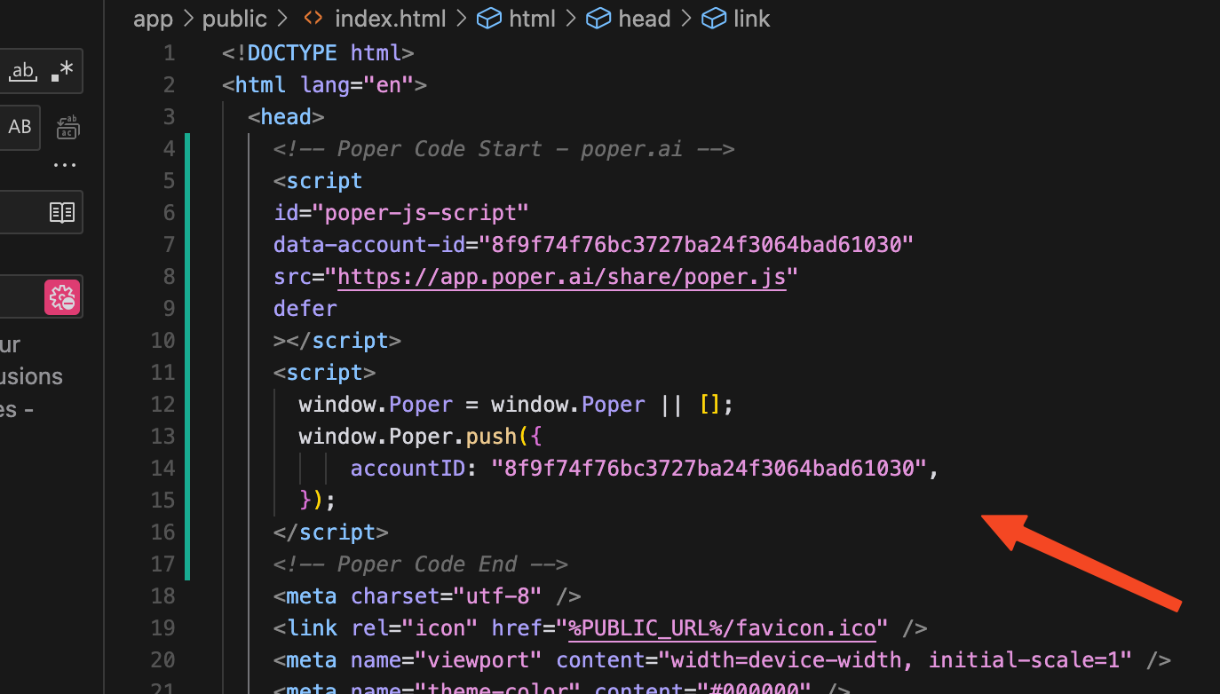
Paste the copied code into the <head></head> section of your HTML website. If you're using a common header file, such as header.php, you’ll need to add the code there to apply it to all pages.
11. Deploy and Test
Save the changes to your HTML and deploy your website. Then, test the popup by hovering over your button. You should see the popup appear as you've configured it.
B. Creating a Hover Popup Using Custom Code
If you prefer to build your popup from scratch, you can use HTML, CSS, and JavaScript. It requires more effort but gives you full control over the design.
1. HTML Structure
Here's the HTML structure for a basic hover popup:
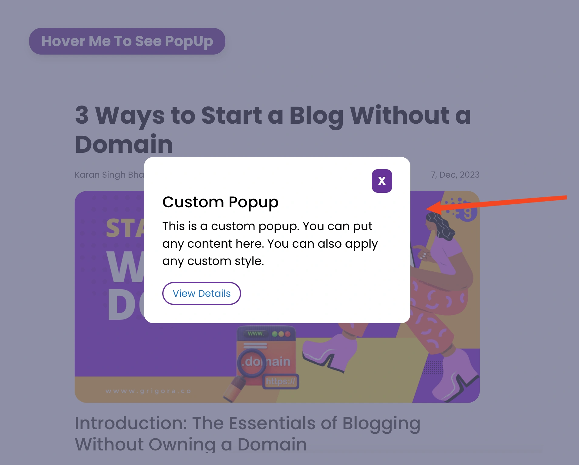
<button id="clickBtn">Hover Me To See PopUp</button><div id="popup"> <div class="popup-container"> <div class="popup"> <div class="close-popup" id="closeBtn"><a href="#">X</a></div> <h2>Custom Popup</h2> <p> This is a custom popup. You can put any content here. You can also apply any custom style. </p> <a href="#" class="popup-btn">View Details</a> </div> </div></div>This HTML creates a button that will trigger the popup, the popup container, and the content of the popup.
2. CSS Styling
Next, you'll need to style the popup with CSS. Here’s some basic CSS you can use:
@import url('https://fonts.googleapis.com/css2?family=Poppins:wght@100;400;600&display=swap');*{ margin: 0px; padding: 0px; box-sizing: border-box;}body{ font-family: 'Poppins', sans-serif; position: relative;}button{ background-color: rebeccapurple; outline: none; border: none; padding: 10px 20px; font-weight: bold; font-size: 1.5rem; color: #ffffff; margin: 30px; border-radius: 20px; box-shadow: 1px 6px 12px 0px rgb(0 0 0 / 13%); cursor: pointer; transition: .2s all ease-in-out;}button:hover{ background-color: orange;}#popup{ display: none;}.popup-container{ height: 100vh; width: 100%; display: flex; flex-wrap: wrap; justify-content: center; align-items: center; background-color: rgb(96 95 127 / 70%); position: absolute; top: 0; left: 0;}.popup{ background-color: #ffffff; padding: 20px 30px; width: 50%; border-radius: 15px;}.close-popup{ display: flex; justify-content: flex-end;}.close-popup a{ font-size: 1.2rem; background-color: rebeccapurple; color: #fff; padding: 5px 10px; font-weight: bold; text-decoration: none; border-radius: 10px; display: inline-block;}.popup > h2{ font-size: 1.6rem; margin-bottom: 10px;}.popup > p{ font-size: 1.2rem; margin-bottom: 10px;}.popup-btn{ display: inline-block; text-decoration: none; border: 2px solid rebeccapurple; padding: 5px 15px; border-radius: 20px; margin: 10px 0px; transition: .2s all ease-in;}.popup-btn:hover{ background-color: rebeccapurple; color: #fff;}This CSS styles the button, the popup container, and the popup content, including how to close the popup.
3. JavaScript Interaction
Finally, you'll need to add JavaScript to handle the hover and close actions:
const clickBtn = document.getElementById("clickBtn");const popup = document.getElementById("popup");const closeBtn = document.getElementById("closeBtn"); clickBtn.addEventListener('mouseover', ()=>{ popup.style.display = 'block';});closeBtn.addEventListener('click', ()=>{ popup.style.display = 'none';});popup.addEventListener('click', ()=>{ popup.style.display = 'none';});This JavaScript code listens for a mouseover event on the button, displaying the popup when triggered. It also adds event listeners to hide the popup when the close button or popup backdrop is clicked.
Important Note
Creating popups from scratch involves adding event listeners, managing display states, and ensuring cookies prevent the popup from showing repeatedly. This can be complex and time-consuming.
Recommendation
While you can create a popup from scratch using HTML, CSS and JavaScript, doing so involves manual work like managing animations, updating popups, handling cookies, etc. Using a tool like Poper makes it easier to create, manage, and update popups without needing to write code manually, saving you time and effort.

