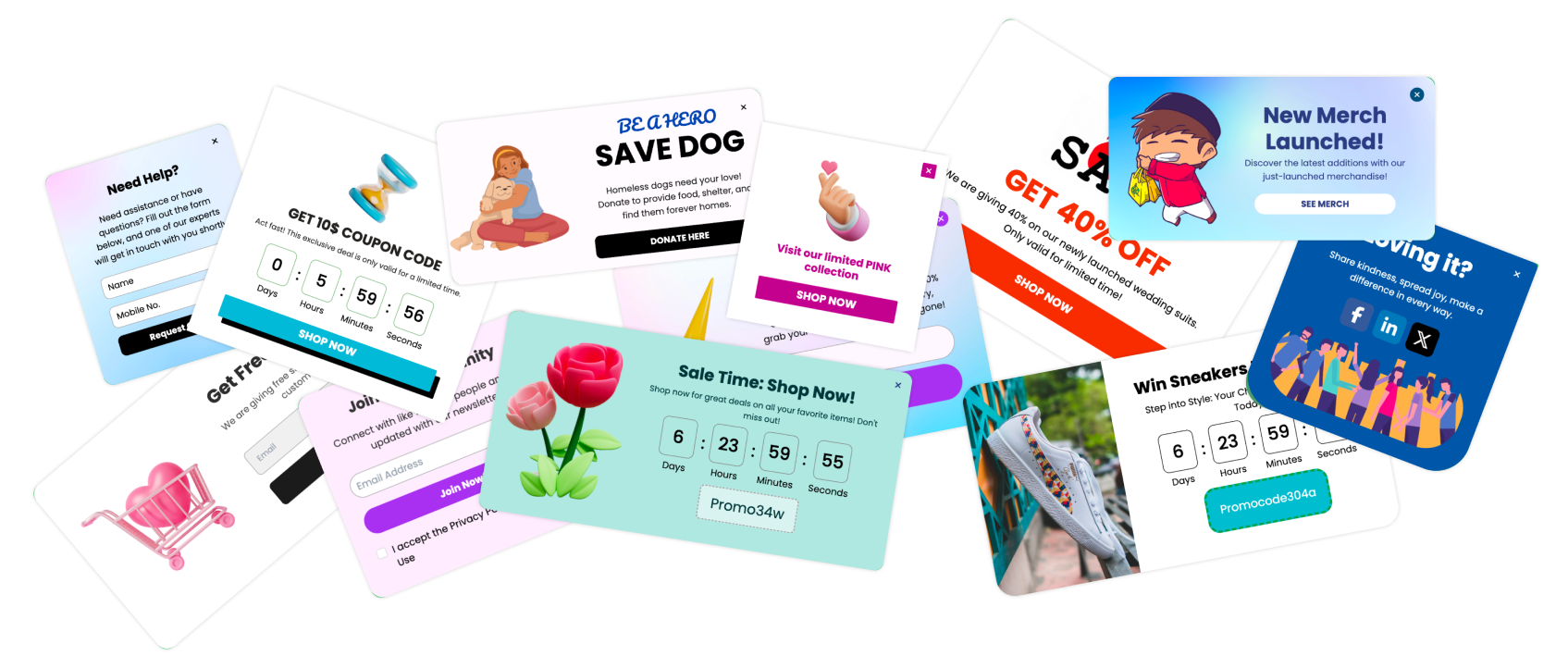
A well-designed popup close button is crucial for enhancing user experience and avoiding frustration. Whether you're using popups for lead generation or announcements, a properly placed and styled close button ensures compliance with UX standards while giving users control. In this guide, I’ll show you how to customize and optimize your popup close button using Poper.
Step 1: Create a New Popup
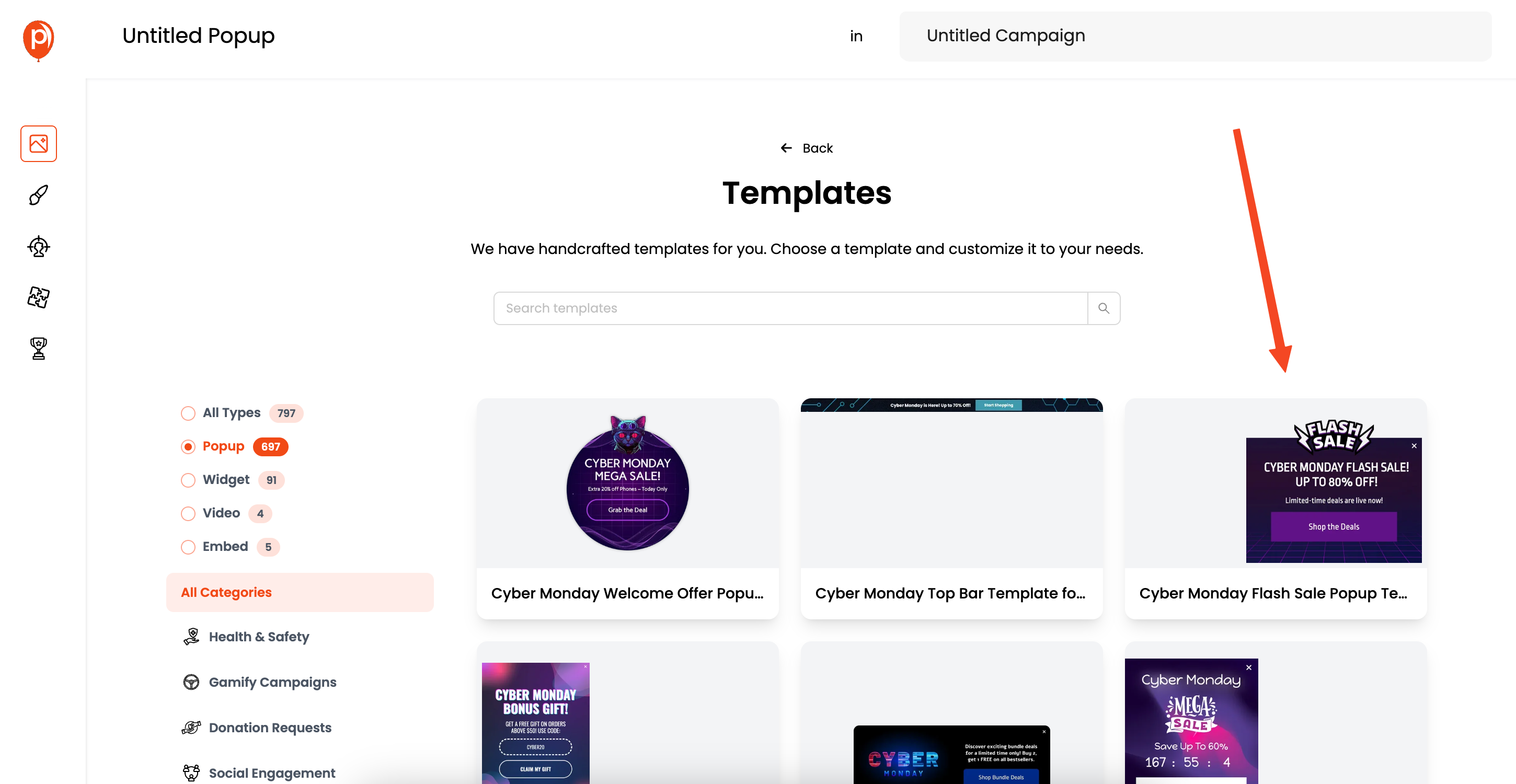
Head over to the Poper dashboard and start designing a new popup. I recommend starting with a template that aligns with your goals; it'll save you time.
Step 2: Select the Popup Close Button for Customization
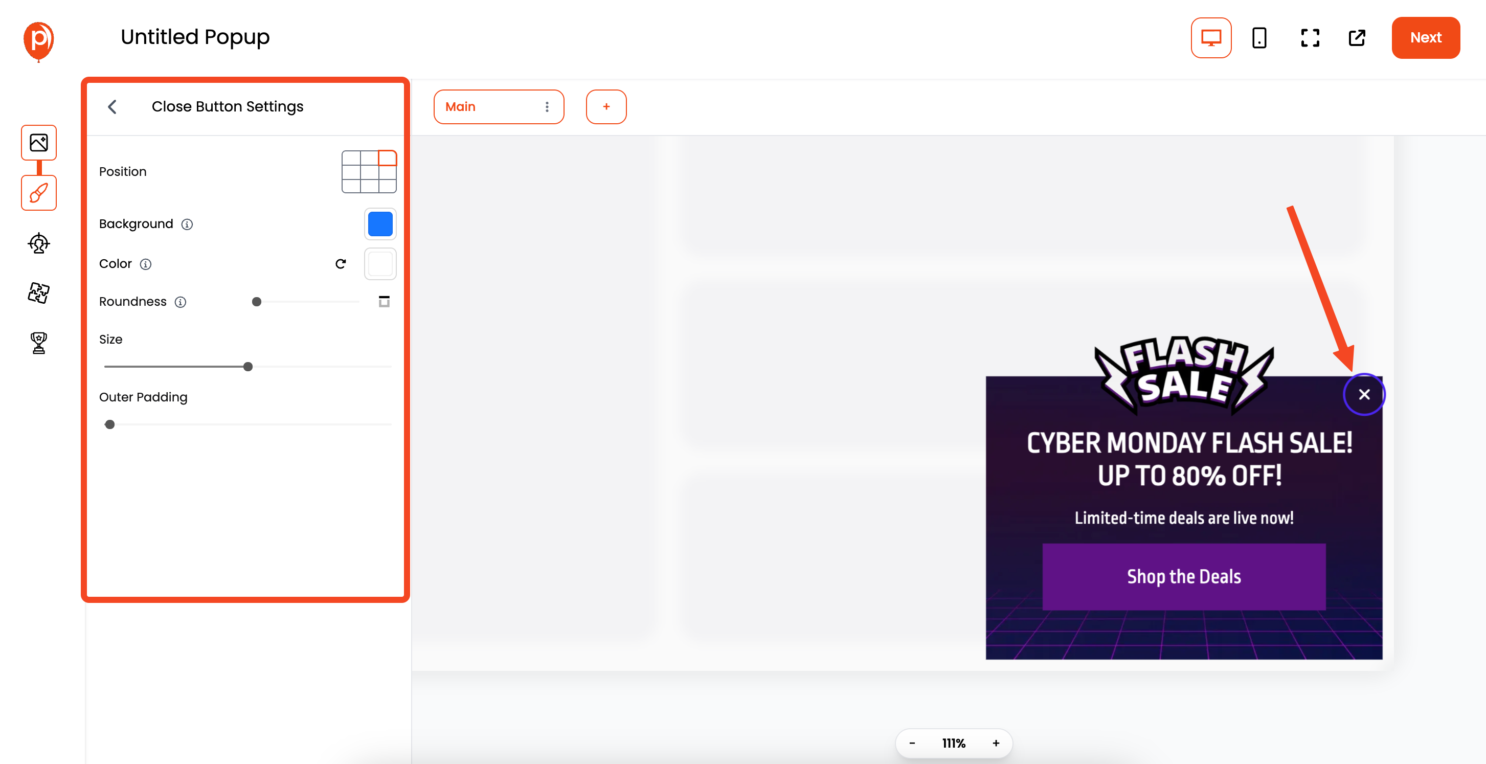
Almost all popup templates come with a default close button that's styled to match the overall theme.
Simply click on the close button within the popup preview to begin customizing it. Selecting it will open a dedicated settings panel in the left-hand sidebar.
Step 3: Adjust the Popup Close Button Position
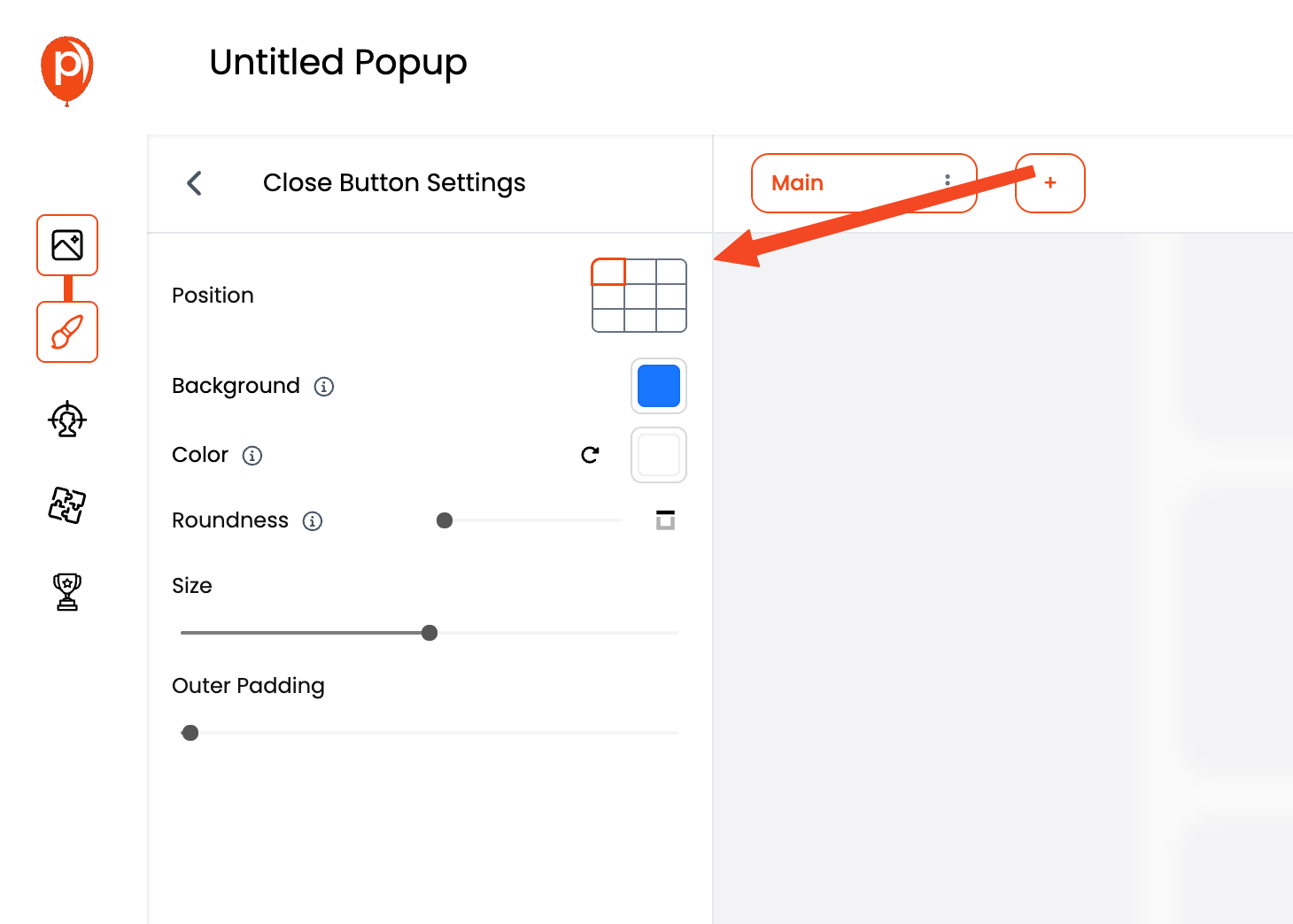
The "Position" setting allows you to place the close button precisely where you want it. Think about user experience. Common placements include the top left, top center, or top right corners. I usually go with top right; it’s where people instinctively look.
Step 4: Set the Background Color
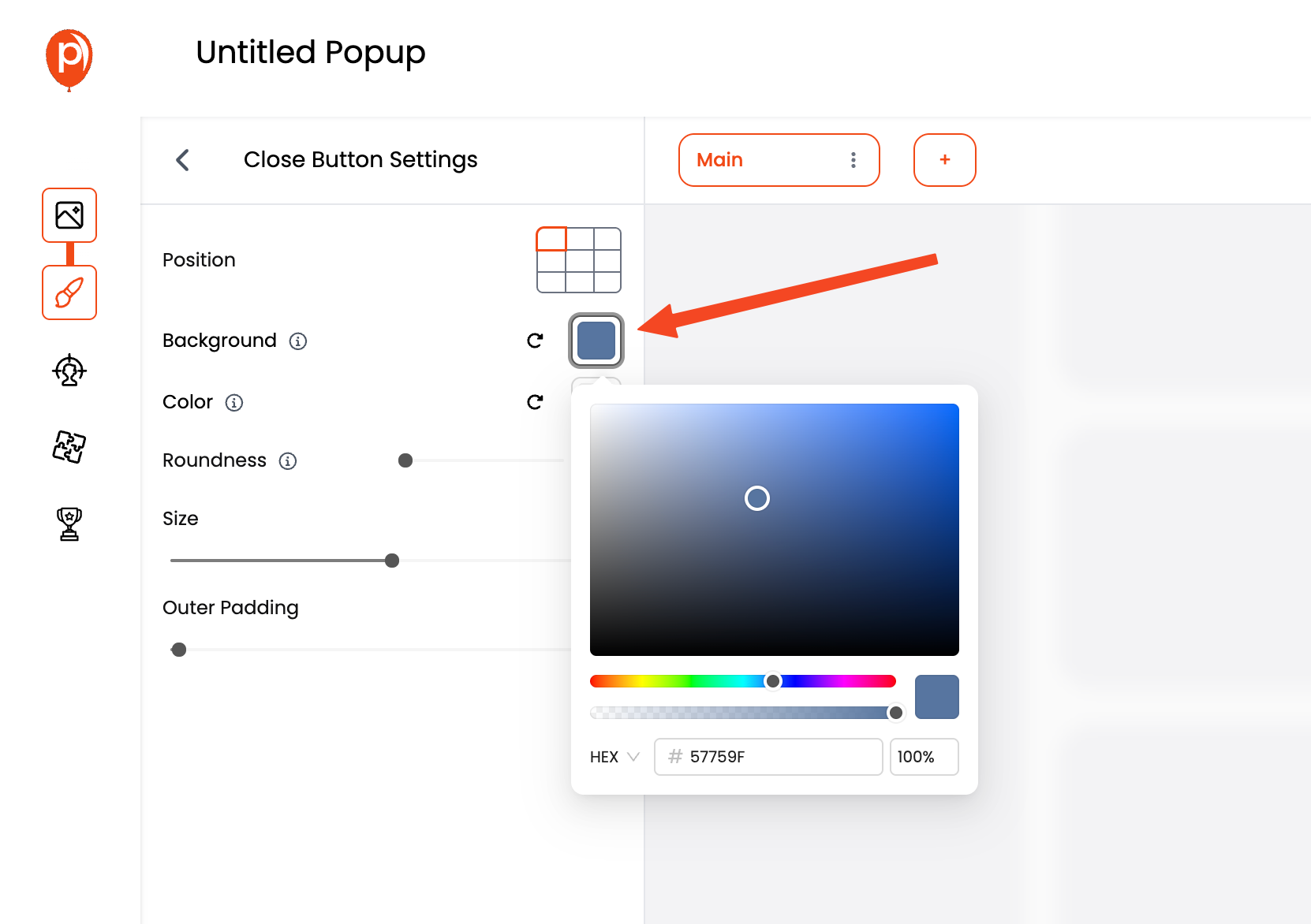
The "Background Color" option controls the background of your popup close button. You can choose a solid color that contrasts with your popup design to make it easily visible. If you prefer a cleaner look, you can even set it to transparent.
Step 5: Choose the Color of the "X" Icon
The "Color" setting lets you customize the color of the "X" icon within the close button. Pick a color that stands out against the background color of the button itself. This ensures it's highly visible and clickable.
Step 6: Adjust the Roundness for a Softer Look
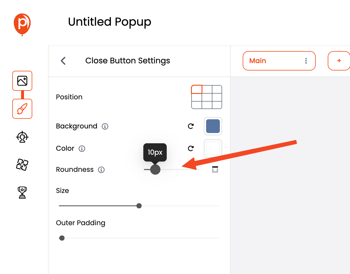
"Roundness" refers to the border radius of your close button. Increasing the roundness will give the button a softer, more rounded appearance. Experiment to see what looks best with your design.
Step 7: Size
The "Size" option allows you to change the dimensions of the close button. A larger button is generally easier to click, especially on mobile devices. However, you don't want it to be so large that it overwhelms your popup.
Step 8: Fine-Tune with Outer Padding
"Outer Padding" controls the distance between the close button and the edges of the popup. Increase the padding to create more visual separation. This prevents the button from feeling cramped.
Step 9: Customize Each Step in Multi-Step Popups
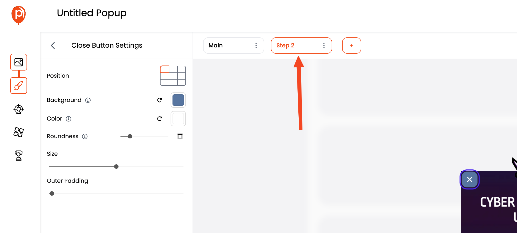
One thing I'm particularly proud of is that you can customize the close button differently for each step in your multi-step popups. This gives you ultimate control over the look and feel of your popups.
Best Practices for Optimizing Your Popup Close Button
To ensure the best results, follow these guidelines when designing your popup close button:
Make It Visible: Use contrasting colors so the button stands out against the popup background.
Test Button Placement: Position the button where users instinctively expect it, usually the top right.
Ensure Mobile Friendliness: Make sure the close button is large enough and easy to tap on mobile devices.
Consider Alternative Icons: While an "X" is standard, you can experiment with alternative icons that fit your brand’s aesthetic.
Frequently Asked Questions About Popup Close Buttons
Where should I place the popup close button?
The top right corner is the most common and user-friendly location for a popup close button, as users intuitively look there.
What size should my popup close button be?
A button size between 24x24 and 40x40 pixels is typically ideal, ensuring that it’s clickable without overpowering the popup design.
Can I change the icon of the close button in Poper?
Yes, Poper allows you to fully customize the popup close button, including changing the icon, colors, and size.

