
Popup menus in React Native allow you to display contextual actions, options, or additional information without leaving the current screen. In this article, we'll explore how to create a popup menu in React Native using two popular libraries: react-native-modal and react-native-popup-dialog.
Using react-native-modal
The react-native-modal library gives you a clean and flexible way to create modal popups. Here's a breakdown of how to use it.
Step 1: Install the Library
First, you'll need to install the react-native-modal library in your React Native project. Open your terminal and run:
npm install react-native-modalor
yarn add react-native-modalStep 2: Import Necessary Components
In your React Native component file, import the React, useState, Button, Text, View components from 'react-native', and the Modal component from 'react-native-modal'.
import React, { useState } from 'react';import { Button, Text, View } from 'react-native';import Modal from 'react-native-modal';These imports give us access to the functionalities to build the modal component with React.
Step 3: Define the Modal Component
Let's create a ModalTester component that uses the react-native-modal library.
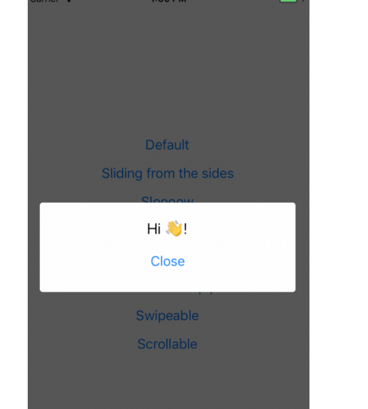
function ModalTester() { const [isModalVisible, setModalVisible] = useState(false); const toggleModal = () => { setModalVisible(!isModalVisible); }; return ( <View style={{ flex: 1 }}> <Button title="Show modal" onPress={toggleModal} /> <Modal isVisible={isModalVisible}> <View style={{ flex: 1 }}> <Text>Hello!</Text> <Button title="Hide modal" onPress={toggleModal} /> </View> </Modal> </View> );} export default ModalTester;Step 4: Explanation of the Code
toggleModal(): This function is called when you press either the "Show modal" or "Hide modal" buttons. It toggles the value of isModalVisible, effectively showing or hiding the modal.
<Modal isVisible={isModalVisible}>: This is the core of the modal. The isVisible prop is bound to our isModalVisible state. When isModalVisible is true, the modal is displayed; otherwise, it's hidden.
<Button title="Show modal" onPress={toggleModal} />: This button is responsible for showing the modal. When pressed, it calls the toggleModal function, which sets isModalVisible to true.
Step 5: Customizing the Modal
You can customize the modal in many ways, such as adding animations, changing the background color, and adding more content.
The react-native-modal library provides various props for this purpose. Refer to the library's documentation for available props.
Using react-native-popup-dialog
The react-native-popup-dialog library offers a straightforward way to create popup dialogs. Here’s how you might use it.
Step 1: Install the Library
First, install react-native-popup-dialog:
npm install react-native-popup-dialogor
yarn add react-native-popup-dialogcStep 2: Import Components
Import the necessary components from the library.
import Dialog, { DialogTitle, DialogContent } from 'react-native-popup-dialog';Step 3: Implement the Dialog
Here’s a basic example:
import React, { useState, useRef } from 'react';import { View, StyleSheet, Button } from 'react-native';import Dialog, { DialogTitle, DialogContent } from 'react-native-popup-dialog'; function PopupDialogTester() { const [visible, setVisible] = useState(false); const popupDialog = useRef(null); const showDialog = () => { setVisible(true); }; const hideDialog = () => { setVisible(false); }; return ( <View style={styles.container}> <Button title="Show Dialog" onPress={showDialog} /> <Dialog visible={visible} dialogTitle={<DialogTitle title="Dialog Title" />} onTouchOutside={hideDialog} onHardwareBackPress={hideDialog} dialogAnimation={{ animationDuration: 200, slideFrom: 'bottom', }} width={0.9} height={200} ref={popupDialog} > <DialogContent> <View> {/* Your dialog content goes here */} <Button title="Close" onPress={hideDialog} /> </View> </DialogContent> </Dialog> </View> );} const styles = StyleSheet.create({ container: { flex: 1, justifyContent: 'center', alignItems: 'center', },}); export default PopupDialogTester;Step 4: Explanation of the Code
<Dialog visible={this.state.visible} ...>: The visible prop controls whether the dialog is displayed.
<DialogTitle title="Dialog Title" />: Sets the title of the dialog.
<DialogContent>: This is where you place the content of your dialog. You can add text, buttons, or any other React Native components here.
Step 5: Customization
The react-native-popup-dialog library also provides ways to customize the appearance and behavior of your dialogs. You can set the width and height, customize the animation, and add your styling. Consult the library's documentation for details.
We will soon release SDK for React Native so you can use Poper directly in your mobile apps.
By integrating a popup menu in React Native, you can offer users a smooth and interactive way to access additional actions without disrupting the main interface. Looking for an advanced popup builder? Check out Poper to create engaging popups effortlessly.

