
Okay, let's break down how to create a popup form using Tailwind CSS in React. Tailwind makes styling a breeze, but getting the popup's structure right takes a bit of work. I'll walk you through it.
Why Use a Tailwind Popup Form in Your React App?
A well-designed popup form can increase conversions and improve user engagement. With Tailwind CSS and @headlessui/react, you can create a fully responsive, customizable, and highly interactive Tailwind popup form in React. This guide will take you through every step of building and customizing your popup form using Tailwind.
Building a Tailwind Popup Form in React
We'll use React and the @headlessui/react library, which provides accessible UI primitives that are easy to style with Tailwind. The logic will remain the same if you want to use other frameworks.
Step 1: Install Dependencies
First, let's make sure you have all the necessary packages installed. Run this command in your project:
npm install @headlessui/react @fortawesome/react-fontawesome @fortawesome/free-solid-svg-icons
@headlessui/react gives us the Dialog component, while @fortawesome provides icons.
Step 2: Create the Popup Component
Here’s the Popup component code, which I'll explain in detail:
import { useState } from 'react'import { Dialog, DialogBackdrop, DialogPanel, DialogTitle } from '@headlessui/react'import { FontAwesomeIcon } from '@fortawesome/react-fontawesome'import { faExclamationTriangle } from '@fortawesome/free-solid-svg-icons' export default function Popup() { const [open, setOpen] = useState(true) return ( <Dialog open= onClose= className="relative z-10"> <DialogBackdrop transition className="fixed inset-0 bg-gray-500/75 transition-opacity data-closed:opacity-0 data-enter:duration-300 data-enter:ease-out data-leave:duration-200 data-leave:ease-in" /> <div className="fixed inset-0 z-10 w-screen overflow-y-auto"> <div className="flex min-h-full items-end justify-center p-4 text-center sm:items-center sm:p-0"> <DialogPanel transition className="relative transform overflow-hidden rounded-lg bg-white text-left shadow-xl transition-all data-closed:translate-y-4 data-closed:opacity-0 data-enter:duration-300 data-enter:ease-out data-leave:duration-200 data-leave:ease-in sm:my-8 sm:w-full sm:max-w-lg data-closed:sm:translate-y-0 data-closed:sm:scale-95" > <div className="bg-white px-4 pt-5 pb-4 sm:p-6 sm:pb-4"> <div className="sm:flex sm:items-start"> <div className="mx-auto flex size-12 shrink-0 items-center justify-center rounded-full bg-red-100 sm:mx-0 sm:size-10"> <FontAwesomeIcon icon= className="text-red-600 text-2xl" aria-hidden="true" /> </div> <div className="mt-3 text-center sm:mt-0 sm:ml-4 sm:text-left"> <DialogTitle as="h3" className="text-base font-semibold text-gray-900"> Deactivate account </DialogTitle> <div className="mt-2"> <p className="text-sm text-gray-500"> Are you sure you want to deactivate your account? All of your data will be permanently removed. This action cannot be undone. </p> </div> </div> </div> </div> <div className="bg-gray-50 px-4 py-3 sm:flex sm:flex-row-reverse sm:px-6"> <button type="button" onClick={() => setOpen(false)} className="inline-flex w-full justify-center rounded-md bg-red-600 px-3 py-2 text-sm font-semibold text-white shadow-xs hover:bg-red-500 sm:ml-3 sm:w-auto" > Deactivate </button> <button type="button" onClick={() => setOpen(false)} className="mt-3 inline-flex w-full justify-center rounded-md bg-white px-3 py-2 text-sm font-semibold text-gray-900 ring-1 shadow-xs ring-gray-300 ring-inset hover:bg-gray-50 sm:mt-0 sm:w-auto" > Cancel </button> </div> </DialogPanel> </div> </div> </Dialog> )}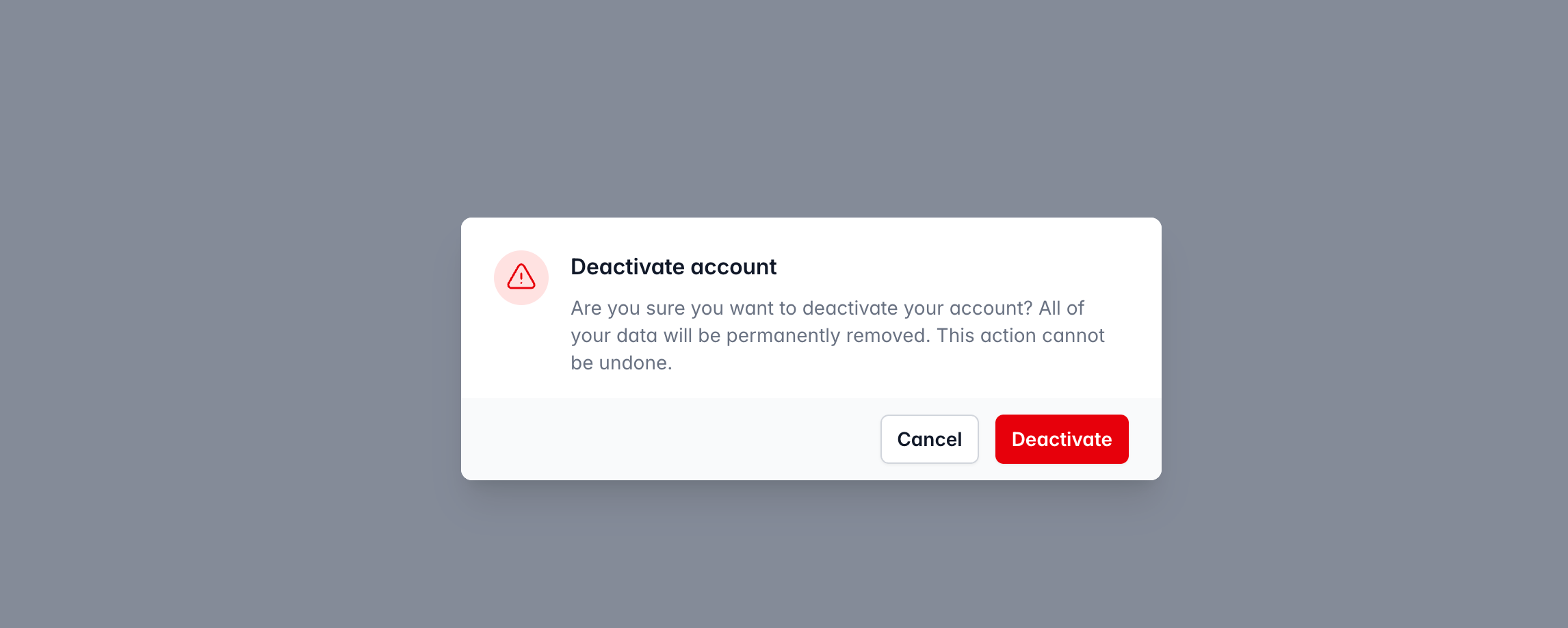
Step 3: Understand the Code
Let's dive into what each part of this code does:
Imports
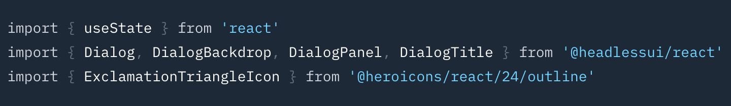
useState from react is used to manage the popup's visibility.
Dialog, DialogBackdrop, DialogPanel, DialogTitle from @headlessui/react are the components that structure the popup.
FontAwesomeIcon from @fortawesome/react-fontawesome and faExclamationTriangle from @fortawesome/free-solid-svg-icons are used for the warning icon.
useState Hook:
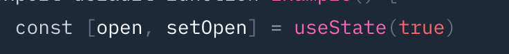
const [open, setOpen] = useState(true) initializes the open state to true, so the popup is visible by default. The setOpen function is used to update the open state, controlling the popup's visibility.
Dialog Component:
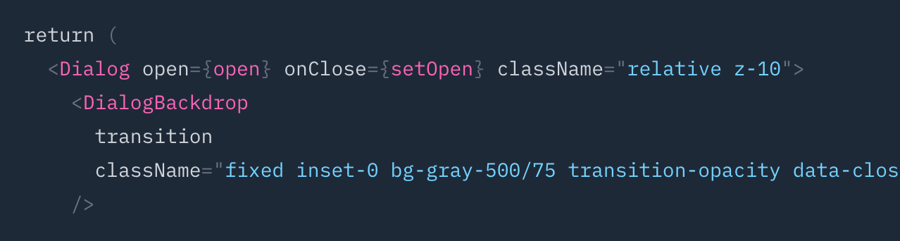
`Dialog` is the main container for the popup.
open={open} binds the open state to the dialog, controlling whether it's visible.
onClose={() => setOpen(false)} is called when the dialog should close (e.g., when the backdrop is clicked).
Dialog Backdrop:
`Dialog Backdrop` creates the backdrop behind the popup.
fixed inset-0 makes it cover the entire screen.
bg-gray-500/75 sets a semi-transparent background.
The transition-* classes handle fade-in/fade-out animations.
Dialog Panel:
`` is the main panel containing the popup's content.
relative transform overflow-hidden ... applies styling like background color, rounded corners, and shadow.
The transition-* classes manage the slide-in/slide-out animation.
Footer Buttons:
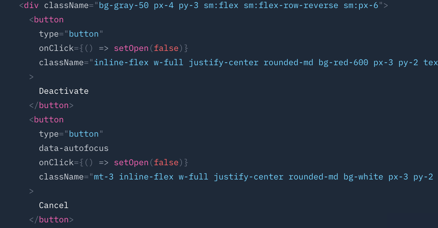
The footer contains two buttons: "Deactivate" and "Cancel".
Both buttons have onClick handlers that call setOpen(false) to close the popup.
Tailwind classes are used to style the buttons, such as bg-red-600, text-white, rounded-md, etc.
Step 4: Using the Popup Component
To use this popup in your application, simply import it and render it:
import React from 'react';import Popup from './Popup'; function App() { return ( {/* Other content */} <Popup /> );} export default App;Step 5: Customization
You can easily customize this popup:
Change the Content: Modify the text within the
<DialogTitle>and<p>elements.Add Form Elements: Include
<input>elements,<textarea>, or other form components inside the main contentdiv.Modify Styling: Adjust Tailwind CSS classes to change colors, padding, font sizes, etc.
Control Visibility: Instead of initializing
opentotrue, manage it based on user interactions (e.g., a button click).
By following these steps, you can create a stylish and functional tailwind popup form using Tailwind CSS in your React application. This approach leverages the flexibility of Tailwind for styling and the accessibility features of @headlessui/react for a robust solution.
Why Tailwind CSS is Ideal for Popup Forms
Using Tailwind CSS for popup forms provides several advantages:
🚀 Faster Development: Predefined utility classes make styling quick and efficient.
🎨 Full Customization: Easily modify colors, padding, and borders to match your brand.
📱 Responsive Design: Ensure your popup looks great on all devices.
🧩 Seamless Integration: Works well with React and other JavaScript frameworks.
With Tailwind, you can create popup forms that are both visually appealing and highly functional.
Frequently Asked Questions (FAQs)
Can I use Tailwind popup forms in frameworks other than React?
Yes! While this guide focuses on React, you can use Tailwind popup forms in other frameworks like Vue or Angular with slight modifications.
How can I make the popup form responsive?
Tailwind's responsive utilities (
sm:,md:,lg:) make it easy to ensure your popup adapts to different screen sizes.Is @headlessui/react necessary to create a Tailwind popup form?
@headlessui/react simplifies popup handling and provides accessibility, but you can also manually manage state and animations if needed.
How do I trigger the popup based on user actions?
You can control the
openstate dynamically using button clicks, time delays, or scroll triggers.

